CVS Updates Beauty Brand to Fit Modern Consumers

(Courtesy of Designalytics)
According to an article in Forbes earlier this year, the next big thing in retail is private label. Store brands are outpacing their national-brand counterparts in sales growth and, in many cases, are rapidly encroaching on market share as well.
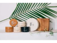
That might prompt some store-brand stalwarts to double down on what has worked for them in the past when it comes to package design. Yet CVS Pharmacy did the opposite, jettisoning its established beauty brand name in favor of a fresh and original new look that placed the products themselves—rather than the brand—at the forefront. The portfolio-wide reimagining of the CVS Beauty Brand packaging paid off immensely in consumer response, boosted sales, and with this year’s grand prize win in the Designalytics Effectiveness Awards.
The CVS Beauty Brand’s “Beauty 360” name had been a fixture on shelves for years, competing with national brands by offering high-quality beauty and personal care products at a great value.
Given the changing dynamics in the space, there was a clear need to give its brand position and packaging another look. “The Beauty landscape is always changing,” said Heather Corkery, executive director of store brands at CVS Health. “We had not updated our Beauty 360 brand in a number of years, so it was time for change to ensure we were continuing to meet the needs and expectations of consumers.”
CVS Pharmacy tasked New York-based design agency CBA USA with this challenge, which was formidable. For one, there wasn’t just one target market; instead, the audience was a kaleidoscopic collection of consumers with disparate wants and needs.
“The CVS Beauty Brand spans multiple categories where customer behavior can vary greatly,” said Corkery. “For example, a customer purchasing disposable razors is looking for something different than the customer buying hand soap. Our new design needed to be very flexible to speak to varied audiences.”
The creative brief was helpful in providing direction at the start—to create, in essence, designs that were “special, desirable, yet wholly familiar”—while offering the agency license to create something new and exciting. For CBA USA, though, true clarity came with learning as much as possible directly from the people who knew these brands best: CVS Health colleagues.
The agency held working sessions with people across the organization, from brand marketing and internal design teams to those on the front lines in stores.
“It was so good to talk to those folks at the start, because they were very candid about the challenges in particular categories. I don't think we would've learned as much if we only had the written brief as a reference,” said Elainne Roberton, managing partner at CBA USA.
Rutger Thiellier, executive creative director at CBA USA, recalled wanting to reward the CVS Beauty Brand’s gutsy vision with inspiring and effective designs worthy of it. “We knew the brand wanted something remarkable, something that moved them,” he said. “If we created something that didn’t move them, they would naturally default to a more rational approach. We needed to show the potential of something a bit daring and yet uniquely CVS.”
After presenting initial ideas, an unquestionably bold idea started taking shape. The brand decided to retire the Beauty 360 name entirely, a choice based on the values of the organization and an understanding of changing market dynamics.
“When Beauty 360 was launched, it was targeted primarily at female consumers,” noted Roberton. “But beauty has evolved as a word and the definition of the beauty consumer has changed. The consumer now is anyone looking for high-quality, affordable personal care products who wants to feel good about their choices.”
Perhaps the most impressive feature of the new design system is the clever way the brand has incorporated the heart icon into disparate product packaging. On the liquid hand soap, it’s set amidst the foam of the ocean on the beach; for the intense moisture night cream, it mimics the moon against a midnight sky; several other varieties feature the heart as a bubble or a drop in water. The symbol unifies the products in subtle and appealing ways.
Yet importantly, each product has a look that aligns with consumer needs and category cues. “We started with what was valuable to the consumer for each product, because that would change across the portfolio,” stated Roberton.
“Maybe it’s the active ingredients, maybe it’s a more quiet, premium look. Then we worked to design something to deliver on those needs that also fit within this flexible system we created.”
The CVS team couldn’t have been happier with the final designs, and of the impact they had on consumers. “Each SKU has a unique visual expression that represents the emotional connection we wanted to create with our consumers,” Corkery observed. “Thankfully, they seemed to agree that it did connect with them—the consumer testing results were very strong.”
In 2023, CVS Beauty Brand’s new designs launched, and it’s safe to say consumers “hearted” the new look. During the six months following the redesign, sales of CVS Beauty products increased by 20% compared to the same period during the prior year. The results of a consumer evaluation by Designalytics support this outcome across a range of SKUs, and many absolutely dominated their predecessors. Take the apricot facial scrub, for example: 74% of category buyers preferred the new design over the previous one.
The design was clearly a driving force in this success, because our private-label brands rely for the most part on placement in our owned assets and the flow of traffic coming into our stores to attract consumers,” stated Corkery. “Still with limited advertising, we experienced sales increases with the brand transition and have received favorable sentiment from our customers about the updated look.”
With a project of this scope and scale, it can be hard to encapsulate what made it such a big success. For Roberton, though, one element made a huge difference. “The whole project was design-led,” she said. “It was backed by data, but it was driven by design.”
Looking for a reprint of this article?
From high-res PDFs to custom plaques, order your copy today!


