Baby Nut, the cute newborn version of Planters’ classic mascot Mr. Peanut who made his debut at the Super Bowl this year, will appear on Planters packaging.
Since 1939 the packaging described the product as a cure for “periodic pain.” Although the name was familiar with young women, the brand lacked relevance with Gen Z and was losing market share due to the increase of new female-focused start-ups.
Wisconsin-based Good Foods switches to illustration from photography for newly rebranded packaging for its guacamole line, noting it is more reflective of the fresh, natural product.
Farmer-owned cooperative Land O’Lakes, Inc. has unveiled new packaging for the company’s consumer-facing LAND O LAKES® products featuring the farmers who are the foundation of the cooperative’s membership.
Cadbury has unveiled a fresh new look for the iconic identities of both Cadbury and Cadbury Dairy Milk. Living true to the progressive vision of Founder, John Cadbury, the new identity celebrates the brand’s inherent goodness and generous spirit with a distinctive and modern twist.
Sun-Maid, the whole fruit snack brand, is unveiling a new look and feel through its packaging to reflect simplicity and transparency. Sun-Maid's iconography has been one of the most recognizable brand visuals for the last 100+ years with its bright sun and Sun-Maid girl.
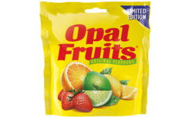
Opal Fruits was first launched in the U.K. in 1960, but were aligned with the global brand name Starburst in 1998. Since then there has been an increasing appetite for retro sweets — and a growing campaign on social media to bring back the popular fruity chews.
Imperial Leather was ready to push forward with a new identity to rejuvenate the Foamburst range, reinvigorate that initial sense of excitement and set it apart from regular body-wash brands.