Home » brand packaging
Articles Tagged with ''brand packaging''
Brand Packaging: Sustainability
How Sustainability Can Amplify Marketing Resiliency for CPGs
January 11, 2021
Brand Packaging: Marketing
Make Your Product Packaging Your Best Marketing Tool
It’s more than just protecting the product inside.
September 30, 2020
Brand Packaging: Rebranding
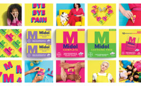
The Story Behind the Packaging: Midol
The iconic pain reliever gets a packaging overhaul, new branding message and 100% digital campaign to resonate with a new generation.
June 12, 2020
Brand Packaging: Packaging Design
Redesigning the Packaging Playbook
Making your brand stand out on a shelf full of copycats.
April 12, 2020
Keep the info flowing with our eNewsletters!
Get the latest industry updates tailored your way.
JOIN TODAY!Copyright ©2025. All Rights Reserved BNP Media.
Design, CMS, Hosting & Web Development :: ePublishing

