Tea Brand Relaunched with Enviro-Friendly Packaging

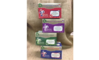
Pure Leaf relaunches its premium teas in the U.K. and Netherlands, with a global brand and packaging redesign by London agency PB Creative.
Pure Leaf’s range of single-origin and blended teas uses ingredients sourced from all over the world and is made in collaboration with the industry’s most reputable tea masters. The brand goes to great lengths to source its tea in a sustainable and responsible way, and prides itself on using traditional manufacturing methods to produce the ultimate cuppa.
But it was felt that the company's philosophy, brand ethos and provenance stories were somewhat muted on pack and needed to be brought to the forefront to get noticed, both instore and online. Pure Leaf approached PB Creative and the team created a modern design that reflects the environmentally responsible and first-class nature of the range, as well as helping it achieve prominence in an increasingly busy category.
Pure Leaf moved from plastic jars to a more sustainable carton format — a move that was needed to reflect the brand’s intrinsic sense of environmental responsibility. The design team worked with packaging partners to create a box structure that increased the scope for brand, variant and provenance expression on pack, highlighting the strong taste appeal across all of the black, green and herbal blends.
PB Creative capitalized on the original core brand color – black – which had taken a back seat to variant shades in previous design iterations. This premiumized the range and created the opportunity for dramatic brand blocking. Vibrant variant colors have been chosen to emphasize individual flavor profiles, as well as create a sense of indulgence and make it easy for consumers to navigate the whole line-up.
Looking for a reprint of this article?
From high-res PDFs to custom plaques, order your copy today!


