Simply Cook Recipe Kits Break Out New Design for In-Store Launch


Subscription-based recipe kit service Simply Cook unveiled a new range of in-store recipe kits with design created in collaboration by B&B studio (bandb-studio.co.uk) and Path (wearepath.com). The move from e-commerce into retail follows the rise of recipe and meal subscription services, with easy-to-follow guides delivering delicious, high-quality meals in 20 minutes.
Simply Cook recipe kits are designed for those who like to cook but not the planning that goes with it. These kits offer a quick and easy solution to the everyday decision of what to have for dinner.
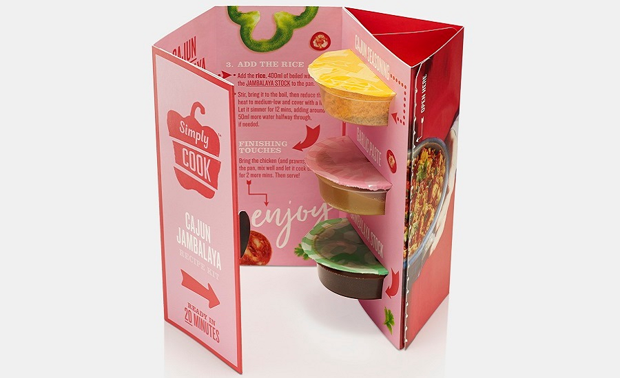
Each stage of the user experience has been considered in the design: positioning the disruptive stands in the fresh food aisles to sit alongside key ingredients, through multi-layered packaging that unfolds like a recipe book, to a fun, functional and visionary design that enhances the cooking experience.
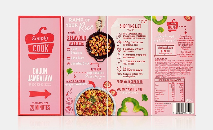
Each kit includes three flavor pots and a step-by-step recipe but no fresh ingredients, enabling the consumer to select their own produce as they shop in store, following the on-pack shopping list.
B&B studio evolved the brand’s existing positioning and identity, moving away from an over-reliance on reassurance through messaging toward a more engaging experience that focuses on the joy of cooking.
The design challenge was to bring that experience to life through packaging. Path’s structural solution stands upright and confident, delivering shelf impact and a post-purchase experience that takes consumers on a journey of discovery. The bespoke cardboard structure features a 5th panel, allowing Simply Cook to communicate all aspects of its unique offer.
The pack is open on the top and bottom, allowing consumers to see the flavor pots, which was important for introducing Simply Cook to a new retail audience.
B&B studio applied bright hues and simple graphics across the design to express the pleasure of cooking. A pared-back design with vivid photography takes users on a visual step-by-step journey from raw, scattered ingredients, through the cooking process, to a delicious completed meal. The front of pack is kept simple, focusing on the flavors within.
Oli Ashness, Simply Cook Founder, says: “Over the past few years our online subscription service has gone from strength to strength and the time had come for us to branch out into the retail environment. These powerful recipe kits pack a real punch, but in a crowded marketplace, we needed a strong visual identity to differentiate from the competition.
“B&B and Path have worked brilliantly together to deliver a unique proposition for our in-store recipe kits, with packs that engage our customers from the moment they set foot in the store till they’re at home making quick and easy meals that are high quality and absolutely delicious.”
B&B studio delivered the brand positioning, creative strategy, brand identity and packaging design for Simply Cook. And Path created physical strategy and design for both packaging and point of sale, and also ran manufacturing consultancy.
Launching in Sainsbury’s stores across the U.K. this month, the range of six kits delivers different flavors from around the world, with recipes including Goan Fish Curry and Penne Alla Rustica.
Looking for a reprint of this article?
From high-res PDFs to custom plaques, order your copy today!


