Better Branding for E-Commerce Shipping Boxes


The incredibly rapid rise of e-commerce can be illustrated with one fact: Jeff Bezos, founder of Amazon.com, is the richest man in the world. Last year, his fortune reached $112 billion, the result of the largest year-over-year growth in personal fortune in … well … ever. Even Bill Gates didn’t get so rich so fast.
Considering the boom in boxes magically appearing on our doorsteps, brand owners should consider what this means from a customer engagement and retention perspective.
Think about it: The vast majority of the packages we receive are bland and blander. It’s an ends to a means — a delivery device, nothing more. From where I’m standing, as a corrugated printer, that’s a heckuva lot of lost real estate for effective branding.
We got here for two reasons. First, e-commerce was novel and nascent … until it wasn’t. For traditional retailers, it started as an also-ran – a source of tack-on revenue – and the approach to it hasn’t changed with the practice’s proliferation. We’re shipping 2018 products in 1998 boxes.
The second reason is security. Simply put, the flashier a package is the more likely it is to be stolen from someone’s porch. But this assessment ignores the inside of the box and, in terms of the exterior, is too absolutist; though it may be unwise to give away key details of a box’s contents on its outside, that doesn’t mean it can’t be made just a bit more attractive. Keep in mind that first impressions count to consumers – even after they’ve purchased your product online. In the e-commerce niche, the point of brand building on packaging materials is to create repeat customers more so than new ones.
Until very recently, then, many brands have relied on e-commerce packaging that was unremarkable in appearance and not adequately representative of their brick-and-mortar brand expressions. But now, many traditional brands are waking up to the importance of their brands permeating the entirety of their sales efforts, including e-commerce.
In addition, online-only retailers are discovering the benefits of extending branding far beyond their websites, identifying their packages for what they are: the first actual touchpoint with their customers. More e-companies are treating their shipping boxes as firm handshakes rather than tepid hellos. And in my experience, customers remember a firm handshake.
From a printing standpoint, the technology is available not only to beautify e-commerce packages, but to do so both expediently and cost-effectively for customers. My company, Sutherland Packaging of Andover, NJ, recently invested in a new large format graphic printer offering the sort of double-sided, one-pass printing capabilities ideal for corrugated e-commerce packaging. In doing so, we’re finding that our deep experience in corrugated point-of-purchase (POP) displays is highly translatable to jazzing up e-commerce shippers.
For both POP displays and e-commerce corrugated printing, versatility is the key — especially the marriage of enhanced-graphics litho printing with less traditional approaches.
Among my company’s range of specialties, we gained a hefty portion of our market share thanks to our innovative direct printing technique, which circumvents the traditional practice of mounting a lithographic label over corrugated substrates. Ideal for the retail consumer products sector and club store displays, this maximal impact, cost-effective full-color technology enables customers to save on both material expenditures and shipping times.
In addition to direct-to-corrugated and lithographic label printing, we also offer high-speed digital production with exacting color matching. This ability to provide ultra-customized, hybrid solutions — for example, combining direct-to-corrugated with litho printing or conventional printing methods with digital – opens up a world of possibilities to e-commerce customers looking to spruce up their corrugated shippers.
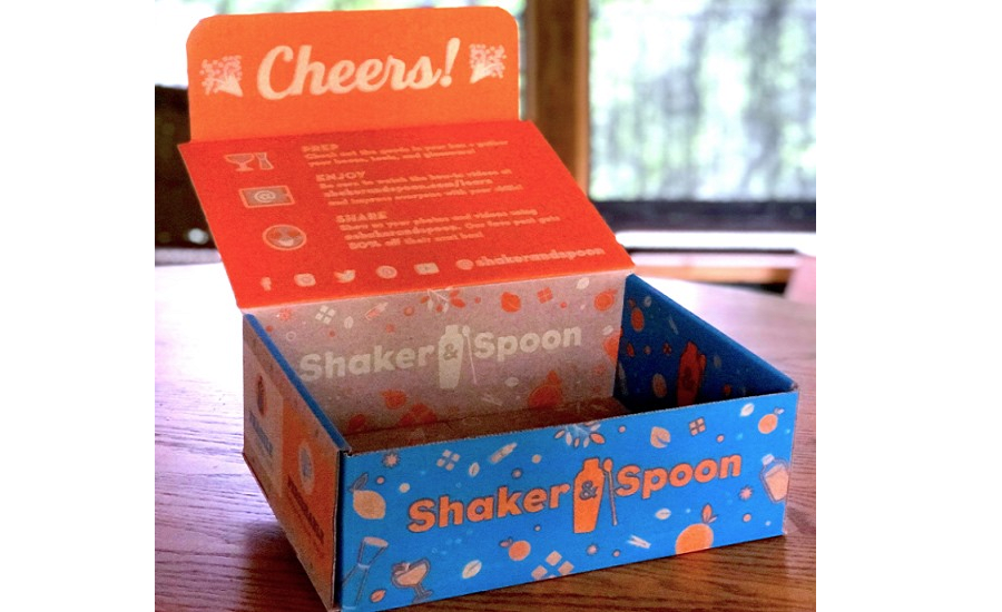
How exactly this plays out differs from customer to customer, of course. But generally speaking, a goal here is to make the outside more attractive without giving would-be thieves a concrete reason to go front porch shopping. Meanwhile, the inside gets a complete makeover, becoming a veritable brand-in-a-box.
The shipper we make for Take Care of, an online vitamin retailer, is a solid example of an e-business “shaking hands” with consumers through its e-commerce containers. The overarching message — uniqueness and personal care — is introduced on the outside and eloquently expanded upon once opened. Shaker & Spoon, which delivers ingredients and instructions for innovative cocktails, rotates its shipper’s color scheme to suit its recipe of the month.
Low key on the outside, vibrant on the inside. That’s the emerging rule of thumb in a once-emerging sector — e-commerce — whose growth seems limitless. It’s time for printing and branding to catch up with the times.


