
According to Nielsen IQ research, Gen Z respondents have a clear tendency to be "face obsessed". When purchasing food and beverage products, they pay more attention to the appearance of the packaging than the rest of the population. In the past year, Gen Z has been more likely to buy food and beverage products with better-looking and a strong sense of design[1].
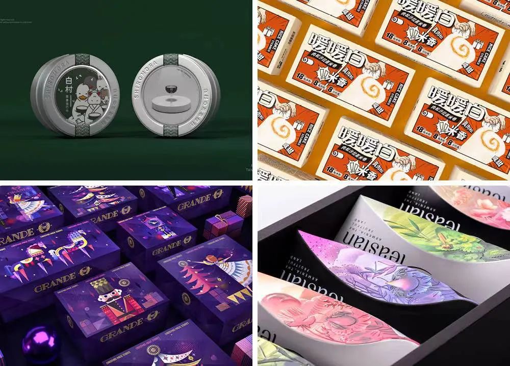
Food Packaging Design
Image source: 【Marking Awards Global Food Packaging Design Competition】Participating organizations
In this issue of [Marking Awards], the collection of entries takes you through the dictionary of young people and shows you the food and drink packaging that appeals to Gen Z.
"Trendy" in the dictionary of Gen Z
Grande Xmas
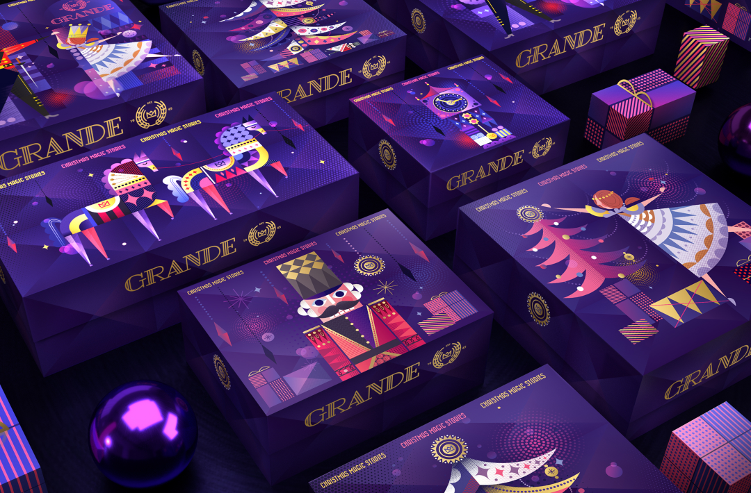
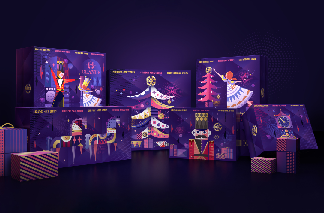
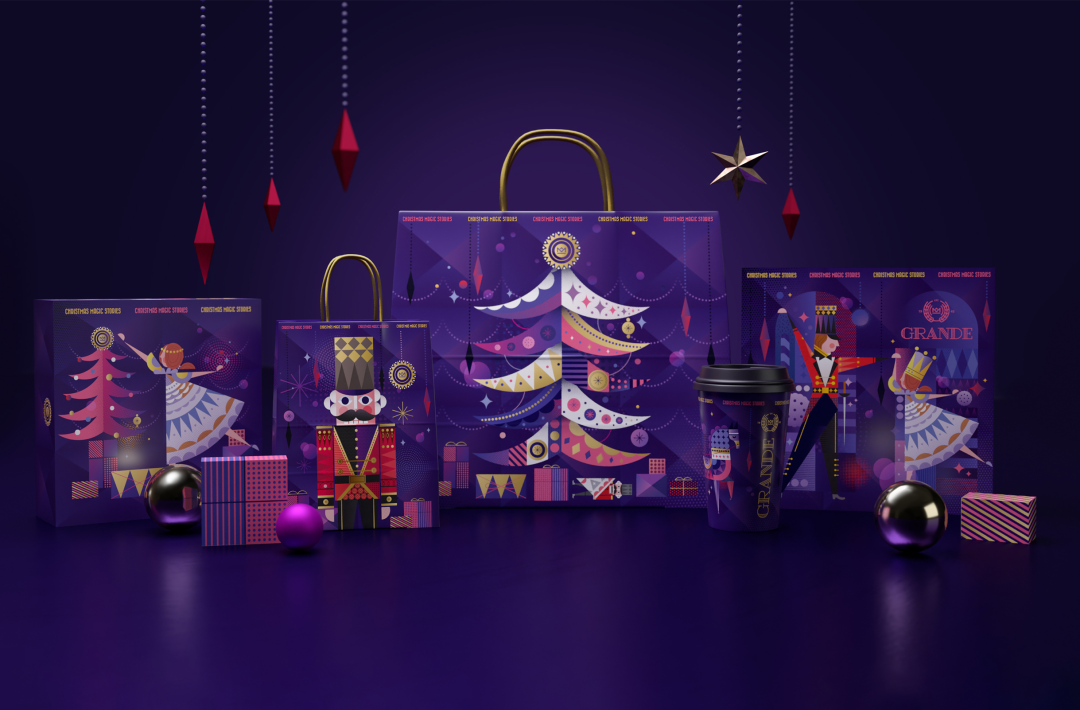
Grande Xmas
Image source: AS Strategy Branding & Communication
The smell of baked gingerbread always accompanied the Christmas memory in childhood. The warmth of the atmosphere eases you into dreamland. The shimmering shadows of the toys caught before bedtime and the waving flames come together to create a vivid fairy tale with a touch of magic. A child's imagination is used in the Christmas packaging. The geometric illustration style brings childhood and magic to life, the blue and purple colors are dreamy and magical, and with some decorative art, the imagery is fun and whimsical. It's as if a fairy tale has been given life.
SECRE Strawberry Coffee Gift Box
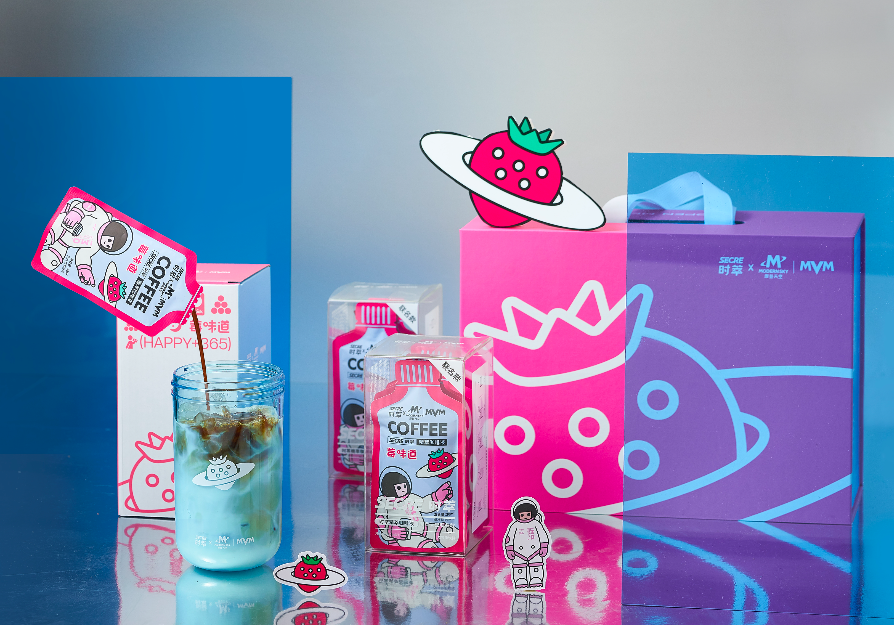
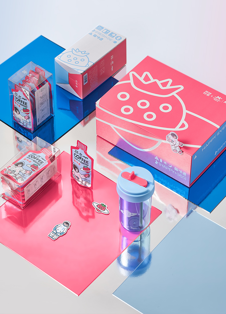
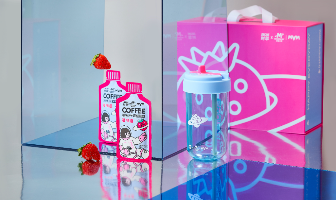
SECRE Strawberry Coffee Gift Box
Image source: Secrecoffee
Gen Z has a broad and diverse range of interests. IP co-branding can establish a connection between brands and consumers' interests. Thus, IP co-branding that starts with Gen Z's interests is just as likely to gain a lot of popularity.
Modern Sky and Secrecoffee extract a new flavour - strawberry – from beans at the background of Strawberry Music Festival and launch a new product– Strawberry coffee, which was inspired by I.M.O. With a series of marketing campaigns during the festival, the "Fall-in-Strawberry café" become one of the most critical sites for Generation Z to show their nature and display their own inimitable viewpoint of coffee、music and lifestyle.
The outer packaging box uses a simple design style to highlight the texture. While the internal product adopts a lively design, the design of opening and closing presents two different feelings, making consumers full of surprises in unpacking the box. The rose color scheme reflects the distinctive strawberry-flavored coffee while enormously appealing.
Meiyitian lactobacillus drink white - Celebrity's comic edition
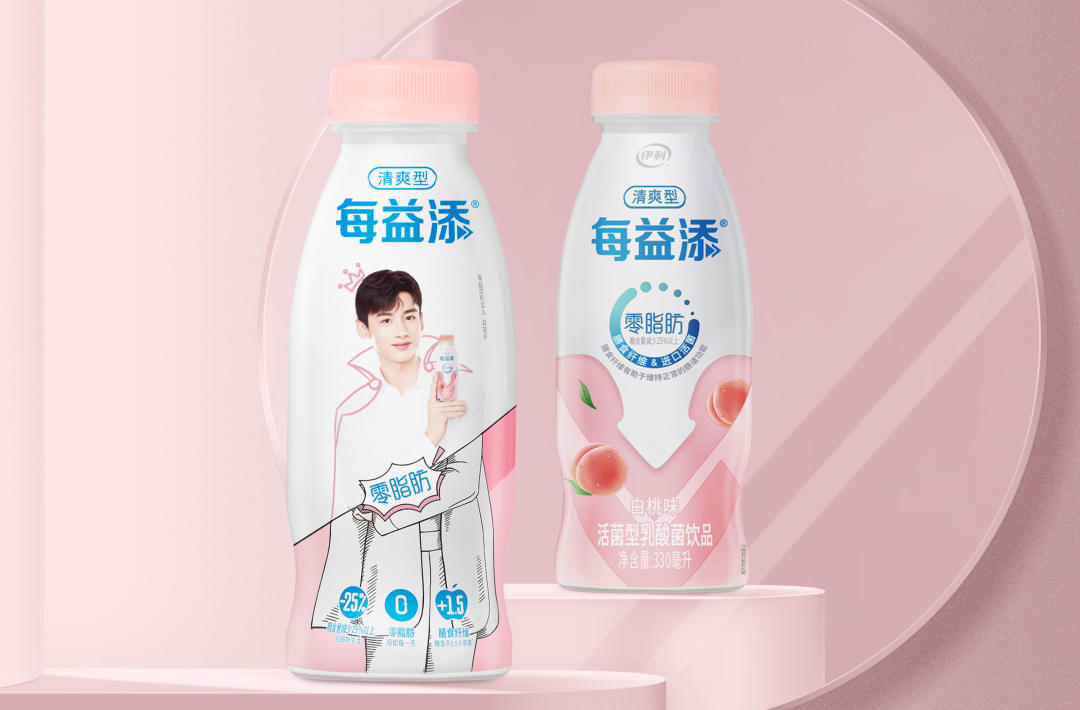
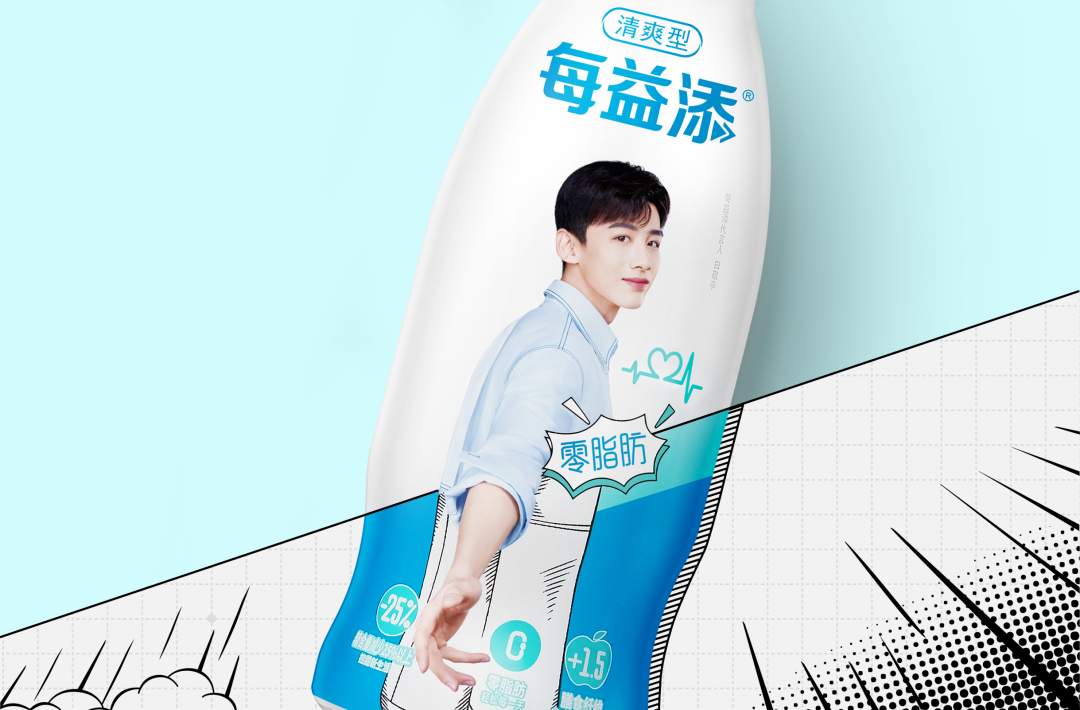
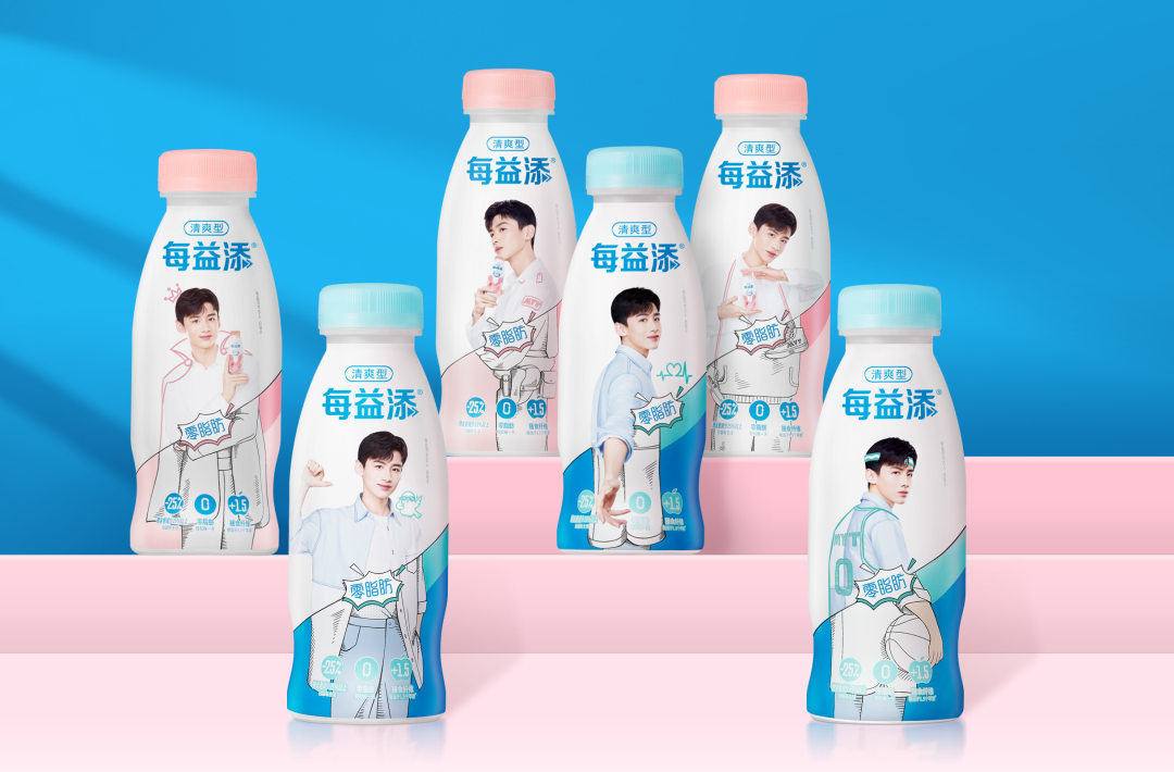
Meiyitian lactobacillus drink white
Image source: pesign design
In order to better communicate with young consumers and strengthen the public perception of "White Milk", a limited edition packaging with a spokesperson was launched by Meiyitian. In the design, the image of the spokesperson is used in a more clever way to interact with the audience. The creative focus on the concept of "breaking the next generation", the combination of characters and secondary generation, will achieve the inversion of the switch between comics and reality. The popular design language can achieve the classic best-selling "romance comic" limited edition.
The "jelly" texture of the translucent cap breaks through the process bottleneck and echoes the colour of the label to convey the core connotation of "refreshment" and its unique difference. The matte texture of the opal film presents a unique premium feel both visually and tactilely. The stylish, ink-free printing of the "romance comic" also allows the brand to explore eco-friendly packaging further.
Warm white rice rolls with meat floss salad
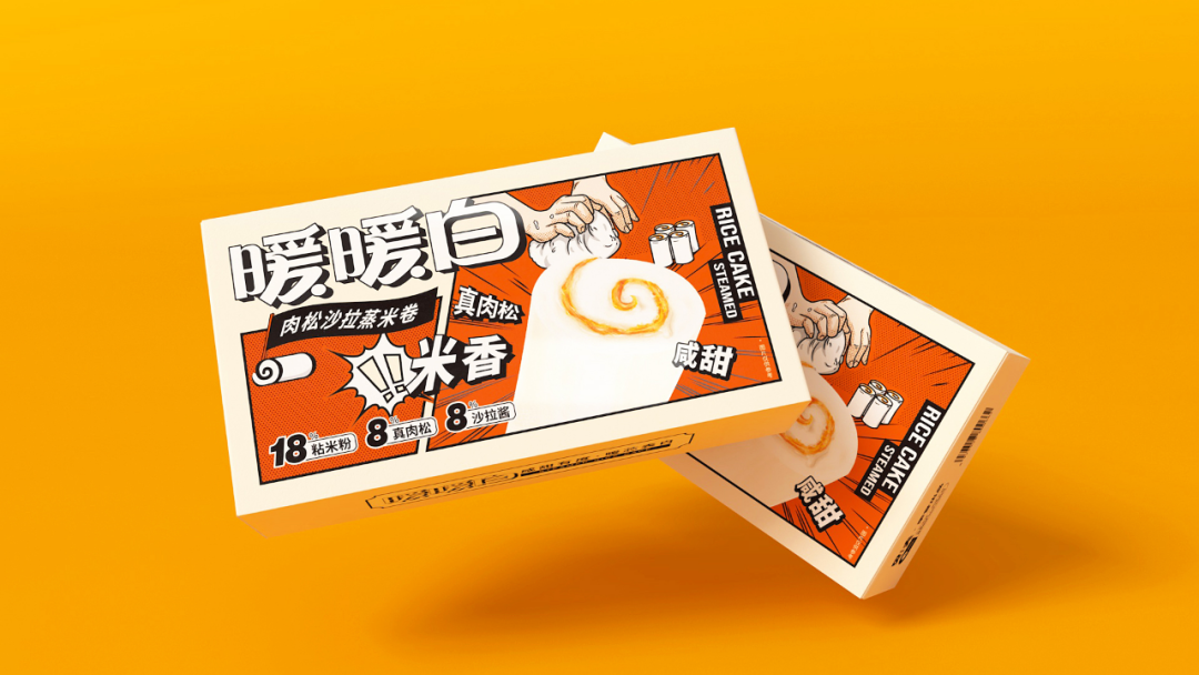
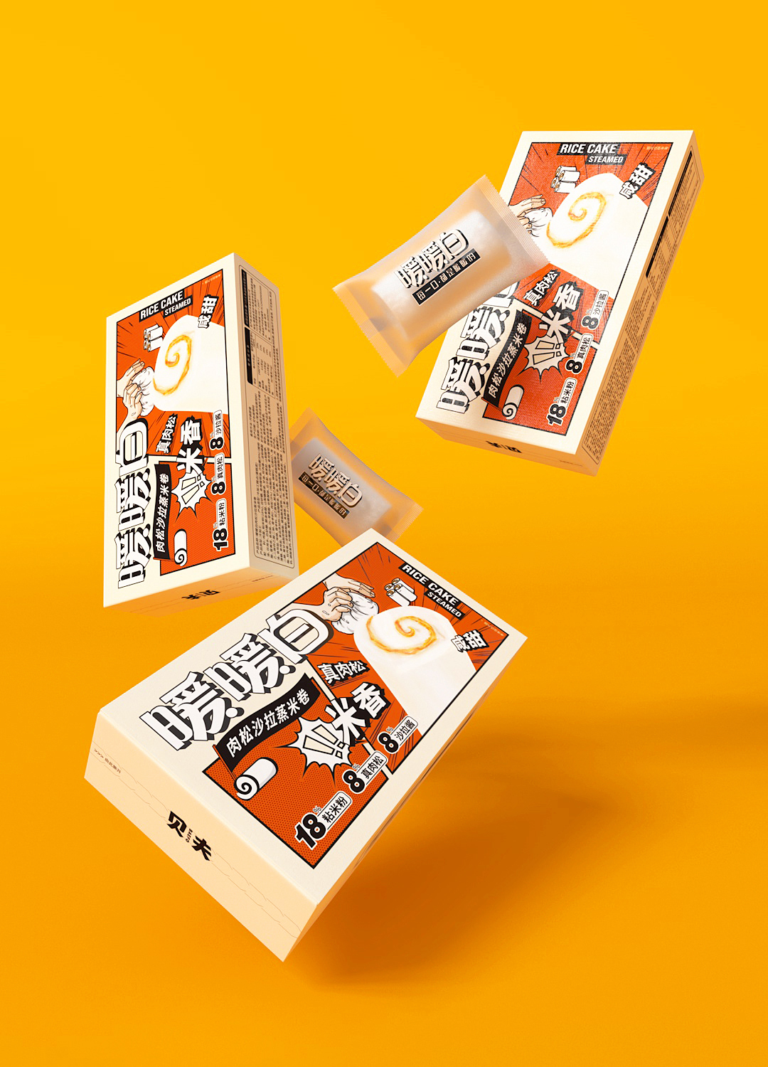
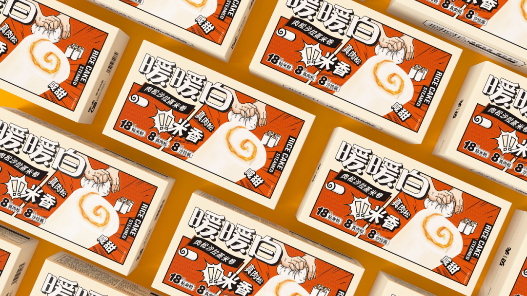
Warm white rice rolls with meat floss salad
Image Source: Baefo Foods
BAEFO warm white rice rolls is a casual food product. The outer box packaging is based on the comic style. The Logo with the illustration as the primary visual is distinctive and provides a strong visual impact. The innovative visuals and resonant creativity are the main focus of this design. The base color is a warm light beige, emphasizing the rice products and bursting with appetite. And the comic vividly depicts the high-quality ingredients and the handcrafting process, with the enlarged products attracting the eye and subtly conveying the real material of the product. The modern version of the comic sub-shot is a fun way to show the taste of the product, and the handmade images visually convey the visible temperature of the craftsmanship, warming every bite and enhancing interaction with consumers. The cartoon style elements on the packaging also bring the product's selling points to life while conforming to the current aesthetic trends of consumers, generating attention and enhancing goodwill towards the brand.
WONDERLAB Silk Road National Tide Limited Gift Box
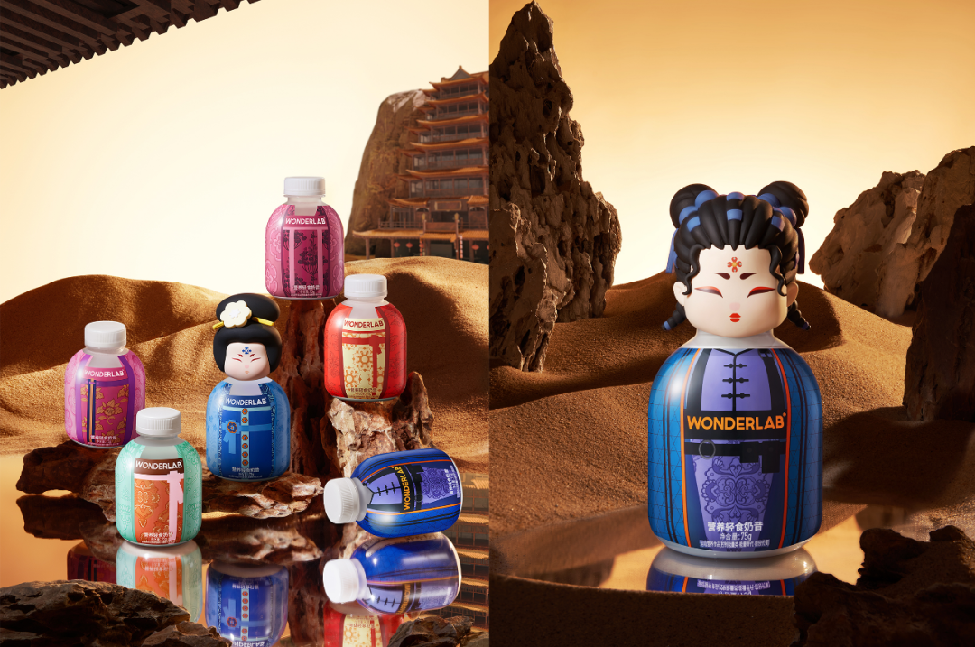
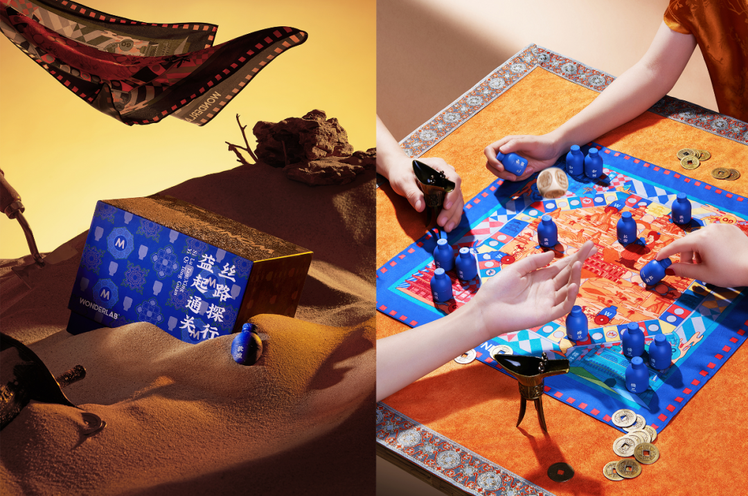
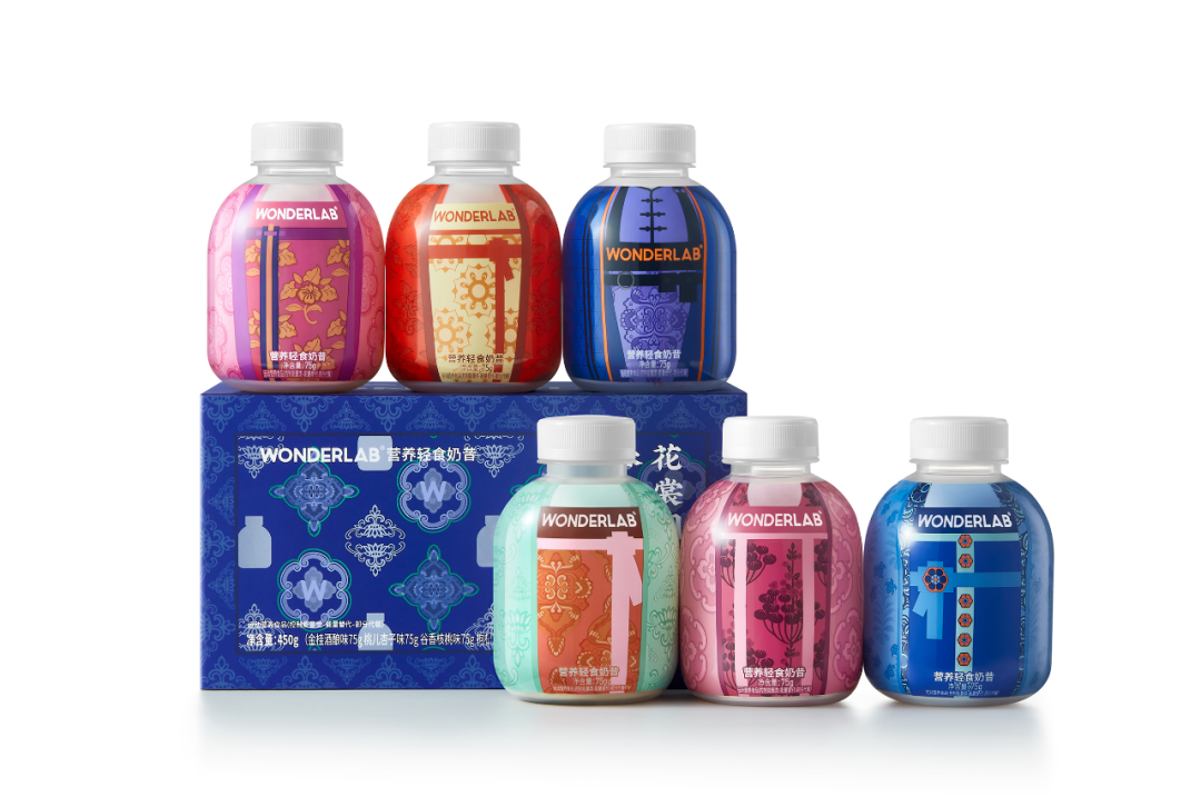
WONDERLAB Silk Road National Tide Limited Gift Box
Image Source: WonderLab
With the development of the Chinese economy, the national consciousness has gradually awakened, which has increased the resonance of young consumers with their own culture. Taping the huge vein of Chinese traditional culture has also become a new challenge for domestic brands. This time, Wonderlab deeply excavated the Tang Dynasty culture on the Silk Road and searched for a series of special and nutritious ingredients on the Silk Road.
The Silk Road National Tide Probiotics Gift Box is illustrated with the concept of the Silk Road. The three sides of the box are spliced together to form the route map of the Silk Road. Silk Road is designed as an adventurous flying chessboard silk scarf as a peripheral gift. Moreover, this packaging design is inspired by the Tang Dynasty style in the prosperous age. It integrates the style of ladies' clothing and bun into the design to form a set of "Women's Illustrations" in the Tang Dynasty. The random blind box of Tang style dolls also includes hidden models, showing the visual collision between modern fashion trends and traditional culture with the appearance of modern functional style + national style.
Matchall – Refreshment Tea Cake (Full of Good Fortune in the New Year 49 pcs)
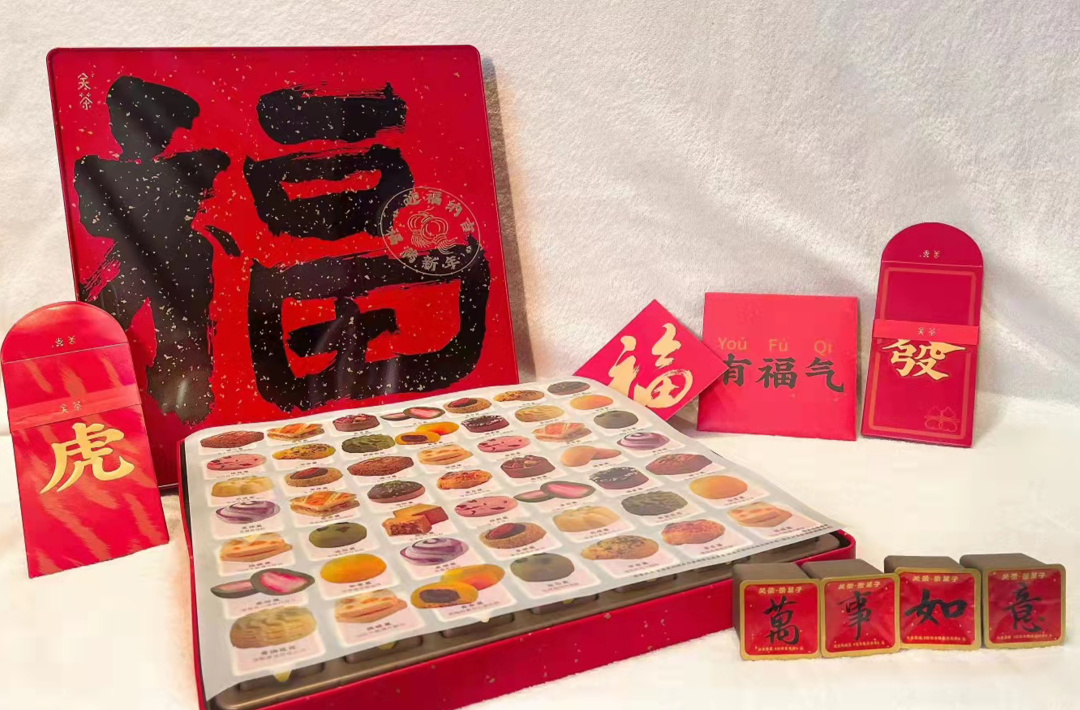
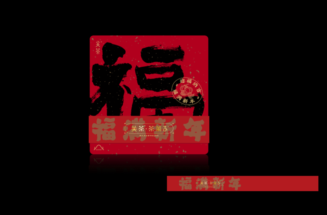
Matchall – Refreshment Tea Cake
Image source: Matchall
When the New Year is approaching, the most impressive sight of the country is the year in which the gods of the door are posted and the characters of good fortune are written. Matchall – Refreshment Tea Cake (Full of Good Fourtune in the New Year) captures the visual symbol of "Fu", which is common from the North to the South in China. On the red and gold surface of the box, a large character "福" is written in charcoal ink, full of charm and Chinese New Year flavour. When you open this steel box that does not have to struggle to pry, you are filled with a dessert blind box with a red background and black calligraphy Chinese characters in Chinese New Year. Every moment you look, you can always find an auspicious blessing word, take it out and put it together; it is the best gift to share.
BUCKOO
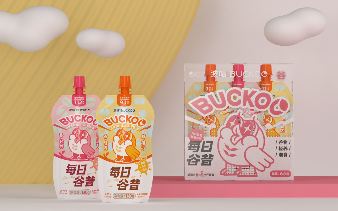
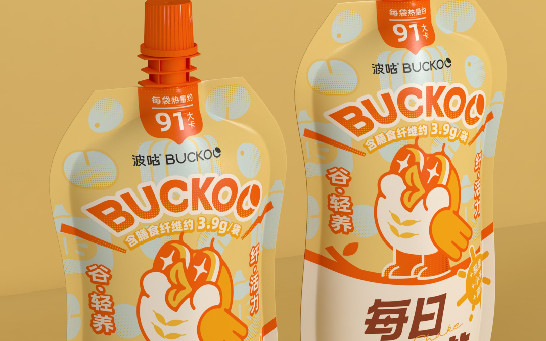
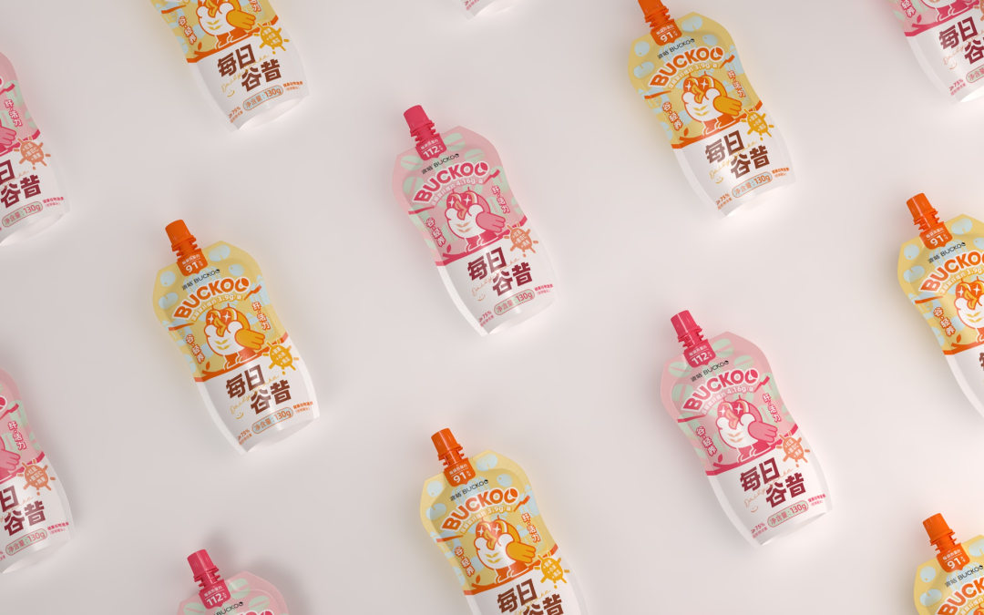
BUCKOO
Image Source: Design Bakery
Buckoo is a young brand. Use delicious cereals to awaken your vitality for the day. A pleasing and unique "Buckoo" image has been created for this brand. Let it wake you up every wonderful morning with a crisp call. Through the design of IP and visual design, the brand name "Buckoo" is brought out with the cuckoo's voice, so as to "characterized" and "humanized" the brand, making the brand and products more easily recognised by consumers.
A unique brand IP design has been incorporated into the packaging design with a prominent and memorable style, greatly enhancing the recognition of the emerging brand among the consumer base.
CHALI Red Chamber Sigh Tea Gift Box
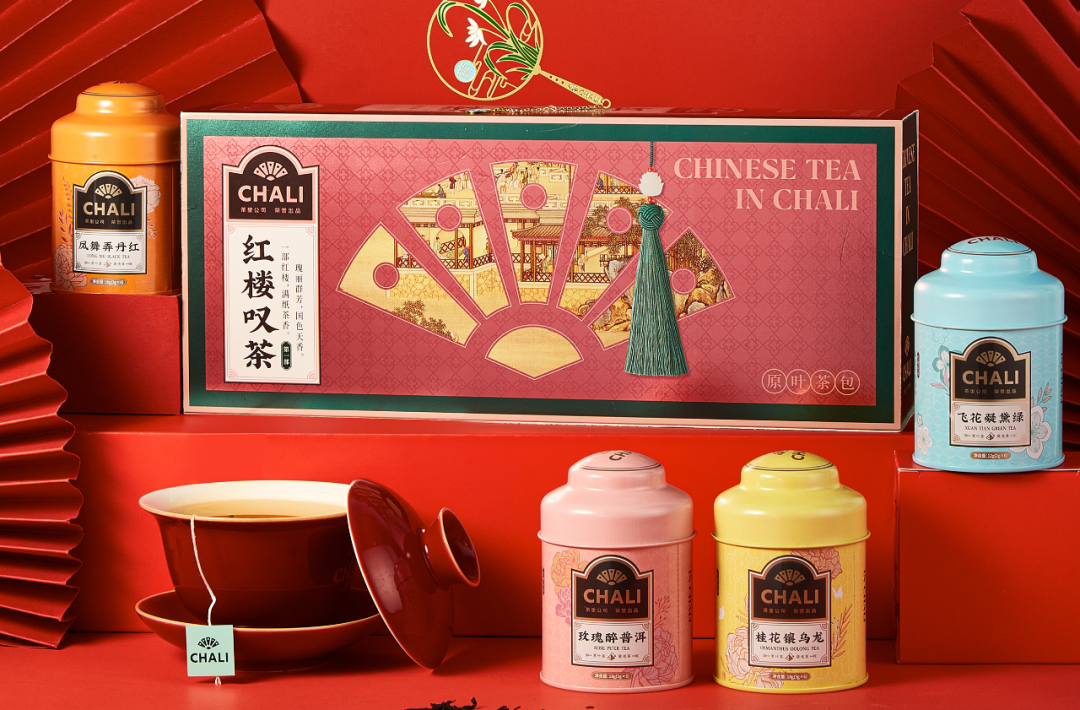
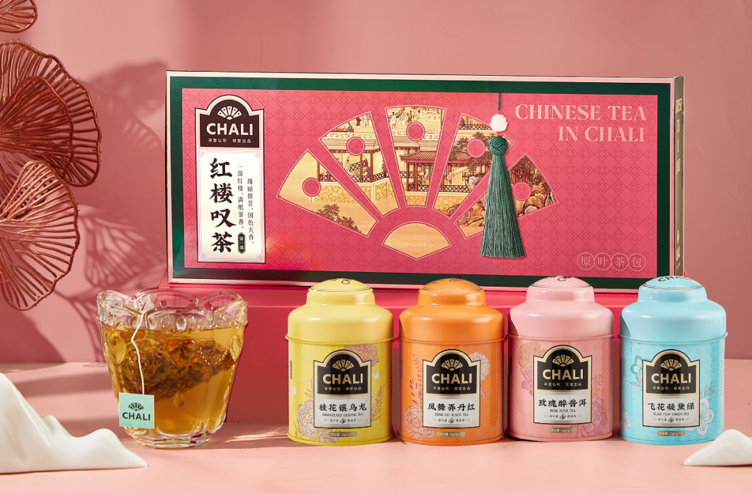
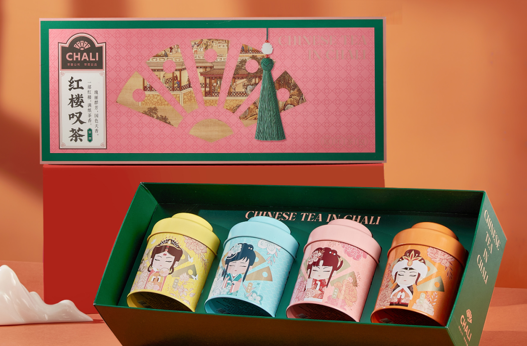
CHALI Red Chamber Sigh Tea Gift Box
Image source: CHALI
In the "Dream of the Red Chamber", there are nearly 300 descriptions of tea, and the word "tea" appears 459 times. It can be described as "in the fragrance of tea, into a dream of the Red Chamber. In the taste of tea, all the emotions could be expressed. The inspiration for the CHALI Tea in the Red Chamber Tea Gift Box comes from the classical masterpiece "Dream of the Red Chamber", a highly romantic and refined tea study.
The gift box is designed with a classical hollow window aesthetic and a modern foil stamping process, making it exquisite and generous. The four Nanking girls are presented in the cartoon through the fan-shaped hollow window, combining modern trends with classical traditions to pay tribute to the classics with a "Red Chamber Tea", the best interpretation of the national trend. The four types of tea in the gift box are given poetic names, fully interpreting the collision of culture and fashion.
Duoli Sesame Oil Series
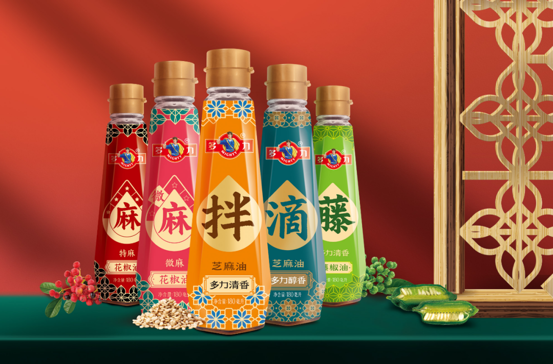
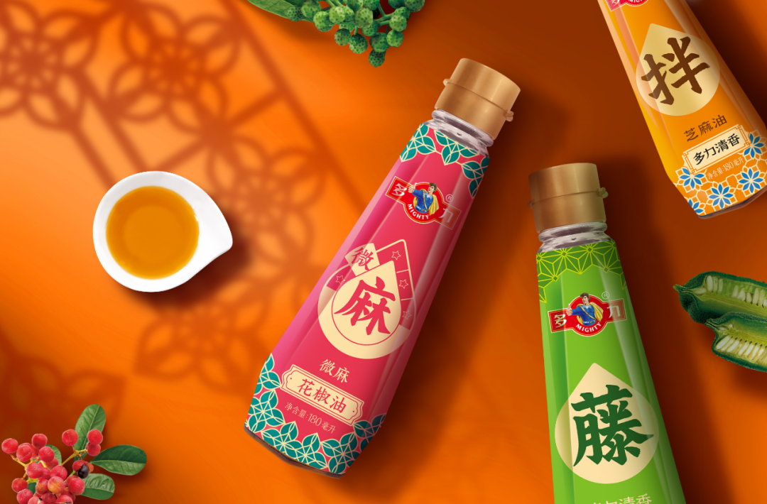
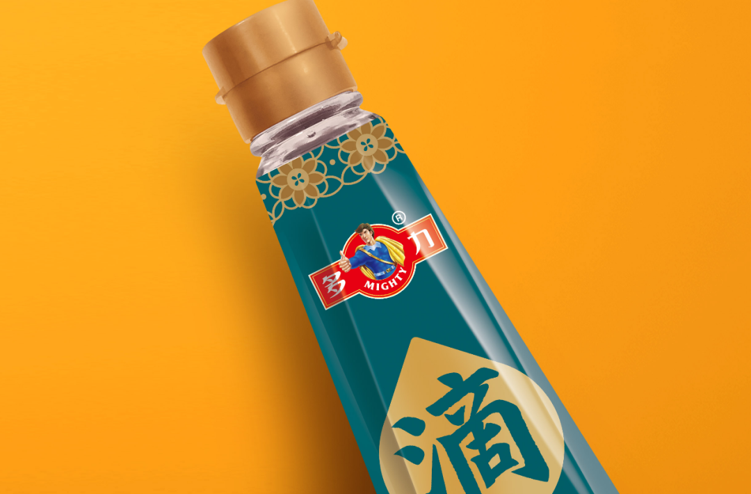
Mighty Sesame Oil Series
Image Source: STANDARD FOODS
Mighty has entered the condiment market and designed its products according to the consumer's usage scenarios. Its glass bottle shape is different from the existing bottles in the market. The label is fully shrink-wrapped to highlight the quality of the product. The label design is divided into 'drip' and 'mix' according to the consumption scenario of sesame oil. Pepper oil is graded according to the user's preference for numbness, differentiating it from similar products in the market. The product is packaged in a diamond bottle with a full shrink film label. The shrink label is easier to peel off than the traditional paper-plastic composite label and facilitates the recycling of glass bottles, highlighting the company's sense of environmental responsibility. The shrink sleeve label is designed with an integrated shrink sleeve, with an easy-tear line at the mouth of the bottle to facilitate the opening of the bottle. Plus, the shrink sleeve label has a transparent scale line to indicate the volume of use at any time, which is thoughtful and heart-warming.
Little Fresh Jar Chicken Essence
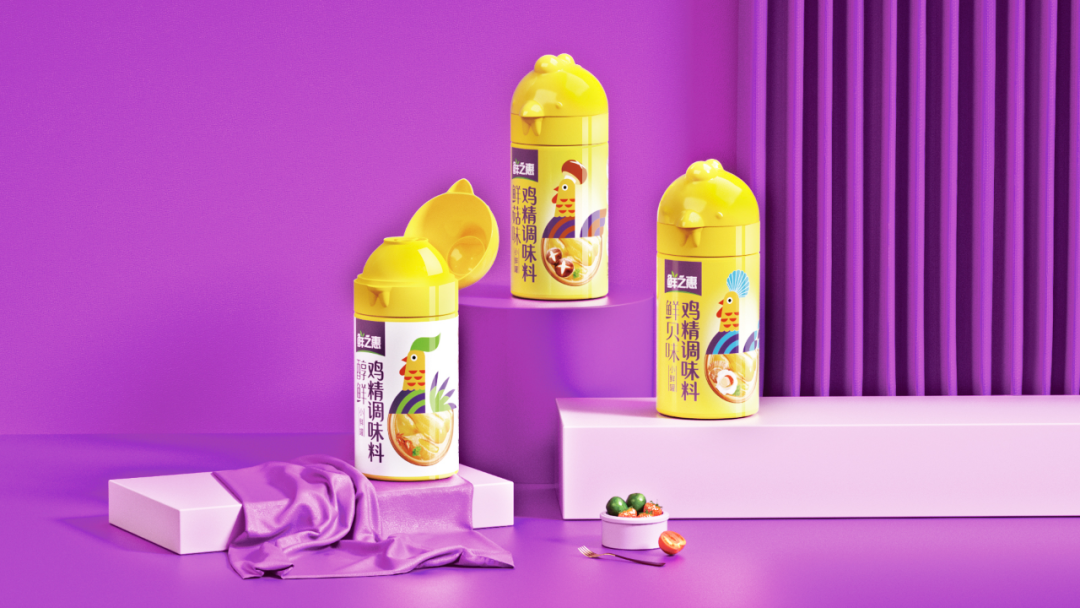
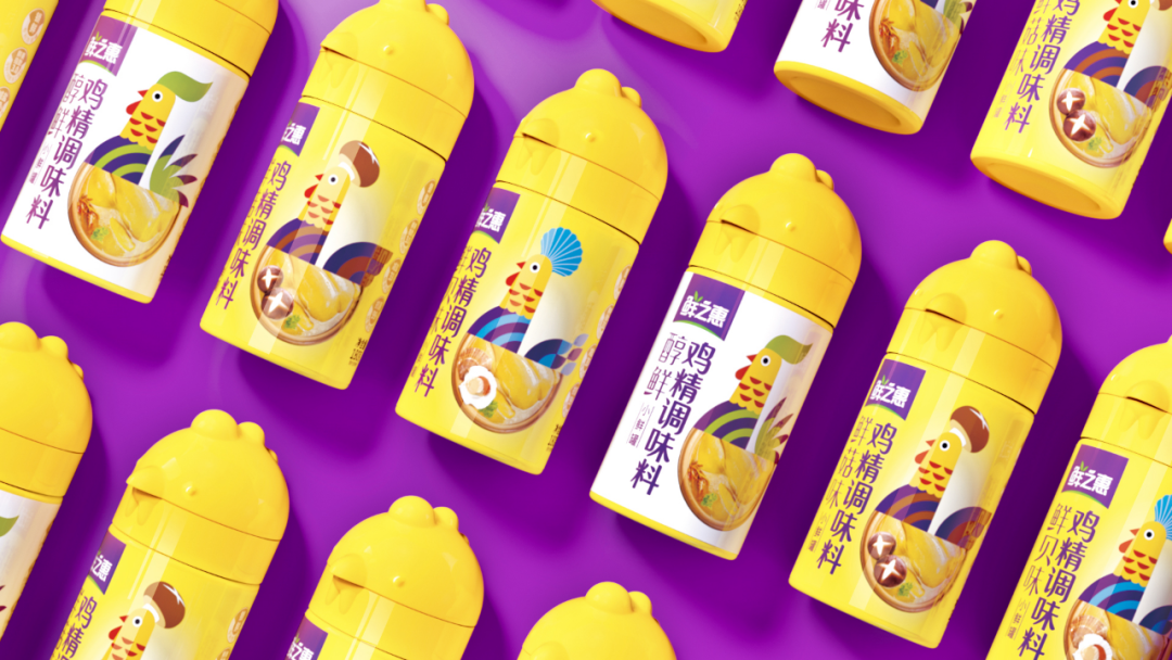
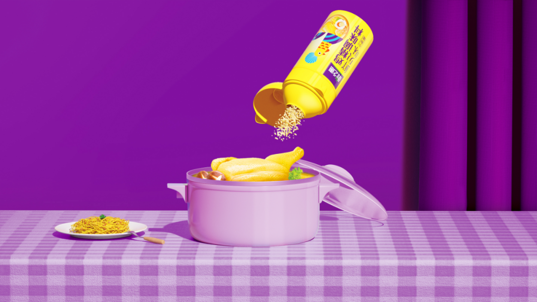
Little Fresh Jar Chicken Essence
Image source: Yuanjian Brand Design
The unique chicken-shaped jar is highly consistent with the product attributes of chicken essence. And the jar is made of antibacterial material and moisture-proof design, effectively avoiding the pain point of easy to moisture and caking for traditional chicken essence. In terms of the cap, it is designed with the function of metering. Moreover, the scientific design of the jar size is convenient for one-handed operation, so you can do things more comfortably.
The cute and handy chicken jar fully understands the needs of consumers and brings them a good visual experience as well as a good visual and user experience.
"SHE" in the dictionary of Gen Z
Teastan
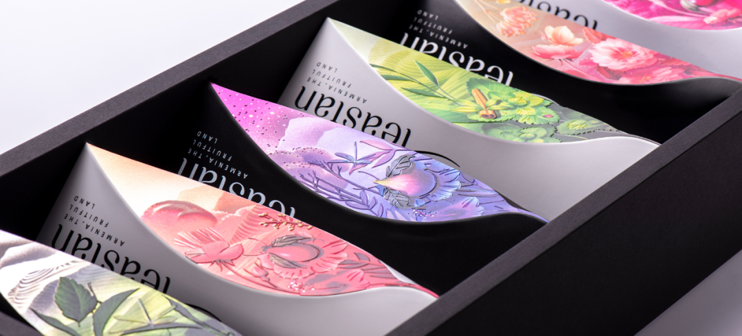
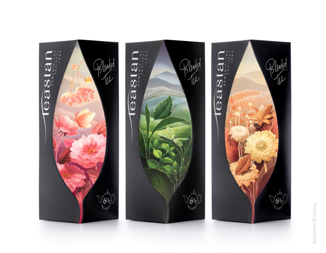
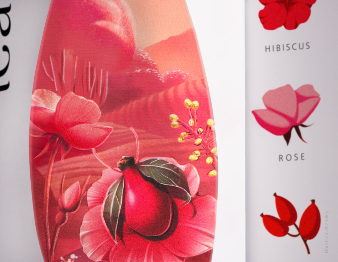
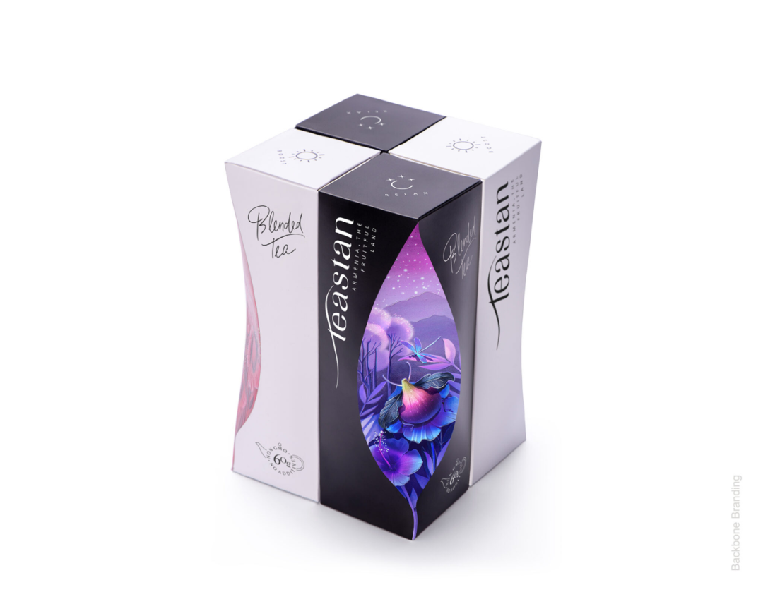
Teastan
Image Source: Backbone Branding
By cutting a piece from the tea box, it is as if opening a window to peer inside the box and see the world of tea inside the box. In this magical and fantastic world of tea, insects, flowers and leaves grow next to each other in nature, breathing fresh air together. In the distance, there are long stretches of mountains from which the sun or the moon rises. The two types of tea are housed in two-colored packaging, the white packaging representing the bright day, symbolizing the energizing tea that provides energy, and the black packaging representing the quiet night, symbolizing the relaxing tea that soothes the nerves.
21BEAUTY
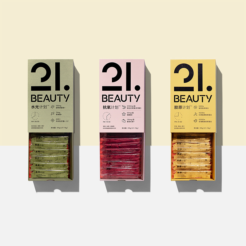
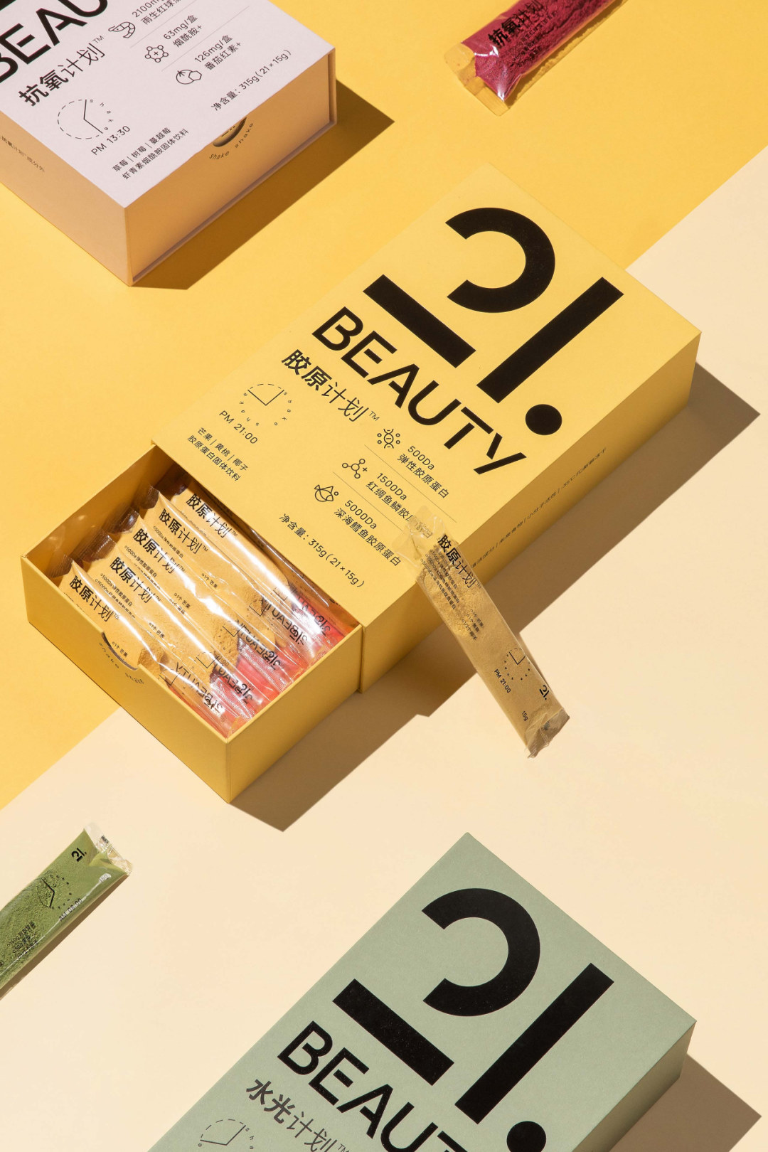
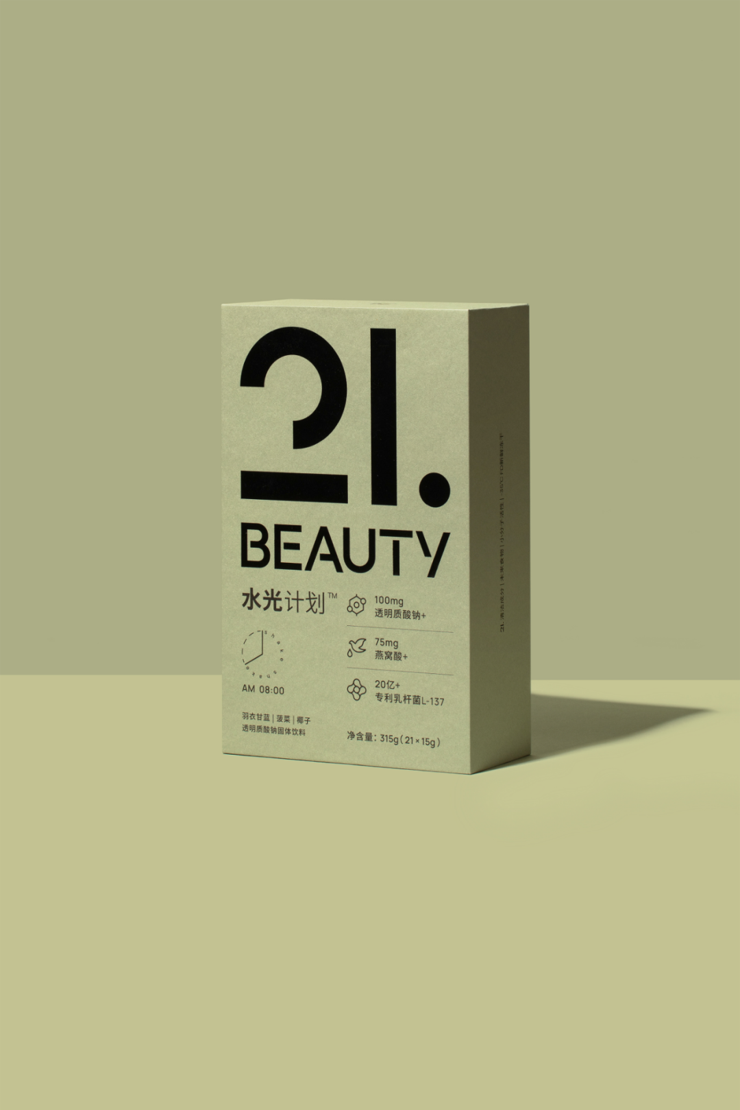
21BEAUTY
Image Source: 21BEAUTY
Based on the concept of "sustainable environmental protection", the outer packaging is all made of FSC certified imported special eco-friendly paper, with no color printing. In order to maintain the brand attributes of the clean label, the use of printed aluminum foil inside the pouch has been abandoned, constructing the inner bag packaging design concept - "what you get". A new three-layer composite material transparent inner bag was developed and designed independently, solving the problem that a single transparent material cannot guarantee a high permeability seal and high temperature resistance. The product's appearance is designed with a mild and bright colour that meets most women's aesthetics, and the functional ingredients are clearly displayed on the packaging to help consumers quickly capture the product information. The product is highly consistent in colour on the outer packaging, inner bag material and after brewing.
Enzyme jelly
Enzyme jelly
Image source: Zhixiaomei
In view of the product properties of jelly, PET material is used for packaging. This material is light, solid and durable, diversified and easy to transport, and it can also avoid waste and can be recycled entirely. . Minimalist design, simple fonts highlight selling points, lines outline product taste, and highly saturated colors attract eyeballs.
Water Capsule
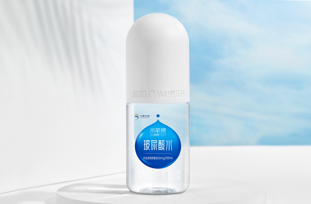
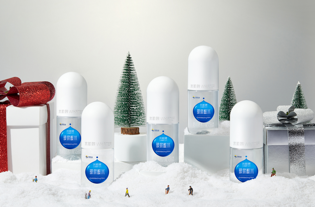
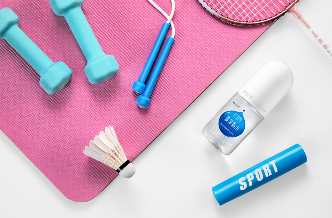
Water Capsule
Image source: Beijing Bloomage Biotech
Visually, the Water Capsule is designed as an oval capsule with crystal and clear bottle and pure white cap. The blue water drop label design on the bottle not only reflects the connotation of the brand but also delivers aesthetics in technology. Its exquisite shape conveys the product concept of "safety" and "efficacy" and highlights WHATER's brand concept of "drink water in a beautiful bottle and be beautiful after drinking". In terms of user experience, the packaging bottle of Water Capsule is small and portable, with an ergonomic design for grasping, bringing people a good user experience. The name "Water Capsule" makes an impression of skin hydration and elasticity, vividly interpreting the value of the product and arousing consumers' demand for drinking water.
"Simple" in the dictionary of Gen Z
@once espresso
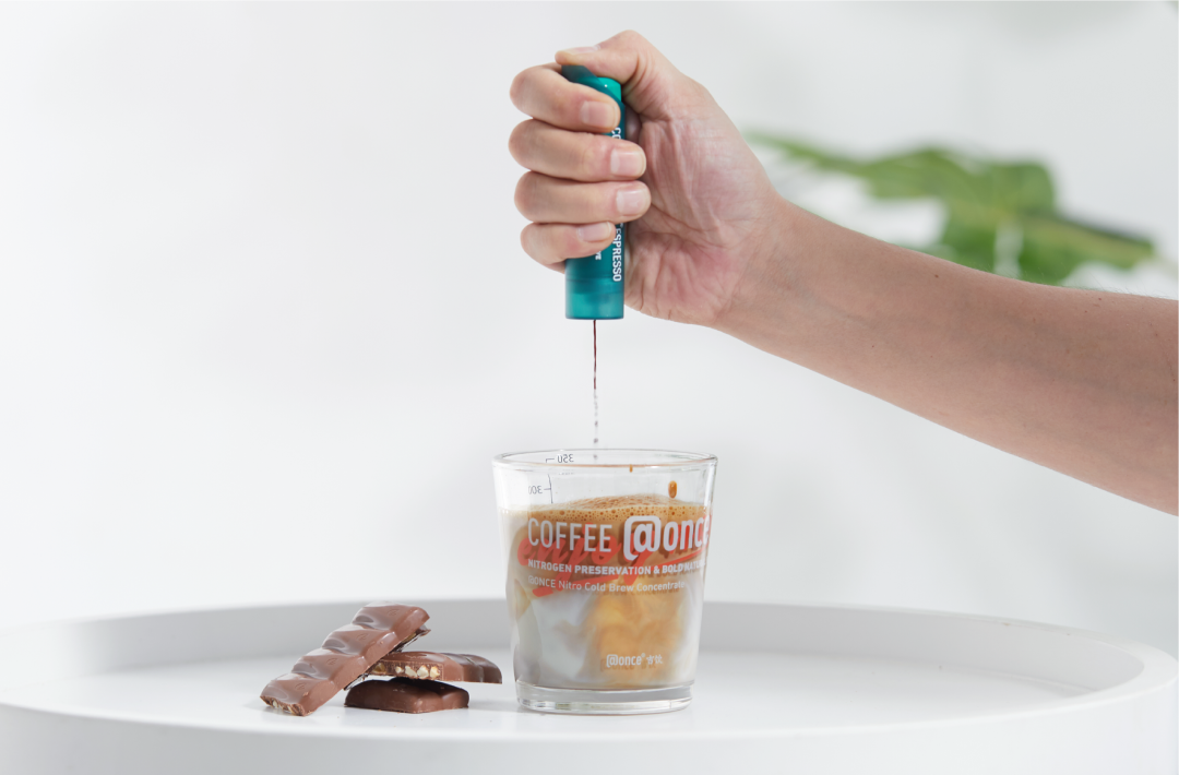
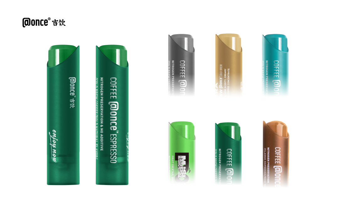
@once espresso
Image source: @once
@once uses the entire bottle as a button to press and as a container for storing coffee liquid. It uses the reaction force of the shell to the valve of the bottle to open the valve and spray the coffee liquid out. At the same time, the compressed nitrogen used to preserve freshness can also be used as a propellant to spray the coffee liquid directly into the water. Coffee liquid also dissolves quickly in ice water.
The innovative packaging structure allows consumers to enjoy fresh and delicious coffee more conveniently. As for the appearance of the packaging, a premium feel colour scheme for both men and women is used, with white lettering, for an overall simple and stylish look.
Consider Pastures
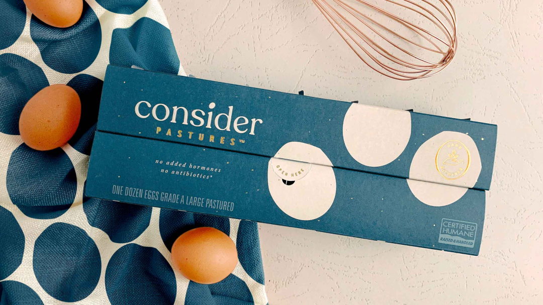
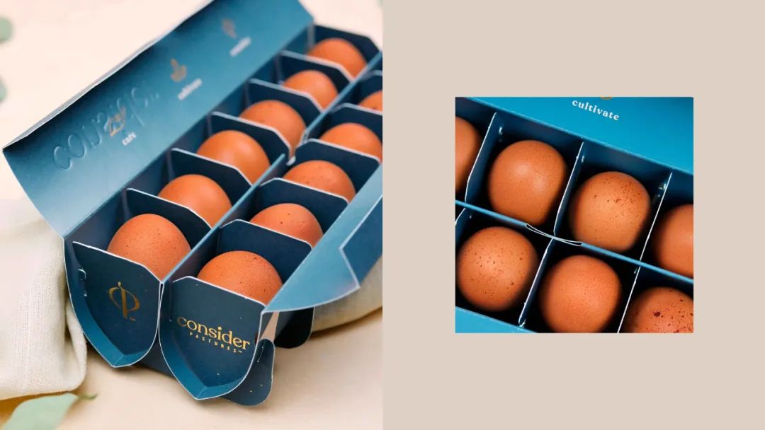
Consider Pastures
Image Source: Pearlfisher
The new monogram and embossed messaging accented in gold speak to the premium and hand-crafted approach in every step of the egg production and in every detail of the packaging design. The repeating geometric egg pattern on-pack boldly celebrates the naturally large and imperfect shape of the egg, drawing the eye to its stand-out impact when shown on shelves or used in brand communications and merchandise. This design created a brand design and world to match the brand mission to always provide the best that nature offers. Giving a bold and striking position on the shelf, Consider Pastures takes people into every element of the story, from the pastures to pride of place in their own kitchen at home.
White Village Tea
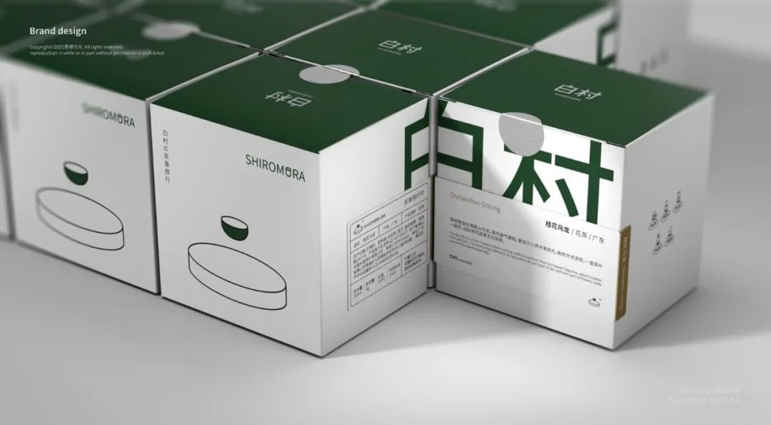
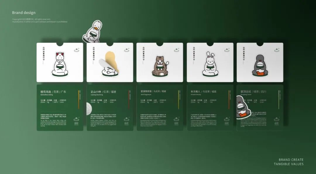
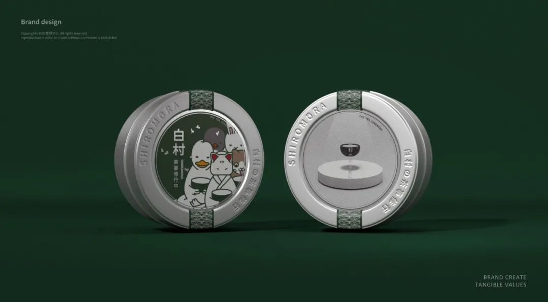
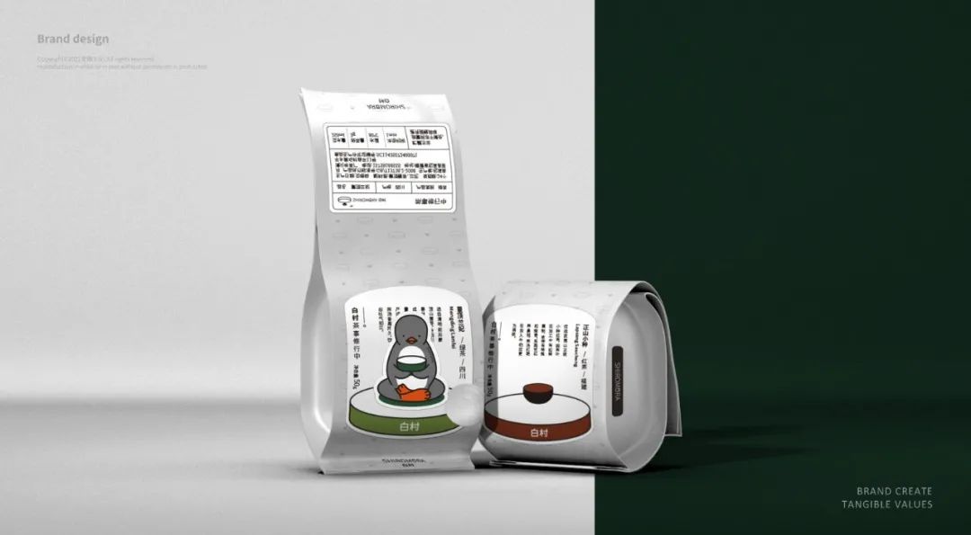
White Village Tea
Image source: Yiqing Culture
With pure white as the primary color and green symbolizing the tea is the auxiliary tone. The outer packaging is simple and visually pleasing. The tea bowl in the base logo means Cha (tea), and the futon means Dao (way). The symmetrical composition combined with simple graphic lines to reflect the tea ceremony and convey the artistic conception. The design of the futon extends the different roles to reflect the concept of tea practice. Each character corresponds to a tea on the packaging, and the accompanying character stickers interact with the inner and outer packaging to reinforce the brand concept. This also allows the visual design to be comfortable and straightforward while still creating the brand's unique visual style.
LAND OF PROMISE Gem Bottle Flavored Yogurt
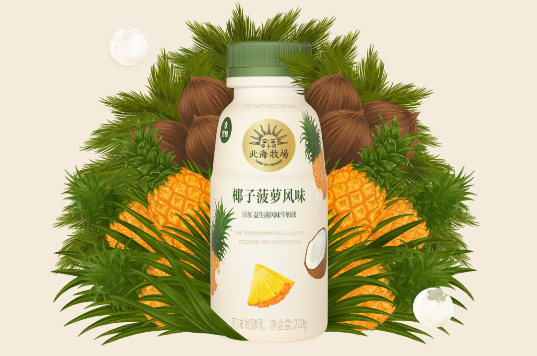
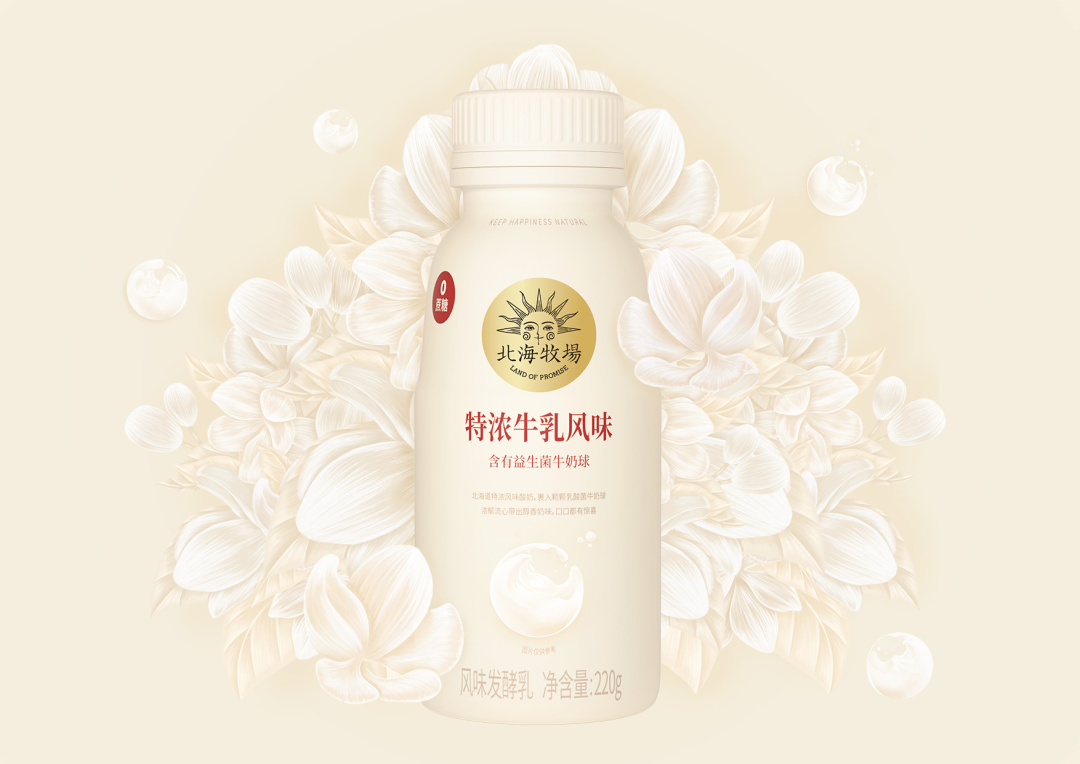
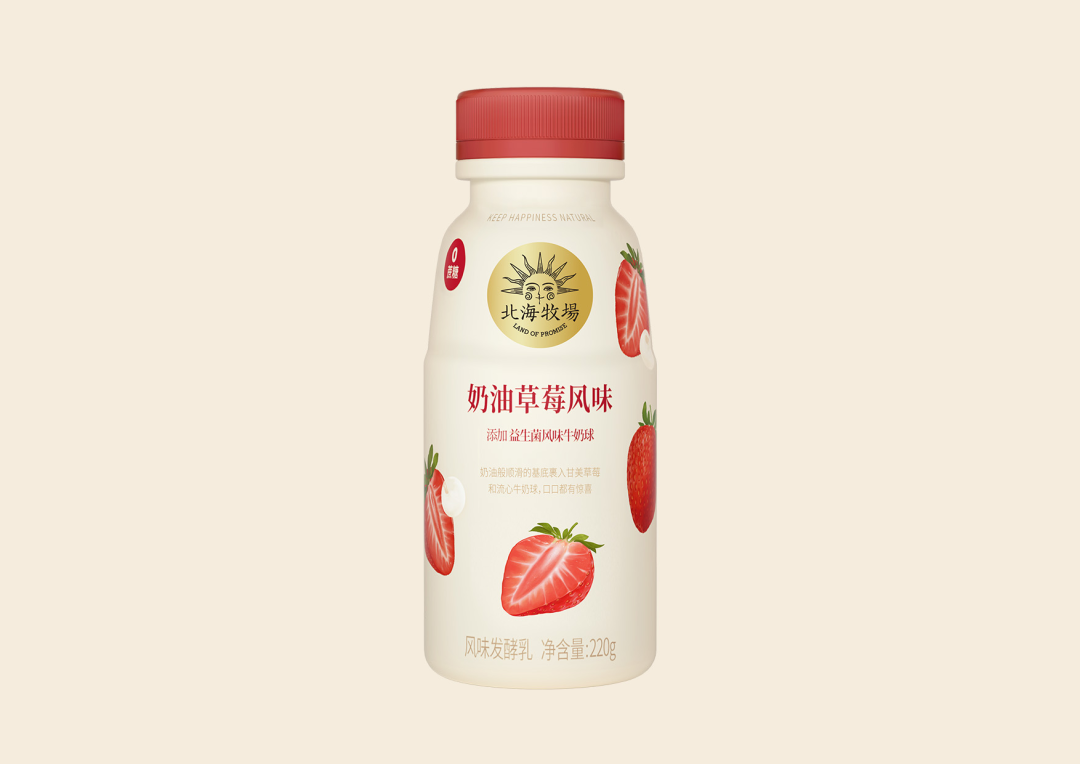
LAND OF PROMISE Gem Bottle Flavored Yogurt
Image Source: LAND OF PROMISE
LAND OF PROMISE used warm beige as the base, which means that the fruit will be sweeter and more delicious along with the afternoon sun while expressing their insistence on using high-quality ingredients from nature.
Cute illustrations reflect the preferred flavour of the fruit. Under the cost limits of the product process, it still preserves fine design elements, advanced design style and appetite-filled senses. We only use simple processes such as printing gold and coating shrink film to make advanced visuals. With milk ball combination, express the sharing of happiness and fun product concept. The visual style of natural paintings was used to inject art into the products. It not only expresses the overall concept and characteristics of the product but also facilitates customers to identify various formulas, thereby enhancing their desire to buy. In addition to the fresh and attractive fruits on the packaging, the brand's unique probiotic milk ball is added to distinguish it from other brands, reflecting the brand's authentic materials and sincerity, allowing consumers to enjoy the authentic happiness of food. It is a kind of conceptual innovation.
Shangri-La - Altitude Series
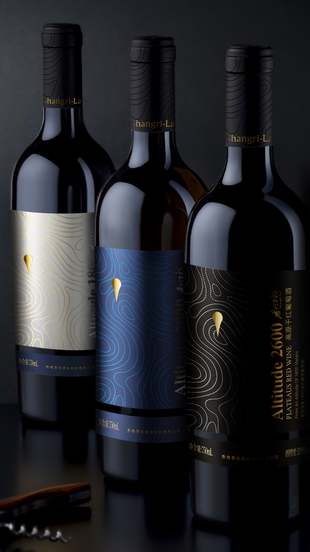
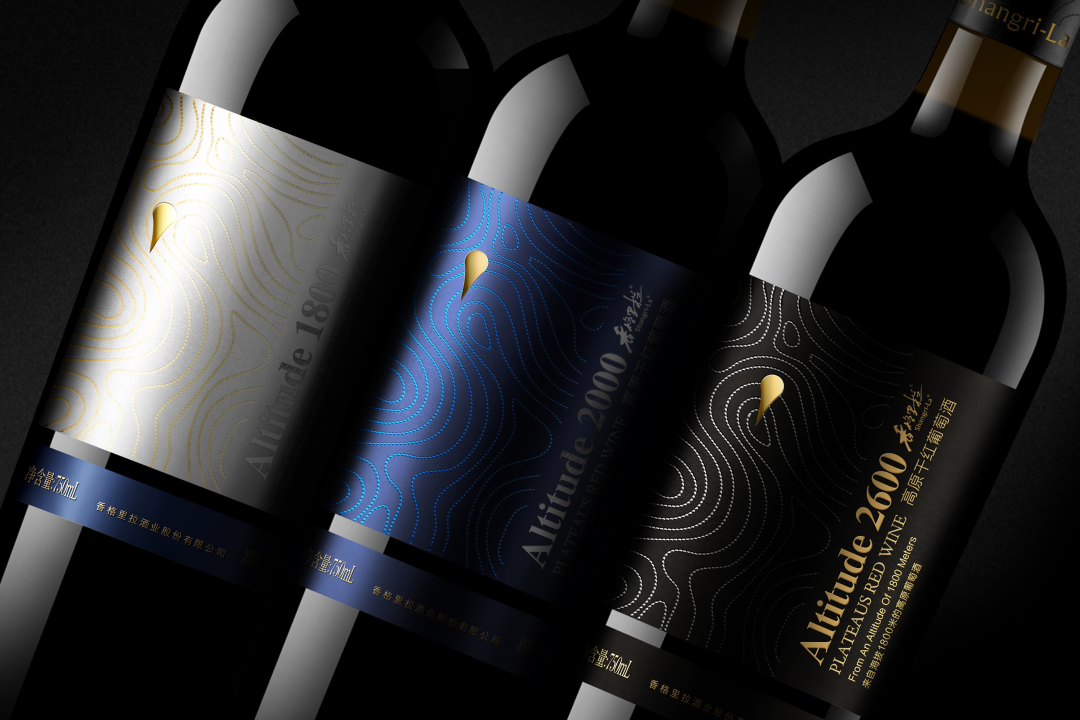
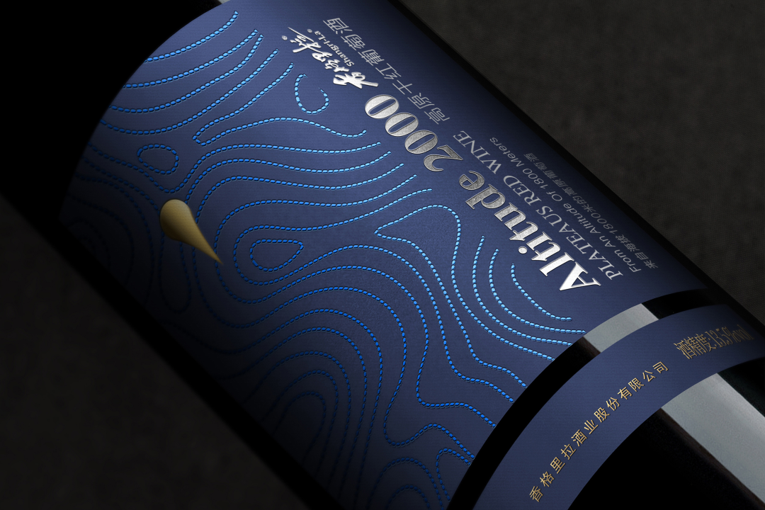
Shangri-La - Altitude Series
Image Source: Pufine Design
The grape-producing area of Shangri-La Plateau is located on the valley slopes at an altitude of 1800-2800 m. The geographical qualities of low latitude and high altitude are the natural conditions for making quality wines. The height of altitude is rigid, the mellowness of red wine is soft, the rigidity and softness merge into a soft but tough strength, forming the exclusive visual symbol of the altitude series of contour lines. Each curved line does not only represent geographical characteristics. The dashed dots represent the fullness of the grapes, the holy springs and the warmth of the sun. The lines encircling the mountains and valleys are like the sweetness and smoothness of Shangri-La wine across the lips; the combination of dots and lines is beautiful and smooth.
The design of the packaging highlights the geographical advantages of the Chinese wine brand Shangri-La, thus reflecting the excellent quality of the product, which can also play a role in promoting Tibetan culture.
"Pure" in the dictionary of Gen Z
The Frontier Ranch pure milk of Xiajin
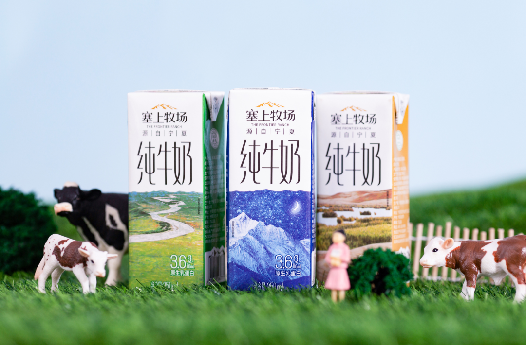
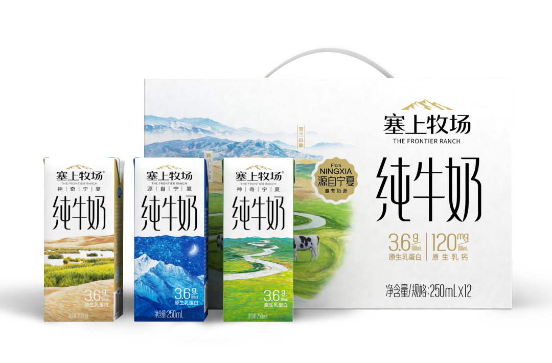
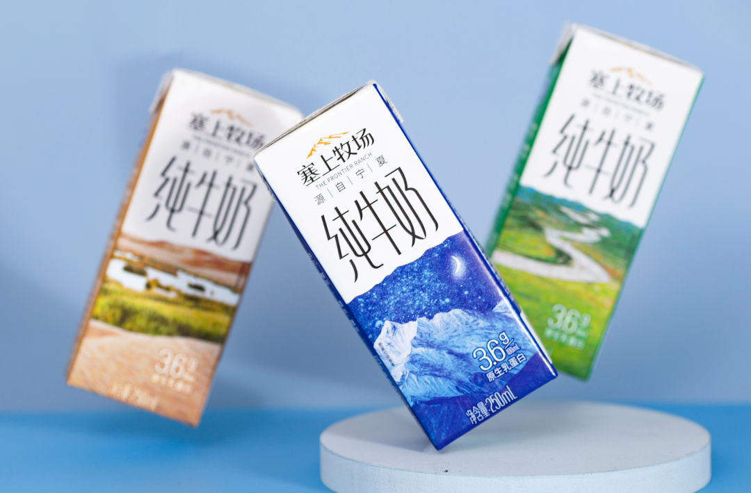
the Frontier Ranch pure milk of Xiajin
Image source: Xiajin
The Frontier Ranch pure milk of Xiajin.
Xiajin is a brand that has its root in the North West of China. In order to reflect the characteristics of the product, three well-known scenic spots with unique northwest characteristics are selected for the product's inner package. The northwest desert reflects the pollution free of the pasture, the twists and turns of the Yellow River illustrates the superior water of the product, and the Helan starry sky shows the pureness of the product. The outer box integrates these three landscapes organically, reflecting the richness and beauty of the Frontier Ranch. At the same time, the brand's slogan, "Timelessness and location make for exceptional milk", is well presented, conveying the freshness and purity of the product while at the same time being aesthetically pleasing and artistic.
Youxing protein bar
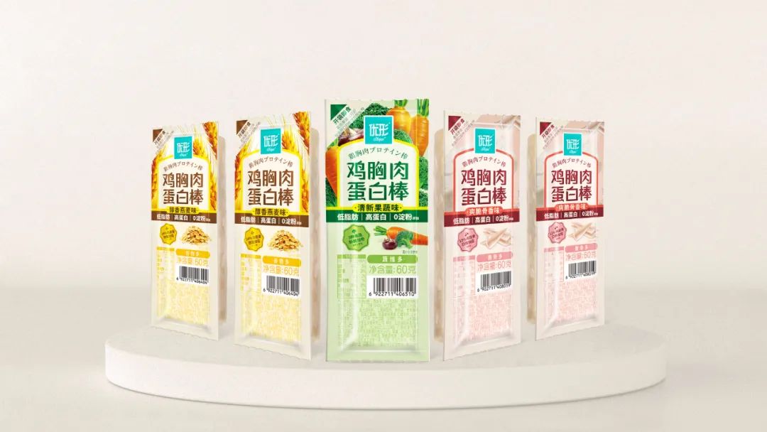
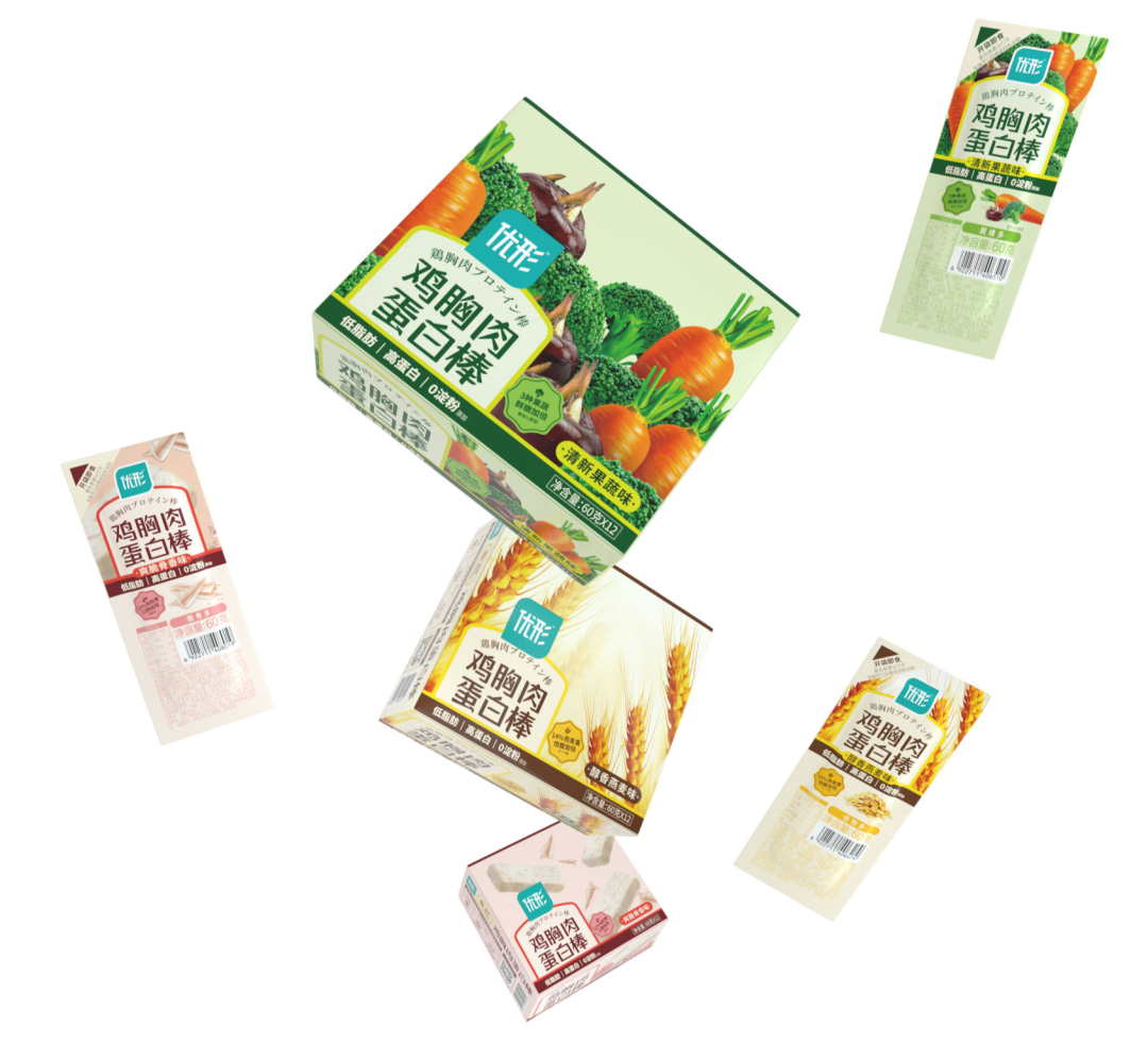
Youxing protein bar
Image Source: Warm Light Design
As a healthy ready-to-eat brand, Youxing wants to avoid the current visual display of meal replacement brands based on functional labels. Therefore, the packaging of the protein bar is designed with real raw materials as the design pattern and the sense of appetite as the core of differentiation to increase the sense of eating, bringing consumers a delicious and healthy visual experience and catering to consumer demands.
Yuanyi Mulberry Juice
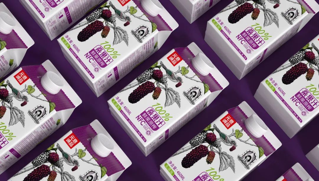
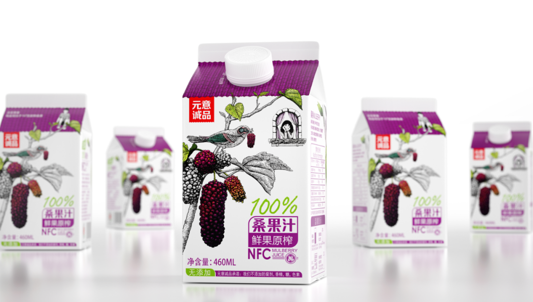
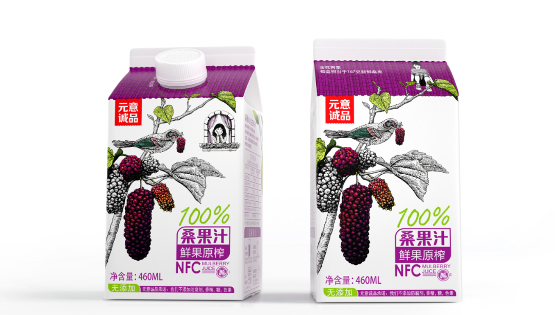
Yuanyi Mulberry Juice
Image source: Shenzhen BOB Design
This is mulberry juice. A roof box packaging structure was used to design a mulberry house. There is a mulberry tree in front of the cottage, allowing consumers to produce a good childhood memory. Through the creation of this scene, a direct message of 100% mulberry juice is conveyed, and a love story about mulberry fruit is created. The bird holding the mulberry fruit connects the 'girl at the window' on the front of the packaging with the 'boy on the roof' on the back. There are birds, mulberries, home, and love - the packaging creates a mulberry house for 100% fresh fruit raw juice borrowing from the shy sweetness of love.
Mesolivia
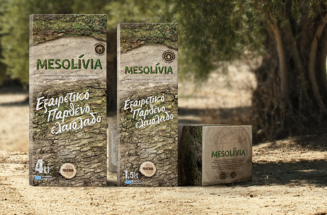
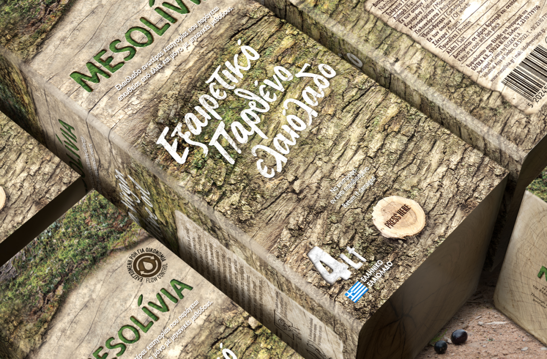
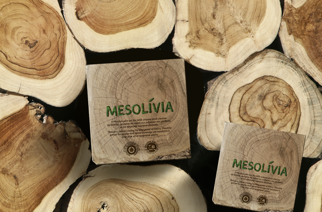
Mesolivia
Image source: AS Strategy Branding & Communication
Mesolivia is a new olive oil brand designed to design olive oil packaging that stands out on market shelves. The Mediterranean olive tree is the symbol of hometown. Such an olive tree bears witness to the growth of locals. All the memories of people growing up in this land are engraved on the olive tree. Therefore, this olive oil package is inspired by the bark of the olive tree, conveying everything to life and nature to the local people.
At the same time, Mesolivia is an active brand engaged in environmental protection. Therefore, an oil package in the form of a fully recyclable bag is designed, and the package also has the additional function of a drip-free system.
New Hope Qiandao Lake Ranch Milk 950ml
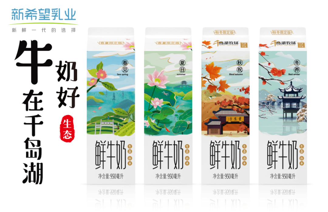
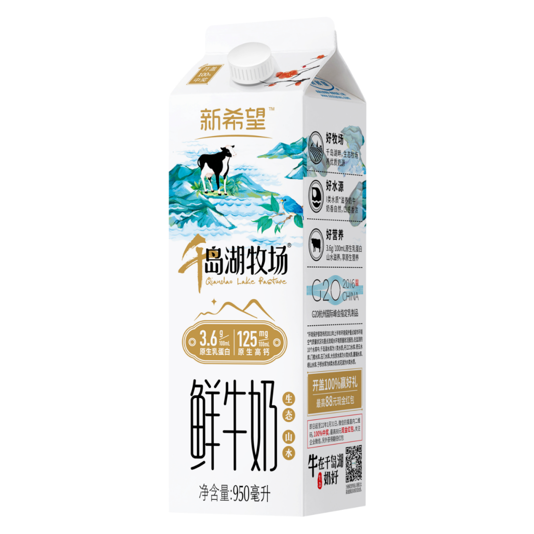
New Hope Qiandao Lake Ranch Milk 950ml
Image Source: A New Hope
By putting natural scenery on the packaging, it can attract those who are impressed by the beauty of the scenery and can also have an emotional resonance with those who have been in that scenery. The packaging of New Hope Qiandao Lake Farm fresh milk is based on the beauty of the landscape. And the packaging of New Hope Qiandao Lake Ranch Milk features a landscape as the core, together with landmarks characteristic in Hangzhou. It slowly narrates the beauty of Qiandao Lake in all seasons, showing the beautiful environment of Qiandao Lake Ranch with a pleasant climate and no pollution or noise. It also further conveys that Qiandao Lake pastures produce high-quality milk. The packaging of Qiandao Lake and Hangzhou's local characteristics attracts and impresses consumers who have some knowledge of and desire for Qiandao Lake.
FOREST FUNGUS
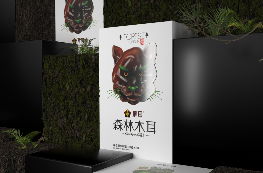
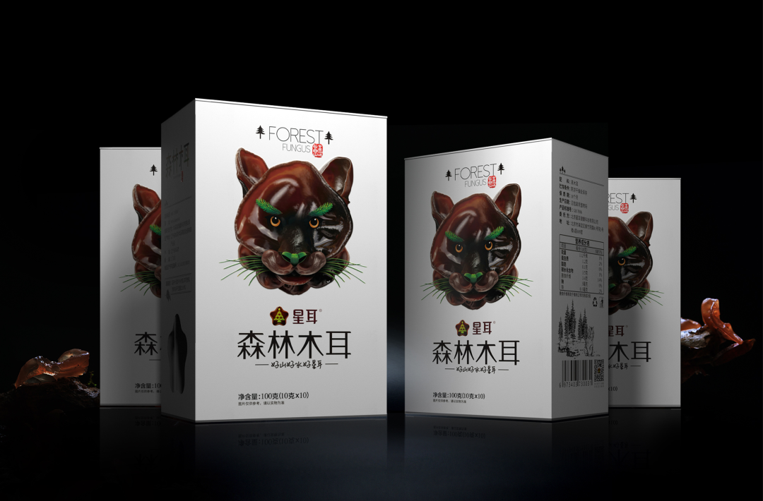
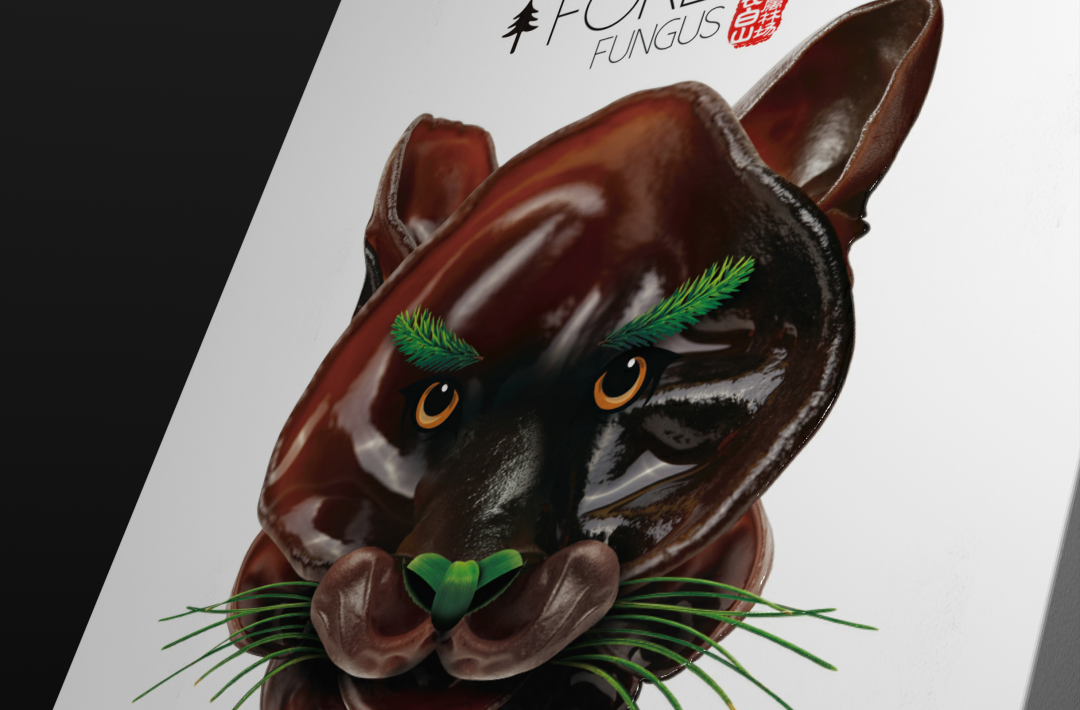
forest fungus
Image source: Beijing Perfect Point Design
It grows in the virgin forest of Changbai Mountain in northeast China and matures in the natural environment of red pine forest. Our design hopes to highlight the scarcity and nativeness of forest fungus and nearly the same as the endangered Siberian tiger in Changbai Mountain. Based on the natural growth shape of fungus, we used fungus and pine branches to fit the tiger's facial features so as to show the concept of ecological and environmental protection in our design.
Liangshan Snow: "very cool very Liangshan" packaging design
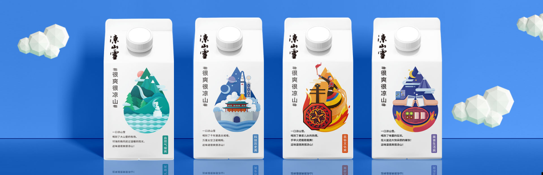
Liangshan Snow
Image source: Xichang Newhope Sanmu Dairy
Combined with the refreshing taste of the product and the idea of highlighting the "cool", we designed 4 scenes on the back of the product on the basis of retaining the original Liangshan Snow logo font and layout: Natural climate, history of science and technology, folk culture, food life, and Liangshan representative Qionghai and Lushan scenic area, a satellite launch, torch festival and brazen barbecue as the screen, plus the corresponding copy, the purpose is to make local people feel the pride of Liangshan through packaging, inspire outsiders to Liangshan yearning.
Conclusion
As a potential consumer group and the future growth engine of the industry, Gen Z plays an extremely important role in the food and beverage industry as a trendsetter. The answer may not be limited to the packaging examples shown in this article but requires further understanding of Gen Z's characteristics and consumer psychology, combined with the brand's own positioning and some thinking and bold experimentation in all aspects of design. We look forward to seeing more of Gen Z in Marking Awards 2022.
About Marking Awards
Initiated by FBIF (Food & Beverage Innovation Forum), Marking Awards (MA) is a food and beverage packaging design contest organized in Shanghai since 2016 while targeting the global. MA was born to discover and praise brilliant F&B package designs and encourage communication between local and international design power in a forum platform that attracts worldwide attention. In doing so, the awards committee aims to speed up F&B brands' packaging innovation, package functional optimization and improve their aesthetics standards. Thus finally, all the stakeholders can build a creative packaging ecosystem together.
So far, MA has been held for five sessions, attracting the World Packaging Organisation (WPO). Over 150 collaborations between brands and design agencies have been completed under the promotion of MA, significantly contributing to the interaction between food and design.
Marking Awards believes that the design philosophies of brands can shape our future!
Marking Awards 2022 Call for Entries ~ Entries close on 15 March 2022!
Entry portal: https://tickets.foodtalks.cn/stores/10006
Contact Us
Business cooperation and registration consultancy
Yogurt
Tel: + 86 181 1757 2640
Email:markingawards@simbaevents.cn
Source of cover image: Baefo Foods
Note: This article is from FBIF食品饮料创新. You can contact the author for authorization.
Join Efood WeChat Group
Join Efood WeChat Group for more English information. Please contact Jemmy (WeChat ID: fbifbd2).
![]()
Find more information at Efood
 赞
赞 收藏
收藏
This article is from FBIF食品饮料创新. FoodTalks is granted to reprint.


