ROOK/NYC Designs New Packaging for 88 Acres

Rapidly changing consumer behavior spurred the redesign.
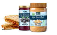
Image courtesy of ROOK/NYC
Six years after launching their seed-based, allergy-friendly snack company in 2015, Co-Founders and wife/husband duo, Nicole Ledoux and Rob Dalton, saw the opportunity to evolve and elevate their brand’s identity and packaging design to adapt to rapidly changing culture and consumer behavior. The team at 88 Acres tapped brand partner of 3.5 years, ROOK/NYC, to collaborate with them on the redesign.
The goal of the project was fourfold: drive taste appeal, set product expectations, educate and drive trial. To drive taste appeal and set product expectations, ROOK/NYC incorporated new ingredients and product photography, with the aim of helping consumers to quickly understand what the product is made of.
The evolved color palette speaks directly to category flavor cues, while the logo was placed in a seed-shaped holding icon. The new logo design aims to emphasize that seeds are the foundational ingredients with which all of 88 Acres’ products are made. The language and product descriptors on the packaging is simpler, with a stronger, more playful brand voice that seeks to reflects familiar, tasty, home-cooked terminology.
88 Acres chose to retain both their existing logo and the leading color of each stock keeping unit to maintain brand and flavor recognition for their current, loyal consumer set.
“Through our long-term relationship, the brand has seen enormous growth, despite the economic challenges of 2020, and this redesign will be a big step in helping 88 Acres to grow beyond the natural channel into more of an iconic mainstay in the conventional snacking category,” says Mark Christou, founder and creative partner at ROOK/NYC.
Looking for a reprint of this article?
From high-res PDFs to custom plaques, order your copy today!