Brand Packaging: Packaging Redesign
Is It Time For a Food Package Redesign?
These steps will help you to make a decision whether it’s time to redesign or leave it alone.

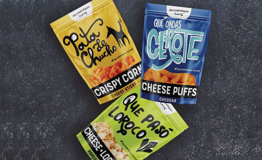
The Salvadorean food pouch packaging design is a collaboration between Jenn David Design and illustrator/hand-letterer Blanco Siniestro – www.blancosiniestro.studio


Food brands owners often come to us when their current packaging design is hindering them from taking a brand to the next level. It’s gotten them to a certain point, but now they are ready to invest in a design that will dramatically increase sales. Sometimes the sign that you need to improve your food packaging is crystal clear, such as when a store buyer says they’d like to carry your food product but the design needs to be improved first. If it’s gotten to this point, you’ve likely waited too long. In order to better plan ahead, what are the early warning signs that your food packaging design needs improvement?
WHEN TO IMPROVE YOUR FOOD PACKAGING DESIGN
- Sales are falling despite all your other efforts being on point. If everything else in your marketing checks out but sales aren’t where you’d like them to be, it’s likely that the packaging design is not serving you. Remember, your food packaging design and messaging should be a workhorse for generating sales. A strategic redesign can dramatically increase your sales.
- Your packaging design pales or blends in, compared to competitors. Take a look at your product within its retail category. Do competitors’ products have greater visual impact? More strategic messaging? Your food packaging design should stand out, get noticed and get results. Otherwise you’re just making do.
- There is a lack of emphasis on key selling points or emotional connection. Design is so much more than visual — it’s communication, feeling and expression. Your design not only needs to look great, but it needs to actively sell the product. Strategic design can facilitate this by guiding the consumer step-by-step through the rapid-selling process in the short window of opportunity the product has to close the sale.
- You have high goals but your product doesn’t look like it can achieve them. If you want to get your food product into Whole Foods, for example, does it look like a product that would be featured in the store? When presenting your products to store buyers or at tradeshows, do you feel proud to showcase its appearance or is the packaging just outer dressing? Does your packaging design elicit excitement? Is there a visual “wow” factor? If not, you have mediocre packaging that is hindering your brand.
- Your gut tells you it’s time. Sometimes there aren’t any significant warning signs but you just know it’s time. You’ve been getting by with your current packaging for some time, and it just doesn’t feel like it fully represents, expresses or sells the product. It’s not maximizing your food product’s potential. Trust your gut, set aside the funds and get to it.
HOW TO PREPARE FOR A FOOD PACKAGING REDESIGN
Does one or more of the above apply to you? When you’re ready to invest in strategic design for your food product, evaluate the following items to get prepared:
Set Your Brand’s Core Foundation
Get clear on the following so you can proceed in the right direction with your redesign. If you already have these items in place, revisit them to make sure they are fresh, accurate and current.
Here are some questions to set your brand’s foundation:
- Who are you?
- What do you do?
- Why do you do it?
- Who are your products for?
- Why does what you do matter?
- How does your product improve your consumers’ lives?
- How does your brand help improve the world?
If you don’t have your core in line first, the redesign may be misguided. Everything you do should align with your brand’s core values.
Evaluate your current packaging and assess what is and isn’t working with your current packaging by asking:
- Is it making an emotional connection?
- Does it express the experience of the product visually?
- Does the container perform well?
- Does it stand out from competitors?
- Does it align with your brand’s core values and the product’s positioning?
- Are different flavors or variants in the line clearly distinguishable?
- Does it tell the brand story?
Decide Whether to Evolve or Scrap the Current Look
Is it important to retain brand equity in your current look? That is, should the redesign look like a new and improved version of the current design, or is it suitable to do something completely different?
It’s usually best to evolve the current design rather than redo it completely when you already have a large audience. If the design looks like a totally different product, you run the risk of alienating some of your current audience. With an evolution, you retain that equity while expanding to a bigger audience.
If you have a small audience and market reach, it’s usually okay to do a complete redesign. If your audience is small, that can be an indication that the packaging isn’t working well — and a signal to take a strategic approach that will generate more sales.
When you have a product with a large following that you’re repositioning — moving from one category to another — that’s usually another time when a completely new design is needed. There are various reasons for repositioning, so evaluate carefully and determine the best course of action.
Determine Whether to Keep the Brand Logo or Redo it
You’ll need to more carefully weigh whether to retain brand equity and do an evolution or do a new logo design altogether. This is because the logo appears in more places than just your food’s packaging design, and there are usually many other products that feature the logo. However, the same principles above apply. Usually an evolution is the right approach for a logo, but, again, if your audience is small, you have more leeway for doing something new.
If your logo is absolutely not working, take the redesign opportunity to redo it. Sure, there will be some brand disconnect in the interim and it will require more work than just updating the packaging design, but brands that don’t evolve to stay fresh and relevant get left behind.
If your logo has been doing fine and you have a large market reach but you’re considering evolving or redoing it, do focus group testing within your current and target audiences on the new and old designs. Many large brands have had huge public backlash in recent years when launching new logos that missed the mark with an audience. Focus group testing can give you a good indication of how a new design will be received.
Once you’ve considered all of the above, you’ll be better equipped as you embark upon your food’s packaging redesign. Remember that design is an investment, so what you put into it is what you get out. The more prepared you are going into it, the more strategic you can be at every step of the process.
Looking for a reprint of this article?
From high-res PDFs to custom plaques, order your copy today!


