Creating Competitive Advantage in e-commerce


There is an enormous gap between physical shopping and the e-commerce experience.

There is an enormous gap between physical shopping and the e-commerce experience.


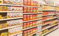
Throughout the world and across every product category, our studies have consistently confirmed an underlying universal reality: The e-commerce shopping experience is not well suited for packaged goods products. In physical stores, consumers typically shop on autopilot for most grocery items, looking for familiar colors, shapes and icons to quickly navigate through overwhelming aisles. In behavioral economics terms, this is a “System 1” shopping experience, driven largely by habit and familiar packaging.
The dominant e-commerce shopping interface (used by Amazon and most other e-retailers) disrupts this natural, largely subconscious navigation process, and it limits shoppers’ ability to quickly “de-select” among many options and compare items. Instead, it encourages clicking on individual images (and/or searching and filtering) to learn more about products. It is a “System 2” shopping process, far better-suited to more information intensive and higher engagement products (such as books, movies and electronics) than the weekly groceries.
Given the small size of the thumbnails, there are several challenges tied to product and packaging images:
- The quality and legibility varies widely
- Sizing relationships can be quite misleading
- The impact of added-value features (finishes, foils, etc.) is diminished
These factors add up to a challenging experience for shoppers and pose a significant threat to the growth of online retailing. In fact, they have been limiting digital adoption since many people default to the familiarity of the physical store for their weekly purchases. An even larger concern is that regular online shoppers will simply end up “list shopping” (i.e., automatically replenishing their favorite items) which limits the opportunity to drive impulse purchases, introduce new products and increase overall items in shopping baskets.
In search of a better shopping experience, we’ve explored changing the web shopping interface to better reflect that of physical stores. In fact, we found that simplified shelf sets (with single facings of each key SKU) led to improved shopability and increased browsing. Clearly, it is unlikely that one “optimal” solution will suit all shopping missions, as beauty browsers have different needs and priorities than those replenishing their pet food. However, just as e-tailers are exploring new hybrid business models (such as “click and collect” and “on-the-go” displays in malls and metro stations), they should also be investigating new shopping interfaces that blend the best of physical and digital worlds. Packaging is a major part of this effort and thus, we’ve explored two different paths in search of more clear and compelling solutions.
Packaging option 1: simplification + mrhi
Pack simplification makes intuitive sense, given the limited size of thumbnails and compromised legibility of most on-pack claims. Many brands are exploring this direction and there’s currently an industry-wide effort regarding Mobile Ready Hero Images (MRHI). The underlying premise is simple and sound: Simplifying packaging in a consistent manner (across brands and sites) enables online shoppers to more quickly and easily identify their products. In practice, however, we’ve found limitations (and potential barriers) to this approach: While simplified images appear to make replenishment shopping easier, they are designed solely for this purpose—and they often compromise branding and point-of-difference communication (of features, benefits, etc.).
Works For:
- Replenishment shopping by consumers that know exactly what they want
Less Effective For:
- Undecided consumers
- Premium-priced brands (Studies show that MRHI images tend to favor lower-priced store brands, as they lead people to shop by size and price.)
- Encouraging browsing and driving impulse purchases
The unspoken premise, borrowed from the physical world, is that if we make shopping easier and faster, people will spend their extra time exploring new products and categories. Unfortunately, this may not be the case in the digital world where shoppers can quickly click away to new sites.
Many brand owners are resistant to the idea of a consistent industry-wide approach and are not convinced that MRHI will drive incremental sales and profitability. And, in addition, these companies correctly sense that there is an opportunity to outperform competition. Many companies don’t want their packs and products to have an identical appearance to other brands, nor do they want their sites to look and feel identical to Amazon.
Packaging option 2: enhancing visual imagery
If pack simplification is a limited solution, then what should brands do? Pursue differentiation rather than uniformity. Specifically, we’ve found that more visceral approaches have shown promise in helping brands create competitive advantage.

This Chinese example illustrates the transition from physical pack (seen in stores) to a best-in-class digital thumbnail, which brings the pack to life in a subtle, yet effective way.

This set of images (courtesy of the Silver Design agency) in Sweden shows the exploration of visual imagery, from the physical pack to variations that also show the product—and strengthen the taste communication
In both cases the enhanced thumbnail images were then dropped in to competitive shopping environments where they drive significant increases in visual attention, click-through and purchase. Clearly, the right solution will vary by category: While showing the product is powerful for food items, it may be less so for home cleaning products. Still, the underlying idea (and untapped opportunity) lies in leveraging the digital medium to create solutions that are not possible in the physical world.
Optimizing product pages
Of course, going beyond the physical pack is exactly the idea of the product page. It is where brand owners have the opportunity to further educate, inform and connect with shoppers—with greater space and flexibility to do so. Frankly, it is difficult to generalize about product pages due to differences in brand strategies, categories and shopper missions. Here’s why:
- In many Fast Moving Consumer Goods (FMCG) categories, most decisions are made at the category page while the product page serves primarily to confirm particular facts (i.e., is it gluten-free?).
- In many beauty categories, shoppers are more likely to be browsing which means the product page needs to engage people on a more visceral or emotional level, perhaps by illustrating usage.
Yet across our broader experience, several themes emerge. More effective product pages typically:
- Illustrate unique product or pack features that are not immediately visible through thumbnails
- Such as unique dispensing or resealable features
- Facilitate product comparisons within complex product lines
- By showing the full line and clarifying where a particular product fits within
- Build a stronger connection with the shopper
- By telling the brand’s story or speaking to users and usage occasions
In particular, we’ve seen that user-generated content (such as videos of consumers interacting with the product) can be very powerful in building trust and community. Posts can be far more powerful than reviews, particularly for higher-engagement sectors such as beauty or fashion.
Uncertainty creates opportunity
Clearly, we are still in the early days of online retailing. E-tailers are constantly exploring new formats and technologies looking for the right combination of disruption and continuity to attract shoppers. And all are struggling to improve the shopping experience, drive impulse purchases and increase basket size.
Brand owners need to experiment with their packaging and visual imagery. Consider it a window of opportunity to create competitive advantage via more clear and compelling packaging and product pages. Now is the time to push the boundaries, engage with e-tailers and quite literally “think outside the box” in terms of packaging for e-commerce. Brands that do will help accelerate the transition to e-commerce and reap the rewards.
Looking for a reprint of this article?
From high-res PDFs to custom plaques, order your copy today!


