Packaging Is the Only Marketing Tool You Need
Packaging is your brand's best link to the customer, and it will sell your brand if you make it compelling.

Traditional advertising may not be the most effective way to create initial buzz around your product. Great packaging kickstarts the process.
Brands can speak about themselves to customers until they are blue in the face, but a strong design concept is just as—if not more—effective in showing consumers a product’s appeal.
Level the playing field with packaging that stands out from competitors. This is attainable by brands big or small.
A new-to-the-market product won’t get lost in the shuffle without advertising if the packaging clearly explains the product’s purpose and creates emotional interest.


What if your packaging was the only marketing tool your brand had? For many startups and small companies unable to afford advertising, this is exactly the case. And do you know what? That’s a good thing. Larger brands too often become preoccupied with advertising—online and in traditional media—with promotions, social media sites and distribution into more channels. As a result, package design becomes an afterthought—to the detriment of the brand.
Packaging delivers brands into consumers’ hands like nothing else can. It’s real. It’s tangible. It can be held, examined and placed into shopping carts. Consumer interaction with packaging usually clinches a purchase decision. Package design, done well, reinforces brand value in consumers’ minds. It makes the brand more desirable than all other competitors; a critical factor when there aren’t many perceived differences among products. Thus, it elevates the value of the product. But in order for that to happen, packaging has to be compelling—otherwise it goes unseen.
packaging puts the spotlight on your product
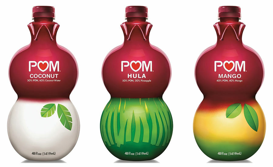
Great, buzzworthy package design delivers brands a considerable amount of free publicity. POM didn’t make its mark through advertising. It used package design. This brand markets a basic product: juice. But nothing’s banal about its packaging. POM Wonderful packaging created a stir of excitement and drove people to the brand. Sure, it helps that POM offers an antioxidant-packed, healthy juice but so do other brands. But with great packaging, POM has become a leader in the juice category.
POM’s distinctive double-curved bottle is iconic, and its new product packaging is just as unique and innovative. When the company launched three new tropical juice blends a couple of years ago, the press release announced it in this manner: “POM Wonderful 100% Pomegranate Juice, the leading premium refrigerated juice, takes a bold step in innovating the category by powering up the produce aisle with a re-imagination of Tropical Blends: POM Hula, POM Mango and POM Coconut.”
Reimagining juice also led to reimagining packaging, which is obviously part of the POM brand DNA. The top curve of each package features the pomegranate, its crown clearly visible beneath the bottle cap. Simple verbal communication describes each juice blend: “50% POM, 30% Pineapple”; “40% POM, 40% Mango”; and “30% POM, 60% Coconut Water.” The bottom curve of each package respectively morphs into a hula skirt, a mango and a coconut corresponding to each blend. This deft use of visual communication delivers the brand in a meaningful, decisive manner.
Plenty of other brands fully leverage their packaging, besides often-cited leaders like Apple or Method, to take full advantage of its power. So, what generates packaging success? Simplicity and sophistication. Go for unusual package structures and package design architecture. Ensure that it will generate buzz and PR by creating a memorable, exciting experience that consumers will want to share. Use packaging as an impetus to build a community around the brand. Create a unique visual and verbal language for the brand to deliver value in a way that competitors don’t. Integrate package design into the brand DNA.
make packaging the first action, not the last
Package design should be the first marketing initiative, not the last, in both spend and focus. To be most effective, it needs to be planned from the outset—as new products are planned—and as part of an overall marketing strategy. Lackluster packaging that needs to be refreshed is an opportunity to rethink its design in order to make the brand more compelling.
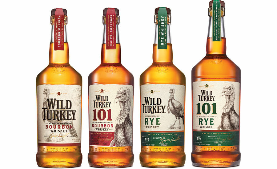
Wild Turkey’s refreshed packaging for its bourbon and rye whiskies gets to the core of its legacy brand in a decisive manner. There’s no doubt these categories are very popular and highly competitive, and there’s no doubt Wild Turkey has a strong group of fans, but the brand had potential to attract new followers through heritage and authenticity—which are vital for a brand that relies primarily on its packaging to do its marketing.
Deep red faux tax strips feature gold foil lettering to denote the kind of whiskey contained in each bottle, along with the verbal brand communication: “Crafted with conviction.” Further brand communication appears embossed into the glass near the bottom of the bottles: “Bold. Genuine. True.” The labels feature realistic drawings of turkeys on each bottle in the product range. These illustrations were rendered by professional wildlife artist, Julie Rhodes, who worked in painstaking detail with the National Wild Turkey Federation to ensure the authenticity of her hand-crafted drawings, and they’re magnificent. Package design with label illustrations say “handcrafted with care and authenticity like the product.”
Wild Turkey’s refreshed packaging goes to the heart of the brand, delivering clear value to the consumer. Eddie Russell, son of founder Jimmy Russell, said it best: “We wanted the new packaging to capture the hard work, craftsmanship and heart that goes into making Wild Turkey. My father and I have been making whiskey the same way for over 60 years. From hand selecting the grain, to bottling the liquid and everything in between, we make sure our product is made the right way, the traditional way, at every single stage. We’re proud of our whiskey, and we’re glad to have packaging that embodies that.”
Wild Turkey’s approach for its retooled packaging points the way for many consumer product brands whose packaging currently misses the mark. The secret to strong package design refreshes is to make certain brands’ equitable assets are retained and then further strengthened by creating an ownable, unique visual and verbal language, as Wild Turkey did. Ask yourself whether this new packaging will call attention to the brand among the many varieties of whiskey on retailers’ shelves.
use packaging to break the category mold
Many people think that children’s toy packaging is formulaic. It’s not. Every day, new ground is being broken by adventurous brands that are fully leveraging package design to market their products in a convincing manner. PR drives interest in small brands at events like Toy Fair, a tradeshow which is held every February in New York City. Industry experts and toy bloggers jump on the coolest new toys and bring them to the attention of the world. Visuals of new toys and toy packaging in social media make a powerful impression and get consumers excited about their imminent release in retail stores and online.
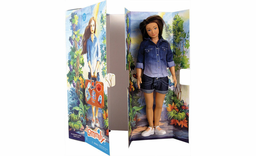
A highlight of Toy Fair this year was the Lammily Doll, the brainchild of artist Nikolay Lamm, who had sketched a more true-to-life doll and positioned it next to a Barbie doll for an art project. The sketch went viral, and people began to ask for the doll—a more realistic portrayal of an average, American 19-year-old girl.
Lamm’s packaging, like his doll, is unique and tells the story while giving a nod to her origin. Water-color illustrations portray the original Lammily doll clad in a blue shirt and roll-up denim shorts walking on a path surrounded by lush scenery and carrying a suitcase covered with travel decals. The doll itself rests on a removable panel inside of the packaging so that she can be easily removed from the twist ties that hold her in place. The inside panel, like the outside of the packaging, features soft watercolor artwork. This is unique packaging in the fashion doll category; it stands out and makes the brand standout. There’s been plenty of buzz about Lammily, most of it positive and enthusiastic, and all generated by a toy and its unique brand packaging.
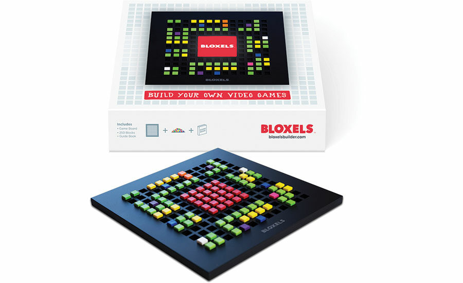
On the tech side of things, another hit of the show and with bloggers was an exciting new toy called Bloxels, which cleverly mixes blocks with pixels, utilizing an app that enables kids to create their own video games. Parent company Pixel Press, based in St. Louis, Mo., developed the game, billing it as “The most kid-friendly video game creation platform, ever.” On a small board, players arrange color-coded blocks to stand for different things: green for walls, blue for villains, white for doors, etc. There are 250 different blocks to choose from so that kids can build whatever kind of video game they’d like. After the game board is finished, it is photographed with a tablet, phone or pad to create a 3D version on the brand’s app, and kids can then share and play their new game with their friends.
The packaging for the product is simple and extremely effective. The black game-building board with its multi-colored blocks appears in the center of the front panel, with the Bloxels logo at the center of the image. The white background subtly shows a grid pattern based on the game board architecture. Beneath the imagery, simple verbal brand communication sums up the toy neatly in a fun typeface: “Build Your Own Video Games.” The side panel of the packaging gives a verbal and visual listing of the contents of the package. Across from that, the Bloxels logo appears again with the brand website listed beneath it. Nothing else is required, including advertising, to help customers understand the product and take an interest in it.
taking a page from apple
Even as brands grow, they should continue to leverage the power of packaging to the max and, rather than focus only on traditional advertising, they might consider using some smart PR tactics to generate buzz and interest in new products.
So why not tease consumers via social media and drop hints to the press about a hot new product that’s about to be unveiled while simultaneously being secretive about the details? Why not promise an unveiling date to build anticipation, and generate press? Then, why not wow everybody with not only product but packaging that delivers value, uniqueness and enjoyment during its presentation? And why not offer consumers an opportunity to pre-order the first round of products due to limited supply? For added buzz creation, why not send influential bloggers each a product and let them light up the blogosphere with their enthusiasm? That’s what Apple does, and it works.
Large or small, when a brand develops packaging that works hand in glove with the product, it creates an irresistible connection with consumers that’s as good, or better, than any paid advertising.
Looking for a reprint of this article?
From high-res PDFs to custom plaques, order your copy today!


