2015 People’s Choice and Editor’s Award Winners Announced
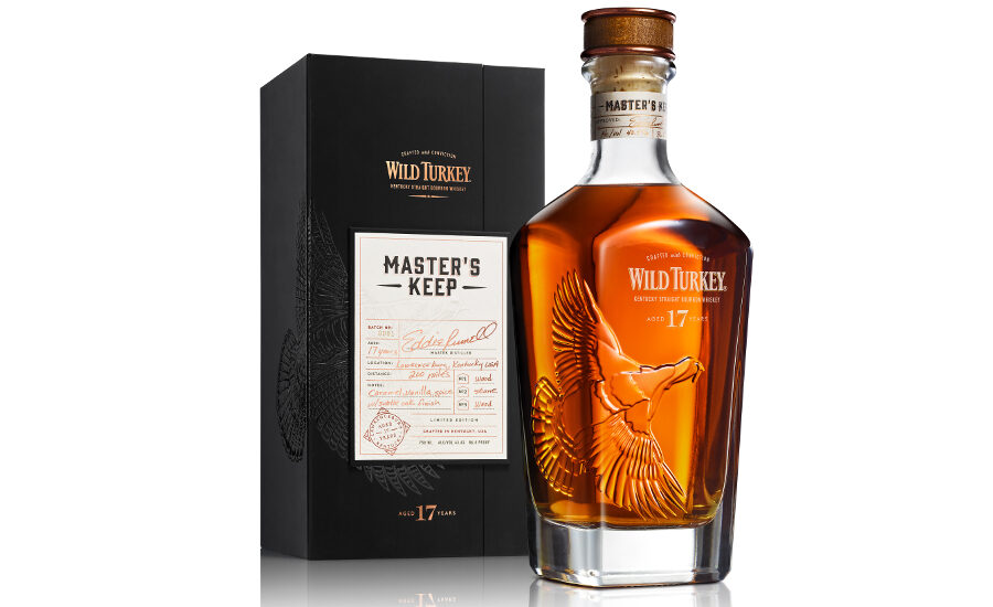
Wild Turkey Master's Keep
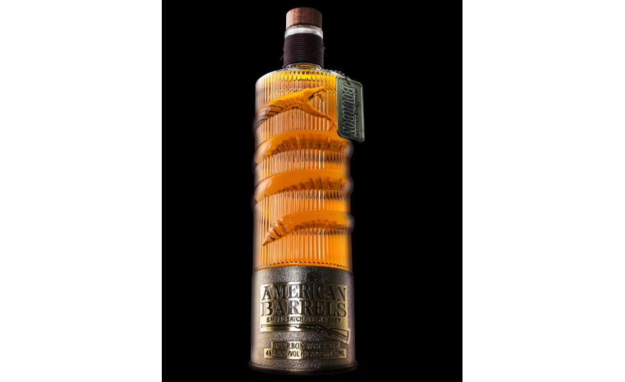
American Barrels Bourbon
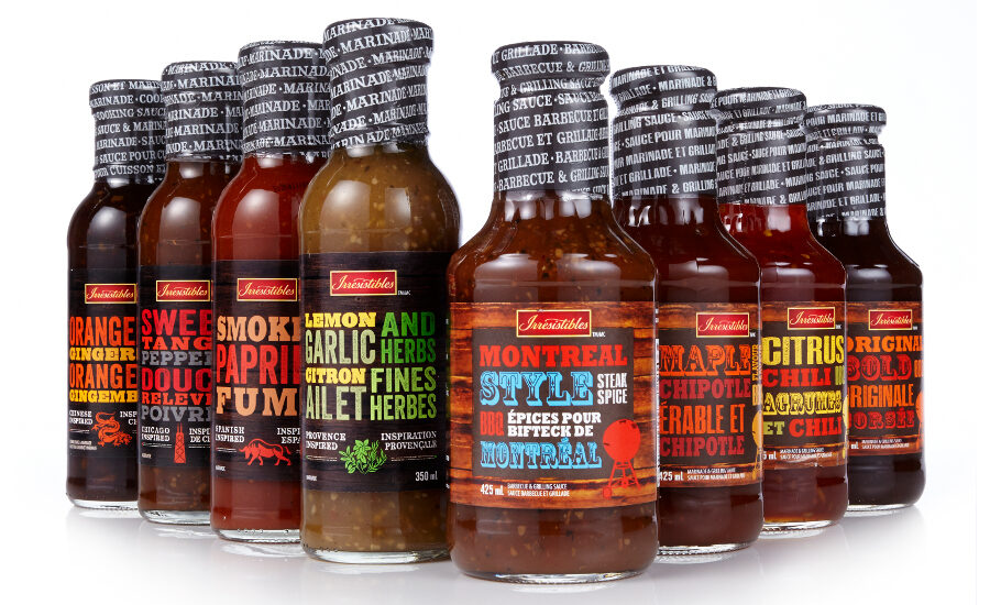
Irresistibles Marinades and Grilling Sauces
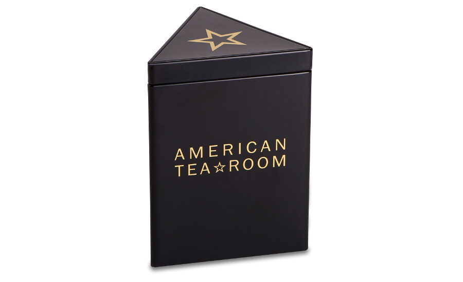
American Tea Room
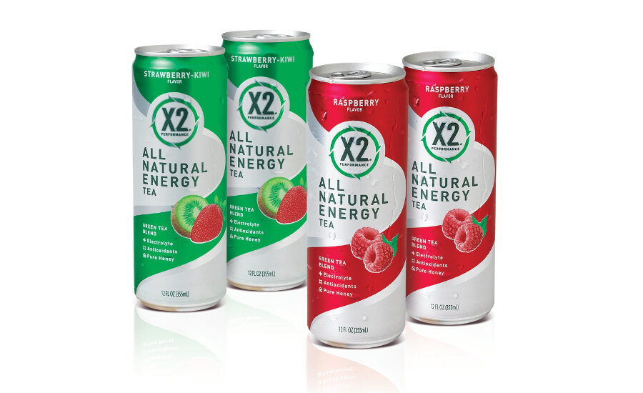
X2 Performance All Natural Energy Tea
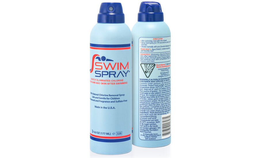
SwimSpray
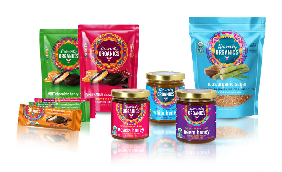
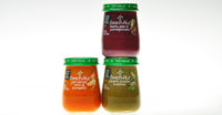
Heavenly Organics
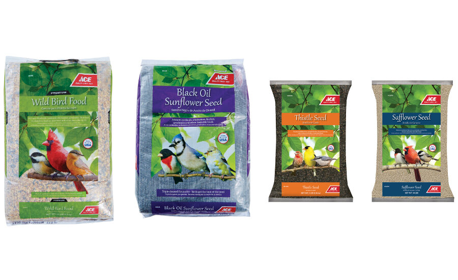
Ace Brand Bird Seed
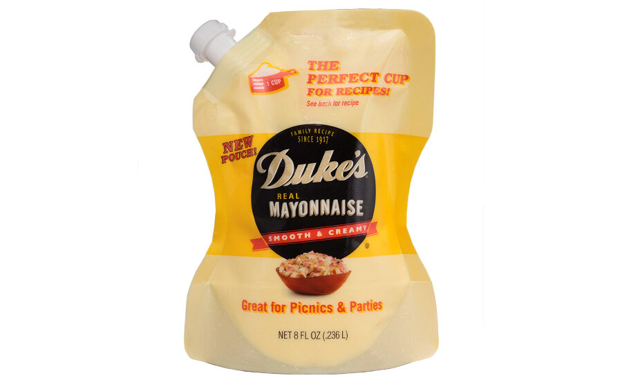
Duke's Mayonnaise
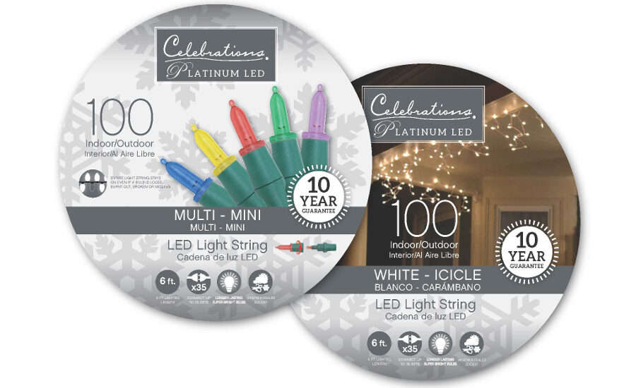
Celebrations Platinum LED
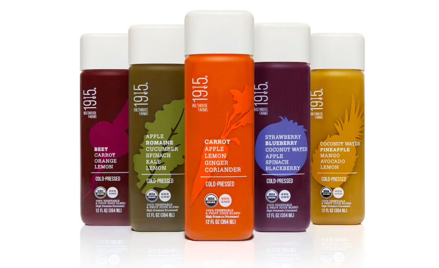
1915
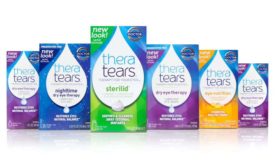
TheraTears
Home Plus
Patricks
Ginstache Gin


People's Choice Awards
These packages received the highest number of votes from the public. Here are your 2015 People's Choice Award winners and runners-up.
Glass
Winner: Wild Turkey Master's Keep by O-I
Runner-up: American Barrels Bourbon by Flowdesign
2nd runner-up: Irresistibles Marinades and Grilling Sauces by St. Joseph Communications Content Group
Metal
Winner: American Tea Room by Planet Canit
Runner-up: X2 Performance All Natural Energy Tea by S2 Design Group
2nd runner-up: SwimSpray by Aptar
Flexible
Winner: Heavenly Organics by Flood Creative
Runner-up: Ace Brand Bird Seed by Ace Hardware
2nd runner-up: Duke's Mayonnaise by Ampac
Rigid
Winner: Celebrations Platinum LED by Ace Hardware
Runner-up: 1915 by Little Big Brands
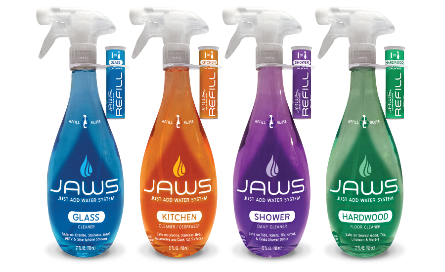
2nd runner-up: JAWS, Just Add Water System by Canberra Corporation
Paperboard
Winner: TheraTears by Little Big Brands
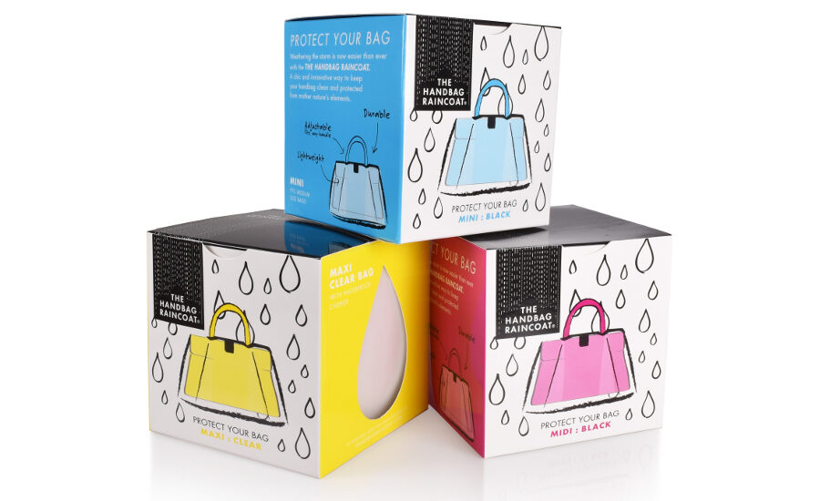
Runner-up: The Handbag Raincoat by Flood Creative
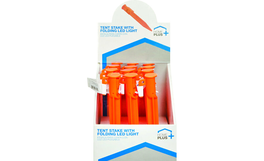
2nd runner-up: Home Plus by Ace Hardware
Editor's Award
These packages were picked by BRANDPACKAGING for accomplishing the brands' purposes.
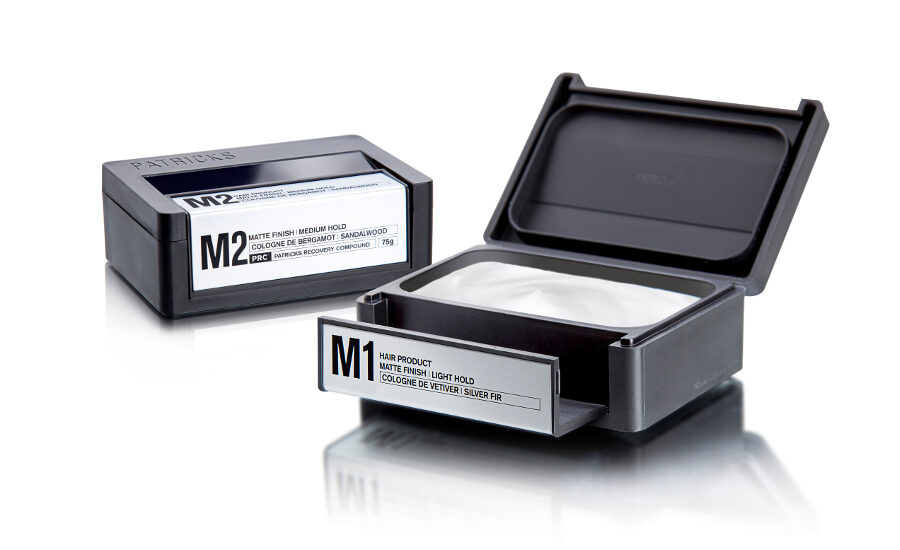
Winner: Patricks by Berlin Packaging
From the brand's inception, each of Patricks’ products have been designed with performance and luxury as top priorities. The package is created as a beautiful little object with a look and feel befitting a durable good. The truly original design elevates Patricks’ products to the level of prestige symbol, in keeping with uber-premium >$60 price points. The package is opening doors and getting placement for the brand in some of the world’s top luxury retailers including Neiman Marcus and Mr. Porter, as well as write-ups in GQ magazine and many others. Labels are silk-screened onto the inset plate aluminum surfaces. The leading edge functions as the locking latch, swinging forward to free the lid and reveal the well-sealed product inside, while a double-lock system ensures the package will not inadvertently open during storage or transit. A rubber gasket seamlessly integrates into the aluminum base to create an audible solidity when putting the package down as well as to prevent slippage in wet areas and protect bathroom surfaces. The Studio One Eleven-designed visual branding reinforces the upscale appearance with a minimalist Patricks brandmark debossed on the cover, a sophisticated commmunication architecture system with abbreviated product descriptors, and a tie back to a ‘Patricks Product Matrix’ that guides men to the SKU best suited to their hair and styling types.
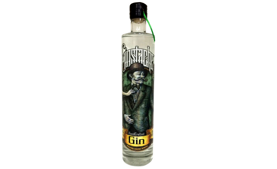
Runner-up: Ginstache Gin by Fort Dearborn Company
Rusted Crow Distillery aspires to be more than just another mediocre brand on the shelf by taking the effort to produce and package every bottle as if it were its very first. Located in Dearborn Heights, Mich., they use only the optimum ingredients the fascinating state has to offer. Rusted Crow wanted this package to transport the consumer back to the dark days of prohibition when men "stashed" their alcohol paraphernalia in their breast coat pockets and women in their garter belts.The brand’s purpose is to leave the consumer in awe of how much beautiful meticulous work actually goes into designing a single bottle; knowing exactly which friend you want to buy it for when you see the bottle. Joe Schebel, owner of Rusted Crow, hand-numbers each bottle and batch on the label, then adds his signature. A ribbon makes opening the neck wrap easy and special. Spot varnish on the labels add tactical and visual impact.
Looking for a reprint of this article?
From high-res PDFs to custom plaques, order your copy today!


