TricorBraun Designs New Packaging for Jack Black Haircare and Skincare Lines
The packages are distinctly masculine and convenient for men to use in multiple settings.

Men’s grooming products company Jack Black LLC sells its extensive line of products through prestige department stores and specialty retailers. Since its founding in 2000, the company has taken a head-to-toe approach to grooming, but this year, the company is expanding its presence significantly in hair with the launch of a full hair care collection of eight products to complete its line. Jack Black began working on the package development for the dramatic new custom green bottles in design in May of 2014; products in the new packaging began shipping in February of 2015.
“Our target is the broad audience of men looking to look and feel their best,” says Emily Dalton, co-founder and executive vice president of Jack Black. “To appeal to those men we focus on three principles, both in product formulation and in packaging: simplicity, quality and masculinity.”
Dalton points out that ever since the Jack Black brand was launched the company has focused on packaging as an important visual branding tool to reach male customers. Many of its packages, for example, reflect visual cues from other categories that are distinctly masculine, such as premium liquor bottles or cigar labels. It also favors packaging that is convenient for men to use in multiple settings — at home, the health club, while travelling, etc.
As it prepared to launch the new hair care line, Jack Black chose leading package developer TricorBraun to design the packaging for those products. In the end, the design of the new shampoo bottle that was developed was so impactful that Dalton reports that the company re-designed some of its existing bottle packaging to project the same look for its core line shaving and skin care products.
The design that was chosen following consultation between the company and TricorBraun designers was a 16oz PET (polyethylene terephthalate) flask shape in dark green, topped with a black pump closure. A distinctive feature of the new bottle was an embossed script Jack Black “signature” molded into each side panel. Accommodating this signature challenged the TricorBraun designers, since creating side panels large enough to carry the signature comfortably limited the breadth of the front panel, which Jack Black wanted to maximize for shelf presence. But the final design is well balanced and delivers the desired impact.
“This design produced exactly the effect we wanted,” says Dalton. “The package is both visually and tactually appealing, and is distinctively masculine in its size, shape and color.”
The bottle is produced in three sizes: 16oz, 8.5oz and 3.3oz. The new flask shape is now also used to package Jack Black’s skin care products, replacing earlier stock Boston round bottles, and significantly enhancing its shelf presence. The skin care products are packaged in a rich cobalt blue, which enables shoppers to immediately distinguish them from the rich green hair care packaging.
The signature Jack Black skin and hair care packaging is labeled with a diamond-shaped pressure-sensitive label (reminiscent of a premium liquor label) that was originally designed by Jack Black, the company collaborated with TricorBraun to optimize the design and maximize its visual impact on each different package type. The label carries the Jack Black signature and is embossed with a red JB monogram that suggests an antique wax seal. Product and use information is silk-screened on the backs of the bottles.
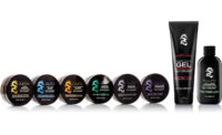
The complete new Jack Black hair care line includes products in tubes, on which all decoration is silk screened, and in jars sourced by TricorBraun, which have the diamond label design pad-stamped on the jar lids.
“TricorBraun designed and produced these packages very efficiently,” says Matt Kusmierz, who leads packaging development at Jack Black. “We are a small, lean company and we have to move quickly. Their responsiveness enabled us not only to achieve our marketing goals, but also matched our aggressive timing.”
Looking for a reprint of this article?
From high-res PDFs to custom plaques, order your copy today!


