Nerd Alert: 5 Common Missteps in Consumer Tech Packaging
The Nerd Alert is a monthly column about consumer tech packaging.
Misstep One: No, You Can’t Be Apple
Misstep Two: The Copycats
Misstep Three: Black is the New Black
Misstep Four: The Curse of the Spider
Misstep Five: Features and Benefits


In general, the consumer tech industry is run by engineering types. Which makes sense when you consider that the cornerstone of consumer-based innovation is, at the end or the day, physical product. Mechanical engineers team up with industrial designers and work together within the constraints of manufacturers, budgets, schedules and, often, sales opportunities. At the end, the goal is to design the products that you pick up at your local Best Buy.
Just to complicate things even more, more times than not you’ll find that the sales people at a lot of these companies are the marketing folks as well. The problem with this is sales and marketing tend to serve different masters. While the sales side of the brain wants to move units (Sell in! Sell through!), marketing wants to differentiate from the competition and build an enduring relationship that can be very time consuming. Sales commissions work on quarterly numbers, and how does one really gauge ROI with regards to building a brand? Yes, I’m making a sweeping generalization, but you get my point.
So, what ends up happening (more times than not) is the highly technical and detailed minds of the engineers team up with “right now” response time of the sales folks, and they direct the marketing messages that are aimed at you and me. We see this every day, in the decisions that are made when it comes to a company’s face to the world.
How do you I know this, say you? What gives me the right to make such sweeping claims, and what do I have to back up such statements? Well, I have two eyes, and they have been staring at this stuff for longer that I will admit. If you look at this stuff long enough, a few trends start to bubble up to the surface and paint a very clear picture as to what’s going on in the fight for your all-mighty dollar.
Misstep One: No, You Can’t be Apple.
Why? Because Apple is Apple. One time, we even had a client give us a ratio: “We would like to be 80 percent Apple and 20 precent us.” So, we told them our agency wasn't a good fit for them. Apple has had such great success because they were able to create great meaning in their brand by NOT doing what anyone else was doing. Steve Jobs was really brave in terms of the chances that he would take with his brand. Would you be that brave? Are you that brave? If your agency pitched you the grammatically incorrect slogan “Think Different” at the same time a top competitor, IBM, had the slogan “Think,” would you accept it? It’s dangerous and scary business to travel far off the reservation and blaze a new trail like that. The reality is, you might fail, but it wouldn’t be because your marketing was too radical. No company with amazing products, solid funding and an iron clad distribution chain ever died from being too different than its competition.
Misstep Two: The Copycats
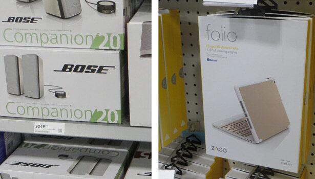
The scene opens on a handful of gents wearing short sleeve polo shirts and khakis, sitting quietly around a boardroom table full of competitive product. A lone marketer is presenting design ideas for their brand new “me-too” line of product, and a conversation ensues. It’s the usual, “Make the logo bigger,” “My wife doesn’t like blue,” kind of stuff, and then the lead sales guy says, ”Just make it look like this.” And he holds up the product packaging from their main competition and leader in the market. He assures the group that’s what the buyer from (insert big box retailer name here) wants, and for differentiation, the accent color can be changed to red. After all, “His wife likes red.”
The problem with copycats is that they dilute the market. The good news about copy cats is ... they dilute the market. Be true to why you got into business in the first place and create an authentic retail presentation around those ideals. Then, if someone tries to copy your direction, they’ll come across as pandering or being contrive. By the way, if your answer to why you started your company was to make money, then don’t call us, we can’t help you. If you can’t answer the question of why you exist with a meaningful statement, then there’s nothing that anyone can do to convince the public otherwise.
Misstep Three: Black Is the New Black
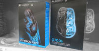
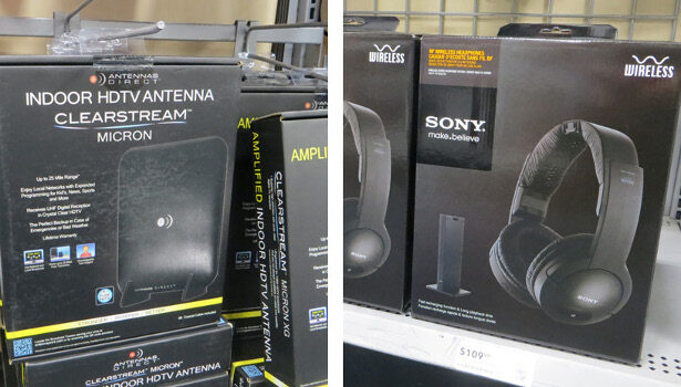
When you’re creating product packaging for any kind of large retailer, the first thing you’ll have to understand is you have next to no control as to how your products are going to be merchandised on the floor. Sure, huge brands like HP and Logitech have full sections for their products, but they pay a dear price for this level of control. For the rest of the brands, all can you hope for is the best, but often times you're 10 inches off the floor, at the merchandising height of a toddler. Knowing this fact going into the packaging design process means that your stuff had better have some POP! That being said, I see black products on black packaging every day, in every aisle of every retailer. I know, it looked awesome on your 30-inch monitor while you were reclining in your Aeron chair, but when it came off the press in China, sailed across the sea and landed on the shelf of your local retailer, you now realize that it looks like mud. And it’s in shadows down in a corner next to another company’s equally riveting black box. Understanding your retail environment is just as important to your packaging and any other element, and maybe more.
Misstep Four: The Curse of the Spider
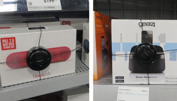
Speaking of retail environments, this brings me to the bane of all packaging designers: the security spider. You know, the black hockey puck that is attached front and center to any product that is at high risk for theft. The industry term is “loss prevention,” but it might as well be called sales prevention with its cable wrapping around and strangling the packaging you worked on for months to perfect. The good news is that a preliminary store visit prior to a design project is a great way to anticipate the unfortunate addition of security spiders to your packaging design. Now, you’re not going to able to avoid its application, which is at the discretion of the individual store manager and is often based upon price point. You can however make sure that no important information, or worse the product image, falls underneath one.
Misstep Five: Features and Benefits
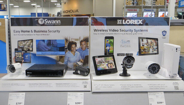
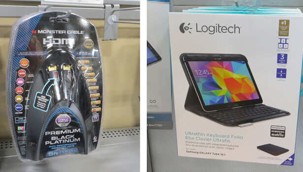
The number one clue that will tip you off that sales is at the helm of any product company is the use, or overuse, of features and benefits. Yes, this fabulous new product might have a few key features that the manufacturer wants to tell the world about. But, then they go and list ALL OF THEM and then tell you why they are all so great. I have two major issues with F&Bs. The first one is that a feature tells me “what,” but a benefit tells me “why.” I couldn't care less about what you did, but I do care a lot about why it matters to me. Features are bad, and benefits are good ... get it? My second beef with F&Bs is the thinking that more is somehow better than less. Product makers will pack every piece of real estate on a piece of packaging with laundry lists of them, including bursts, violators and callouts of every kind. Here’s a small lesson that I learned the hard way: If your product delivers one major benefit to mankind, then by all means tell us what that is. We’ll understand that benefit and log it under your brand. But, if you try and muscle down our throats three, six, 20 different features and benefits, you’ll end up communicating nothing. The messages will cancel themselves out, and all your marketing efforts will be for naught.
This may seem like an intimidating list, but fear not, because companies larger than you have fallen into these exact same traps. Do yourself a favor, and go to a store. Get out of the meeting room, put away that sales schedule, and stop looking over your designer’s shoulder at his screen. Oh sure, the mockup looks great in the middle of a white conference table, in the middle of a well lit room, with no other packaging around it. But, it tells you a grand total of absolutely nothing. Only when you understand where your packaging lives at retail will you be able to avoid these missteps. If you don’t, you may just invent misstep number six.
Looking for a reprint of this article?
From high-res PDFs to custom plaques, order your copy today!


