Upping the Ante on Luxury Packaging

Luxury market trends reflect the concept and imagery of feel-good indulgence, but luxury itself is a state of mind: the perception of pleasure derived from the visual and physical experience of a product. To create a state of mind that’s receptive to a brand’s luxury cues, use tools that heighten sensory perceptions including packaging structure, visual cues, color associations, package size and finishes. How a consumer responds to and interprets what he or she sees about a product on first contact is all in the presentation and the context in which it’s presented.
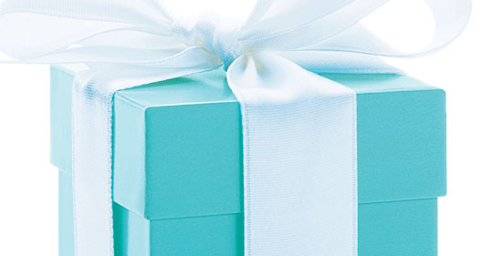
Strip a Paloma Picasso silver ring of its Tiffany box and put it in a white box on the shelf in a 99-cent store. Chances are somebody will be delighted with his or her find, but it’s highly unlikely the person will perceive the ring for what it really is. Context is critical.
MANY FORMS OF TRADING UP
A shift in a brand’s marketing position to trade up or heighten the impact of product benefits can take many different forms, depending on the target audience, budget and sales channels. It’s also dependent on how the “luxe factor” is directed at the consumer. For example, moms, who are extremely busy and whose school-aged kids are always hungry, may use frozen burritos as a snack or alternative to a meal, but they feel guilty about it. So Mom looks for foods she can feel good about providing and that her kids will eat — a brand she can believe in, perhaps one with a track record of authentic taste with real food such as fresh-baked tortillas, whole beans, juicy fillings and real cheese, nothing processed. In this case, amplifying the brand to appeal to her requires only a re-orientation of the brand image to gratify and reward her with the sense she’s made the better choice; for her, this convenience is a form of luxury. This tack does not require structural change to the package and, possibly, no change in production requirements either.
An image trade up adjusts the product repositioning through packaging personality refinements, using a variety of tools to craft an accurate graphic presentation in an optimal shelf context. Some of the most commonly used tools in redirecting a brand up-market include:
Mnemonics.
The use of prompting devices such as iconic monograms and brand marks in creating the perception of a brand and aligning it with the desired brand image is commonplace. But the key to instant recognition and an accurate perception of the brand mark or icon lies in its ability to distinguish itself in any venue and speak for the brand, loud and clear — Yves Saint Laurent’s logo on a Citroen used to shuttle important guests to an exhibition of the designer’s work in Paris is an example of an effective application of a brand mark to represent the brand values. In taking the opulent factor of a brand visually up a notch, an update of the logo and overall imagery can go a long way.
Update for relevance.
Evolutionary updates of a brand mark ensure the brand’s position and relevance in an ever-changing market environment that’s pinned to the consumers’ penchant for freshness — the mark must evolve to maintain its lead position in a contemporary context.
Typestyle.
The perception of “high end” is influenced by the brand personality. Brand personality can be expressed through any typeface — minimalist, ornate, calligraphic or no-nonsense, whichever best suits the brand positioning. Typography is a particularly effective option in positioning a brand.
Emblems and signets.
The mark of a royal warrant in the U.K. has been the standard for prestige and luxury products since the 12th century, and facsimiles of such accreditations have been liberally borrowed by the commercial sector to visually communicate a fit-for-royals brand positioning. Adding a touch of class is a sure way to increase the luxe factor, if the product merits it.
Color.
Virtually any color can be used as an expression of brand, and color associations with a brand convey a particular perception about the company, such as quality or sumptuousness. The catch is that using color as a hallmark is a long-term investment, because it takes time to establish a proprietary color. As long as the integrity of the color remains uncompromised in the long run, it will be instantly recognizable for everything that the brand stands for, including the rich image: Classic examples are Tiffany blue, Hermès orange or Veuve Clicquot’s yellow.
Patterns.
Repeating surface patterns or wallpapers are similarly effective, like proprietary colors, but with an added benefit: Patterns have a broader range and are more flexible than color alone, in that they allow the brand to evolve and build on its heritage. Once a pattern has been connected to the perception of premium or other brand essence, patterns can be adapted to fulfill a variety of needs by varying the color palette, and they are an especially useful technique for seasonal or generational packaging: Louis Vuitton has released many items featuring a spin on its famous monogram.
Stamping.
Embossing, debossing and ink or foil stamping techniques can be applied to create a deluxe look and add elegance, something grand or lavish, producing a very effective way to achieve a “wow” response.
Perception.
The choice of color, the product shot, typographic and other graphic elements are deliberate. Each element is integral to the overall brand image. The whole is designed to manipulate perception. In design, perception is reality, and the adage “less is more” does apply. Less is elegant, uncluttered. Less is sophisticated — it hones in on the essential. Less is rare, more desirable.
Less is more.
The simplicity of an uncluttered, well-organized visual communication, combined with an outstanding product presentation and the adroit use of color codes to signal premium instantly says “Buy me; I’m special.” Superb product photography and skillfully positioned diecuts, which showcase the product, are also effective ways to heighten a brand’s extravagant feel.
Novelty.
And then there’s the luxury of novelty — a unique structural form that captures the essence of a smart, imaginative and stylish product. Structure is the overt expression of the brand persona. A creative structure can embody the allure of a product and make it seductively irresistible, even if it’s bad for you, like eggs: Gogol Mogol’s egg packaging is designed to produce a perfectly hardboiled egg, without water. Who wouldn’t want to test that creation?
WHICH WAY TO GO?
The many techniques that can be employed to enhance a brand must be compatible with the end objective. In magnifying the luxury factor, there isn’t necessarily any one solution: For some, luxury is a convenience; for others, it’s a form of self-expression. A product can be presented as a utilitarian item or endowed with a certain “something” that makes it a compelling luxury to indulge in — again, it’s all about perception. For example, the convenience of ready-to-eat tamales and snacks delivered to your door is a form of luxury. Specialty chocolate Easter eggs are luxurious, too. Upgrading a necessity to a luxury is in the artful direction of perception.
IT’S A COMPLEX PROCESS
One is what one consumes. From food to clothing, smart phones, cars and all the other products that one buys, it’s all about branding and how well the perception of the product agrees with the consumer’s self-image and needs. Every aspect of daily life is expressed by the product choices we make, and those selections are guided by a skillfully executed creative process, from inception of a new product concept to the final production art, filtered through many refinements to ensure the final product will successfully achieve the desired result.
In the end, like all art forms, design techniques work best in an environment that’s supportive of a talented and experienced creative team with resources to draw from various artistic disciplines, working in collaboration with brand management and production teams to gather inspiration from their varied expertise. The techniques used to upgrade a brand are but tools, and choosing the right device for the job is a complex, multi-layered process. It starts with a clear understanding of the brand mission and expectations: where the brand is today, where it needs to be in the interim while making the transition and the intended target position. One size, or one approach, does not fit all; there are no cookie-cutter solutions. Each upgrade is a custom challenge that requires three components to be successful: talent, collaboration and funds. The rest is technique.
In the long run, it’s useful to keep in mind that while many avenues can lead to the end goal, to succeed, a brand must be flexible enough to assimilate evolving marketing trends and select the right implement to remain relevant to consumer progressions.
Looking for a reprint of this article?
From high-res PDFs to custom plaques, order your copy today!


