How Strong Will Your Label Redesign Be?
Make the most of the nutrition label makeover!


Hiland extended its line into seasonal/ holiday milks and made it spooky fun to target kids and the primary purchaser — moms. Side panels talk about its yummy goodness and cross-sell other flavors.

The light and icy-colored metallics on the cans promote the brand’s sleek, cool and refreshing vibe, while the dramatic top and bottom color-coding quickly and easily differentiate each mixer from the other.

The packaging reflects the unique and sleek character of this spirit with the “3” logo emblazoned on the bottle using a dramatic shade of crimson specially formulated for 3 Vodka. It earned a first-place Mobius Award and was voted Best Package of the Year by Beverage Industry magazine.


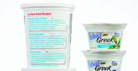
The FDA’s proposal to update the Nutrition Facts label on food and beverage packaging means there’s a golden opportunity to refresh or completely revamp a brand’s packaging design. Everyone will be headed to the printer, and there’s no good reason not to come away with a package design that communicates a clear, compelling, premium-quality and impactful image.
I strongly believe in the strength of good packaging design and how the design has the power to drive the brand and make the sale. A good design should attract the consumer to your product, quickly inform them about what’s most important, differentiate your product from the others and compel the consumer to purchase.
GETTING STARTED
A packaging redesign means it’s time to review your product’s brand history and current image, and then establish new brand objectives. When we’re called on to do
a package design or redesign, we look to partner with our client and be extremely thorough so there aren’t any surprises along the way. We look at the category, channel of distribution and the competitive landscape. We do store checks with the sales team, analyze touch points, understand market trends and conduct a complete brand packaging audit. We also take into consideration the plant operations, existing equipment, packaging suppliers and current printing specifications. Nothing should be left to chance.
When embarking on a design project, be ready to communicate and collaborate. The result will be a good design that meets your objectives, successfully conveys your brand’s attributes and sells the product.
WHAT’S IMPORTANT
Know your target audience and what’s important to them. With this knowledge, the features, benefits and voice of your brand that will resonate with your audience can be communicated on your packaging.
Naturally, the most important and unique features and benefits should appear on the front, or principle, display panel. Tapping into what’s most meaningful with consumers is critical. Right now, it’s all about promoting the product’s health benefits. And with the introduction of the new Nutrition Facts label, consumers will be extra alert to health claims and benefits. Brands with a health or nutritional benefit would be smart to capitalize on this health-conscious moment.
The front panel is critical to your logo, your product’s name, and key features and benefits. However, the side panels, back labels and wraparounds are also critical. These areas offer packaging real estate where you can tell your brand story, talk more about the product, talk about product usage or elaborate on features and benefits. They are real brand-building areas and should never go to waste.
Packaging is a direct extension of the brand, and it must therefore look, sound and feel like it. After the consumer has received the brand message from various touch points, they must be able to quickly recognize and identify with it when the product is on the shelf. That means the packaging structure, materials, copy tone and design must be on strategy.
AVOID THE RUSH
While we don’t yet know when the new Nutrition Facts label requirements will go into effect, we know they’re coming. That means there’s no excuse to rush the design at the last moment. Product development teams and brand managers should start acquiring and compiling market research and consumer insight data now. Then, design work should begin. Early engagement dramatically increases the level of packaging design success.
GREAT OPPORTUNITY
The changes to the Nutrition Facts label on the majority of packaged foods and beverages are an opportunity to make adjustments where they’re needed. It could be design tweaks, or it could be a complete redesign overhaul. Regardless, smart brands will invest the appropriate time and resources to make the most of new packaging. They’ll come out swinging with an innovative, on-target and memorable design that increases sales.
Looking for a reprint of this article?
From high-res PDFs to custom plaques, order your copy today!


