Design Firm Wins GDUSA Awards
Two retail food brands and a hardware brand are recognized for clean, effective design.
The award-winning WFM design firm (William Fox Munroe Inc.) recently garnered three 2014 Graphic Design USA American Package Design Awards, the company has announced.
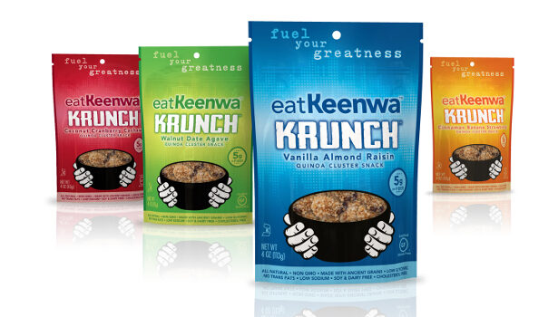
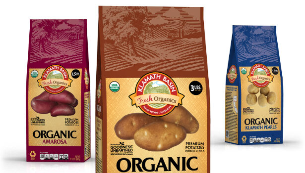
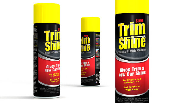
The three awards span several retail market categories. Keenwa Krunch is a refreshed hybrid quinoa snack food brand with bold new brand colors; Klamath Basin Fresh Organics is a brand potato line that gained wide distribution with effective variety indicators, and Trim Shine is a line extension for an established brand of automotive cleaning products. Each design provides optimum “shop-ability,” helping consumers navigate the choices in the aisle and leave the store with the right variety.
Different but the same
The key to refreshing the existing Keenwa brand was to not only reflect quinoa’s heritage, but also to introduce it to mainstream culture in an energetic, contemporary way that would resonate with an active, health-conscious audience. WFM updated the existing bowl icon around a product window, providing a perfect way to reconcile the Inca-inspired element with a newly vibrant, high-energy background.
The colors that now dominate each package are the flavor variety indicators, unified in boldness and intensity, and the core brand message is contained in the central logo, bowl and caring hands. The new overbrand, eatKeenwa, is a call to action and the “fuel your greatness” tagline inspires fitness warriors to take control of their diets.
The Klamath Basin Fresh Organics potato brand charged WFM with coming up with a more innovative and versatile packaging strategy. WFM created a new logo, reemphasized the organic differentiation of the product and managed the development and print execution of 11 variety colors that dominate the packaging.
The paper packaging created a better canvas and more space for educational information of all kinds while still featuring a product-viewing window, moved to the back of the package. “We gave the segmented design strategy a lot of thought,” WFM partner Tom Newmaster says. “The challenge was to create a branded-product look without a brand. Now the whole potato section looks better than before.”
The previous Trim Shine packaging showed a close-up of a car exterior that had become dated and no longer communicated Trim Shine’s ability to restore color and shine to automotive trim surfaces — both exterior and interior. The new package design focuses on the surfaces which Trim Shine protects by using a combination of two textural design elements: vinyl and metallic.
To consumers, these textures represent both the interior and exterior automotive finishes that benefit from the application of Trim Shine. By eliminating the need to show an automobile on the packaging, WFM provided a solution that targets the product’s uses while alleviating the potential visual miscommunications inherent in the previous graphic treatment.
The new Trim Shine design also complements the existing, flagship Invisible Glass product line design, which WFM had previously developed. The design team took its typographic cues from the Invisible Glass line, modified the spark icon and then incorporated it as part of the new Trim Shine branding. In addition, the Stoner logo received a refresh that gives it better positioning in the layout and a cleaner read.
Navigating the retail landscape
Challenger brands are raising the quality bar at retail in more creative — and colorful — ways than ever before. From small, independent startups to retailer-driven private label, these branding strategies work hard to capture shoppers’ attention — and to keep it.
The WFM package design firm in Shillington, Pa., has recently helped a handful of brands execute boldly colorful challenger strategies with flair and precision. “It might be counterintuitive,” explains Newmaster, “but challenger brands actually have much more freedom in design strategies than most established national brands.”
One way to do that, as with both Keenwa Krunch and Klamath Basin potatoes, is to forego a primary brand color and elevate variety accent colors to primary positions on packages. The rainbow effect grabs attention as a contrast to the common, expected blocks of brand color on store shelves.
Looking for a reprint of this article?
From high-res PDFs to custom plaques, order your copy today!


