Big League Packaging
How to use packaging's structure and design to bring consumers in from left field.

 Making it into the big leagues in any sport is hard. Really hard. Nearly impossible, actually. Less than half a percent of high school seniors playing baseball will be drafted by a major league team (that’s 0.45 percent, for those who aren’t mathematically inclined). Of those drafted, an even smaller percentage will make it out of the minors, and a yet even smaller percentage will have long, successful, multi-million dollar careers.
So, what’s with all of the baseball talk?
Over the last decade, almost a quarter of a million new products have been announced at the Consumer Electronics Show in Las Vegas. And what percentage of these product launches has actually made it to a shelf at Best Buy or Wal-Mart stores? You see my point.
There are many factors at play in getting your stuff into those stores, but what we want to share is an idea that can help you win once you have been drafted. In the unassisted sales floors of big box retail, it’s your product packaging that has to do the heavy lifting, and there is more to success than simply making the pack look pretty to you and your executive team.
>The Right and Wrong Way
We found there are two ways companies review and judge product packaging: the right way and the wrong way. The right way would be developing it with actual stores in mind, and the wrong way is how everyone else does it — in their offices. A typical packaging review is held in a board room with soft lighting and cozy chairs. The team sits back, holds the package comfortably in their hands, and calmly and leisurely takes in the entire piece. Most of the time, the key decision-makers are surrounded by their highly trusted team of expert advisers who collectively know every nook and cranny of the product, from its conception up to this reviewing moment. The group will hypothesize about the customer’s interpretation of the packaging, but to be honest, this group is way too close to the project to be very objective about the reality of how people shop and the factors that play into their decision making.
So, what is the right way? How can you be sure that your packaging design will work in a store if the first time it’s ever seen the inside of one was the day it was placed on the hook? At that point, we’re talking about years of R&D, expensive tooling and manufacturing costs, the expense of sales, PR and marketing, not to mention how much it costs for fulfillment and shipping — such a long, exhausting and expensive road all to bet that people are going to line up for a chance to buy your product. Strike three … you’re out!
| It’s a simple game; don’t complicate things. Keep your messaging and graphics clean, and resist the urge to use all the negative space or shoehorn in everyone’s ideas, from the CEO to the marketing assistant. |
Now, it’s not very cost-effective to build a retail environment in most offices, and doing field studies with an entire team is hardly efficient. We’d like to share a little method we use to overcome this obstacle and help manage the transition from your office to the retail floor. The concept is very simple: Your product packaging has to “speak” differently from a few different vantage points in the retail selling process. And by selling process, we simply mean from the moment the customer walks in the door until he or she walks out with your product under his or her arm. How does your packaging communicate from across the showroom floor, as part of a wall full of products and, finally, when it’s in the customer’s eager little hand? If you think of packaging as a tool that has different stages of communication, then you’re on the right track. We call this method the “25, 10, 2 foot rule.” What is your packaging saying at 25 feet, 10 feet and at two feet to build trust, convey a compelling solution and make the sale?
>25 feet - Use shape and color like a tractor beam
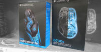
You’ve just walked through the doors of your local Best Buy. You scan the “sky” for a ceiling sign to direct you to the section of the store you’re looking for. If you came here today because you actually need something, you’ve probably done a little preemptive online research and want to get a closer look at the different available options — then, if your shopping experience has built the sufficient crave or motivation in your limbic brain, you’ll go home happy with your new purchase. For now, you’ve found your section of the store, and the first things you’ll be affected by as you approach are shape and color — the physical structure and broad color strokes on the packaging. These are the building blocks of a brand. A brand doing a world-class job of this is Logitech. You can spot its products from across the room — far before you can read any of the printed information. The combination of a plastic blister and paperboard material establishes a very original look. Logitech was also brave enough to stick by its guns as the competition made numerous attempts to copy its success. Being the first to establish this look and having the nerve to stick with it is why you notice its products from 25 feet way. Customers approach them with confidence because Logitech owns that real estate in their “retail subconscious mind.” You can only achieve this by starting with a strong design and sticking with it no matter how the other factors in the market around you try to sway you from your path. It is at 25 feet that shape and color are used to pull in prospects like a lighthouse guides a ship through the retail environment fog of poor lighting, distracting noise and crowds of people.
>10 feet - Inform like an air traffic controller
Once the prospect is through the maze of people, structures and aisles, it’s time to get the right product into his or her hand. At 10 feet, there’s a new set of guide posts that come into focus — logos (brand), quality level (good, better, best), specifications (length, power, etc.) and product design (color, etc.). This information needs
to be well-organized and intuitive, whether it’s presented typographically or infographically. Web designers make wireframes of sites before they add in graphical treatments so they can present the structure of information without the distraction of opinion. The same should be done with packaging. Make sure the pertinent information is reaching viewers at 10 feet to help them pick up the right product for their wants or needs.
Of these 10-foot factors, the most important is association. Different brands are going to resonate with different people depending on their presentation at retail. SOL Republic headphones are directed at the young urban dweller and might not connect with the adrenaline junky who would gravitate towards Skull Candy headphones or the older buyer who would be attracted to a more reference brand such as Sennheiser.
There’s no mistaking it, the 10-foot battle is the toughest. It’s like captains picking teams from a crowd of eager kids for a Saturday pickup baseball game. Only here, the customer has more participation. At this vantage point, the packaging that communicates the clearest has the upper hand.
>2 feet - Create crave, educate and make buying easy
Now that you’ve attracted prospects by first using shape and color, then skillfully guiding them closer by informing them of where they need to be, you should have them sitting in the palm of your hand. Or rather, your product should be sitting in the palm of their hands, and its job is to stay off the hook. If you try to push fancy terms or “snake oil” features, here’s where you’ll be exposed. All of those expensive refinement stages come into play now, and the efforts of your marketing team really shine. The clearer and simpler the communication, the more confidence it will convey. This is not to say that you should create Apple-esque packaging — as much as we all love its style, being like Apple is better left to the good folks at Apple themselves. For the rest of us without 10 years to spare and millions of advertising dollars to spend, the packaging has to work a bit harder to sell!
In his book “Start with Why,” Simon Sinek shows us that “why” is far more important to the success of your brand than how or what you make: “People don’t buy what you do, they buy why you do it.”
The very best place to drive this point home is when a package is in a prospect’s hands. Don’t call out “why” verbatim; rather, choose the critical selling attributes from the reasons you made it in the first place. What compelled you to bring this product into existence? We’re too often asked, “What if a customer is holding two packages? How can we win if we don’t communicate more than our competitor?” Our answer would be to not play the feature and benefit game and instead play the “why” game. Have a truly compelling reason for putting the product out there, and let your packaging sing those attributes. So, let’s try that comparison question one more time: If you have a product in your left hand that is telling you “what” it does at great detail and another in your right hand telling you “why” it exists and the belief system behind it, which one is going to go home with you? The “what” packaging talks like a commodity the customer can bargain-shop for online, but the packaging that sold the belief system that resonated with the customer’s own will serve to inspire. When you get in this ballpark, you’re selling more than an A to B solution. You’re selling ideas. Ideas are not subject to price comparison or buyer remorse; ideas get bought and go home.
In the movie “Bull Durham,” there’s a classic line that goes, “This is a very simple game. You throw the ball; you catch the ball; you hit the ball. Sometimes you win; sometimes you lose; sometimes it rains.” Rain reference aside, the rest of that line works perfectly for our purposes. It’s a simple game; don’t complicate things. Keep your messaging and graphics clean, and resist the urge to use all the negative space or shoehorn in everyone’s ideas, from the CEO to the marketing assistant. Overdesigning and over-communicating will do only one thing: intimidate the customer and hinder the sale. Communicate one point, and the customer will receive one point; communicate too much information, and you’ll end up communicating nothing.
Next time you’re in a retail store, look at the environment a little differently, and I hope you’ll spot the brands that understand the game.
Looking for a reprint of this article?
From high-res PDFs to custom plaques, order your copy today!


