Pouches Make Plum Packaging for Baby Food Brand


As more baby food brands move to pouches, Plum worked to re-establish its identity to help buyers shop.

Plum Organics has a goal of innovation with every product. The pouches are a success because kids can easily feed themselves.


Little Jack Horner was on to something when he sat in the corner and pulled out a plum all those years ago: It’s what thousands of kids reach for nowadays — the organic fruit, vegetable and dairy squeezable Plum pouches, that is. Plum Organics seeks to bring the best to babies and children from the highchair to the lunchbox, and the 2012 Inc. 500 ranking company has aimed to make it fun and simple.
In 2007, Neil Grimmer started The Nest Collective with business partner Sheryl O’Loughlin to create better foods for kids. Plum Organics joined Nest in 2009. From that point, Plum continued to expand — it recently launched a line of over 30 organic options for school-age children — and at the same time, many more natural baby food brands joined the market. Due to the growth of both the company and the industry, Plum took a look at its portfolio to determine if it was best living up to its goal of easily and innovatively bringing good food to kids.
“Since first launching our baby food pouches in early 2009, the space has become quite flooded with competitive brands,” says Rachel Loyd, VP of creative at Plum Organics. “As such, the shelves are now cluttered with pouches, and it is harder than ever for busy moms and dads to find what they're looking for. In order to pop on shelf we felt that it was necessary to redesign our packaging to even further communicate our premium product position and celebrate our unique ingredients in a way that would be easy to shop and clearly identify flavors.”
Plum knew it needed to boost its position on shelf while maintaining its identity of fresh, pure baby food in interesting combinations. So the company turned its package design up a notch.
“We have prided ourselves in being a leader of innovation in the baby food category and have worked hard to maintain the purity and beauty of our brand,” Loyd says. “Because of the many fast followers, we took care to protect and further own the elements of our brand that have always been so distinct to us. An elegant use of white space, bold fresh color and delicious photography — we took all of those components and amped them up, resulting in a beautiful brand block on shelf.”
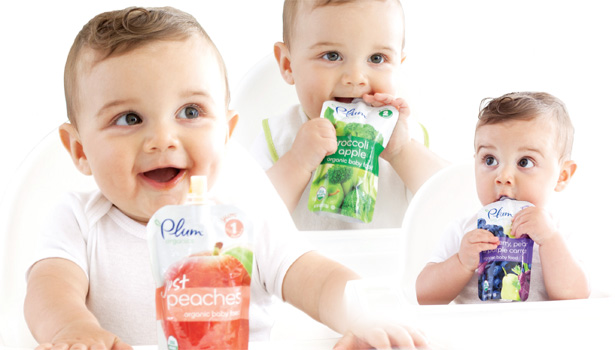
One of the reasons behind using pouches as the packaging was ease of use: Children can grasp and squeeze the pouches easily with their little hands in order to feed themselves. So why should the packaging be any more complex for parents? Moms and dads don’t have time to search labels for recommended ages and flavors in the store. The product that gives them the information they want in the quickest time will most likely be the one bought.
“Our consumer research indicated that consumers have just a few seconds to make a decision on shelf, so our packaging needs to be easy to shop — meaning we needed to be able to tell them what the product is in a very clear and succinct way,” says Sangita Forth, VP of brand at Plum. “As such, we made sure that the key purchase drivers were highlighted: stage, flavor name and visual indication.”
Plum used the packaging features to call out details rather than only relying on words and graphics.
“In addition to the design highlights Rachel mentions, we wanted to make sure that the cap color matched the color of the flavor name to help consumers easily identify their preferred flavor on shelf,” Forth continues. “We also added a Stage 1 or Stage 2 call out on the upper right hand corner as most consumers are shopping by ages and stage.”
When you have so much goodness packed in such a small pouch, brands might feel obligated to announce every feature. As tempting as it was to let consumers know each product characteristic and instruction, Plum’s team knew what key elements to address and what to hold back to keep the design simple. Like a screaming baby, no one cares for packages that yell everything from the shelf at once.
“We would have liked to include additional communication on the front of the package on product features and benefits but did not want to clutter the front panel,” says Forth. “We decided to move the additional product information to the back panel under the Plum Promise.”
Besides contributing to readability, sticking with a clean look gave the products an upscale feel and put the focus on the healthy ingredients inside.
“Our primary objective for the redesign was to ensure our graphics reflected our premium brand position and the premium, unique ingredient combinations that are included in each and every pouch,” says Forth. “We wanted to make sure that the pouches were easy to shop on shelf and that they really stood out.”
The consumer response to the new look has been phenomenal, Plum reports, and the clarity of the design has helped tired and harried parents locate the right food product for their children, resulting in more pouches sold.
“We knew our goal had been accomplished when the sales of our pouches began to turn at higher velocities across the board,” says Loyd. “The clear communication through fresh ingredient photography; bold, bright flavor colors; and clear, easy-to-read product names has made it easier than ever for busy moms to quickly find Plum and shop our many unique flavors.”
Plum Organics’ redesign freshened up the brand by making products instantly readable to parents, kept the expanding line cohesive and amplified the company’s shelf appeal, all while protecting the brand’s identity. And if the company had been around when Little Jack’s nursery rhyme was written, he wouldn’t have had to dirty his hands in the Christmas pie — but could have enjoyed a mess-free, easy-to-use, resealable Plum pouch instead.
Looking for a reprint of this article?
From high-res PDFs to custom plaques, order your copy today!


