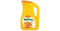
Premium Orange Juice Pitcher
Premium Orange Juice Pitcher
Conveys Quality and purity
by Rob Croft
The gable-topped carton and the HDPE bottle are both frequently used for orange juice packaging, however both are severely lacking in terms of communicating “premium”. A transparent package that shows the quality and purity of the product easily surpasses the graphic promises that are made by the majority of orange juice brands.
Injection-blown PET is a good choice for an orange juice bottle, because of its wonderful optical qualities. The ability to unashamedly display the contents, and to utilize the glass-like properties of the material, leads to a more “table worthy” package and a premium effect that is streets ahead of the generic gable-topped carton.
But the age-old challenge with larger PET bottle packages is to create an in-mold handle. Sure, you can switch to PETG (Glycol Modified PET) and extrusion blow mold a bottle with a handle – but the resin is much more expensive and extrusion lines tend to be evident in the finished molding. Faced with this problem, most marketing executives are urged towards a design with a high grip point around the neck of the bottle – or they sacrifice the transparency and go with the conventional HDPE, neither of which correlates to consumer preferences.
Shrink label makes for “table worthy” package
For our orange juice structural packaging exercise, we side-stepped the Asian practice of insert molding (a subject that is worthy of at least several pages) and focused on the fascinating and largely overlooked (and potentially more flexible) strategy of snapping on an injection-molded handle.
The injection-blow-molded bottle has a square cross section for maximum cube-out efficiency and can be blown and filled by just about everyone. The bottle is filled and labeled with an orientated shrink-wrap, prior to the handle being snapped on. The upper shoulder of the bottle is textured to resemble an orange peel, creating a zesty and tactile surface. This also ensures that the widest and narrowest point of the label-able area fall within the physical shrink ratios of most films.
The lower anchor point for the handle is created with a dovetail of plastic on either side of the split line. The on-center neck features a finish with a non-return flange that keeps the circular anchor ring in place. The push up on the underside of the package receives the over cap of an adjacent package, allowing the bottles to be securely stacked.
A major design feature is the fitment of the “leaf-like” handle and its relationship with the shrink film. As the handle slides into place, the shrink-wrap is slit at the lower anchor point—resulting in a fully exposed handle on a fully labeled bottle – quite a packaging coup! Supplier relationships can still be kept flexible and the design demonstrates how two fairly simple components can be linked together to create an effect that is revolutionary. BP
The author, Robert Croft, is Managing Partner of Swerve Inc., specialists in 3-D brand design. Contact him at 212.742.9560 or rob@swerveinc.com.
Looking for a reprint of this article?
From high-res PDFs to custom plaques, order your copy today!


