Dr. Pepper Snapple Group's Single-Serve Bottle
The beverage company creates a consumer-preferred, proprietary bottle.

 by Jennifer Welbel
The story: In 1885, pharmacist Charles Alderton invented Dr. Pepper in Waco, Texas. More than 120 years later, the Dr Pepper Snapple Group (DPS) - the result of numerous mergers and acquisitions by Cadbury Schweppes Americas Beverages - became a standalone, publicly-traded company. Today, DPS is the leading producer of flavored beverages in North America with more than 50 brands of carbonated soft drinks, juices, teas, mixers and waters, including Sunkist Soda, 7UP, A&W, Canada Dry, Crush, Mott’s and more.
The challenge: In 1997, many DPS brands began using a proprietary, 20oz single-serve package that featured an embossed splash-like pattern (often referred to as the “splash” bottle). But after 10-plus years in the marketplace, the company wanted to rework the bottle structure and create an improved visual and tactile design that would work across 21 brands within the DPS portfolio. Yet, despite multiple redesigns, consumers continued to prefer the original, “splash” version. According to Robin Utay, director of packaging, Dr. Pepper Snapple Group, “I don’t think we were listening to consumer needs. [Instead] we were developing what we thought was the right thing, which was jus something that was different from what we currently had and would stand out on shelf.” To come up with the ideal design - one that would tap consumer insights upfront - DPS joined forces with plastic packaging design solutions firm R&D/Leverage.
The solution: For DPS, it was essential that the new bottle was a consumer-preferred package. It was also important to them that they perfect the 20oz single- serve size, because consumer research showed that the bottle was their “on the go, preferred package.” “The 20oz size is central to our efforts to grow our business in single-serve formats across our flavor portfolio, so it’s got to be perfect, in many ways,” says Utay.
As a result, R&D/Leverage began by conducting comprehensive consumer research. The first component, “the unlock phase,” consisted of ethnographic work. Here, R&D/Leverage and DPS immersed themselves in the consumer experience, spending time in homes and cars, and in stores and gas stations.
They then conducted brainstorming sessions that were designed to make consumer preferences explicit. According to Tamara Christensen, R&D/Leverage’s director of research, “[Consumers] get very wrapped up in the label. So, when we try to get feedback from them [on tactile or structural elements], they are still thinking very visually.” Therefore, during the brainstorming sessions, Christensen’s team covered 15 concept bottles in black bags, which enabled consumers to give targeted, structural feedback. “After that exercise, we had a pretty clear picture of the bottles and structures that were preferred for functionality,” she says.
The last step was to ask consumers to design their ideal bottles. But according to Christensen, “We were less interested in how they would design the bottle-what features or shapes-but more how they would connect that [design to] specific benefits they were looking for.”
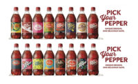
The research, brainstorming sessions and ideal designs all revealed that some of the most important benefits were grip and texture. “Texture is a big thing, because it helps [consumers] understand where to hold [the bottle] and how to hold it,” says Christensen. “It also facilitates grip.” However, most soft drinks are actually very slippery, because the label panel is often placed in the middle of the bottle where people hold their drinks. So DPS pushed the label panel up higher and made the waist smaller on this redesigned bottle. The company also incorporated soft panels below the label that have a light bubble texture. Together these changes resulted in a new, curvilinear structure with the grip and texture consumers were looking for.
The results: After 28 weeks, including three complete cycles of research (two qualitative and one quantitative), the new DPS “legacy” bottle (named for the brands’ longevity and heritage) was complete. “This is a totally unique shape, because of that gripability, high waist and high label,” Utay says. [And although] the [changes] may look minimal from the outside, it is actually fairly substantial what we were able to do,” says Christensen.
CREDITS
Research and Package Design
R&D/Leverage, www.rdleverage.com

AFTER

BEFORE
The story: In 1885, pharmacist Charles Alderton invented Dr. Pepper in Waco, Texas. More than 120 years later, the Dr Pepper Snapple Group (DPS) - the result of numerous mergers and acquisitions by Cadbury Schweppes Americas Beverages - became a standalone, publicly-traded company. Today, DPS is the leading producer of flavored beverages in North America with more than 50 brands of carbonated soft drinks, juices, teas, mixers and waters, including Sunkist Soda, 7UP, A&W, Canada Dry, Crush, Mott’s and more.
The challenge: In 1997, many DPS brands began using a proprietary, 20oz single-serve package that featured an embossed splash-like pattern (often referred to as the “splash” bottle). But after 10-plus years in the marketplace, the company wanted to rework the bottle structure and create an improved visual and tactile design that would work across 21 brands within the DPS portfolio. Yet, despite multiple redesigns, consumers continued to prefer the original, “splash” version. According to Robin Utay, director of packaging, Dr. Pepper Snapple Group, “I don’t think we were listening to consumer needs. [Instead] we were developing what we thought was the right thing, which was jus something that was different from what we currently had and would stand out on shelf.” To come up with the ideal design - one that would tap consumer insights upfront - DPS joined forces with plastic packaging design solutions firm R&D/Leverage.
The solution: For DPS, it was essential that the new bottle was a consumer-preferred package. It was also important to them that they perfect the 20oz single- serve size, because consumer research showed that the bottle was their “on the go, preferred package.” “The 20oz size is central to our efforts to grow our business in single-serve formats across our flavor portfolio, so it’s got to be perfect, in many ways,” says Utay.
As a result, R&D/Leverage began by conducting comprehensive consumer research. The first component, “the unlock phase,” consisted of ethnographic work. Here, R&D/Leverage and DPS immersed themselves in the consumer experience, spending time in homes and cars, and in stores and gas stations.
They then conducted brainstorming sessions that were designed to make consumer preferences explicit. According to Tamara Christensen, R&D/Leverage’s director of research, “[Consumers] get very wrapped up in the label. So, when we try to get feedback from them [on tactile or structural elements], they are still thinking very visually.” Therefore, during the brainstorming sessions, Christensen’s team covered 15 concept bottles in black bags, which enabled consumers to give targeted, structural feedback. “After that exercise, we had a pretty clear picture of the bottles and structures that were preferred for functionality,” she says.
The last step was to ask consumers to design their ideal bottles. But according to Christensen, “We were less interested in how they would design the bottle-what features or shapes-but more how they would connect that [design to] specific benefits they were looking for.”
The research, brainstorming sessions and ideal designs all revealed that some of the most important benefits were grip and texture. “Texture is a big thing, because it helps [consumers] understand where to hold [the bottle] and how to hold it,” says Christensen. “It also facilitates grip.” However, most soft drinks are actually very slippery, because the label panel is often placed in the middle of the bottle where people hold their drinks. So DPS pushed the label panel up higher and made the waist smaller on this redesigned bottle. The company also incorporated soft panels below the label that have a light bubble texture. Together these changes resulted in a new, curvilinear structure with the grip and texture consumers were looking for.
The results: After 28 weeks, including three complete cycles of research (two qualitative and one quantitative), the new DPS “legacy” bottle (named for the brands’ longevity and heritage) was complete. “This is a totally unique shape, because of that gripability, high waist and high label,” Utay says. [And although] the [changes] may look minimal from the outside, it is actually fairly substantial what we were able to do,” says Christensen.
CREDITS
Research and Package Design
R&D/Leverage, www.rdleverage.com
Looking for a reprint of this article?
From high-res PDFs to custom plaques, order your copy today!


