Calgon: Soaking in a New Look
After 60 plus years in the personal care market, Calgon decided to revamp its line to better appeal to the active consumer of today.

 The story: Calgon launched its first product, Bath Oil Beads, in 1946. But it wasn’t until the 1960s that the famous Calgon TV commercials and print ads began appearing. The brand’s tagline, “Calgon, take me away!” not only caught consumers’ attention at the time, but remains a strong cultural reference today. Popular songs like Shake It Off by Mariah Carey, Gone by Kanye West and Cowboy Take Me Away by The Dixie Chicks, and TV shows like Gilmore Girls, The Nanny, and The Fresh Prince of Bel-Air, all reference the tagline. Over the years, the brand expanded its product line to include body washes, body sprays, body lotions and shower gels.
The challenge: The brand hadn’t undergone a major redesign in nearly 15 years, leading to structures and visuals that looked dated. And, because the brand had been acquired multiple times since its launch, the packaging had become somewhat inconsistent.The old-time Calgon advertisements focused on women looking for an escape from their hectic, everyday lives. When Ilex Capital Group purchased the brand from Ascendia Brands in 2009, it conducted consumer research that found active women of today looking for an “escape to,” not an “escape from,” stemming from the need to be more in control of their lives.
The goal: Ilex Consumer Products Group worked with Kaleidoscope and Bevel Design to create an updated, consistent brand look and reposition the Calgon brand to better appeal to its consumers. The redesign also aims to attract a younger demographic: women between the ages of 25 and 35 (its current market is women ages 35 to 65).
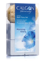
The solution: Calgon updated the structure of its Bath Beads and Body Lotion varieties, and switched out the imagery on all of its products to appear more vibrant.“Without the update, you almost get the feeling of ‘that’s my mom or my grandma’s brand,’ so we wanted to dispel that with the new structures, new visuals, new formulas and new fragrances,” says Bernie Kropfelder, EVP of marketing and sales for Ilex Consumer Products Group.
Changing the structures also helped with functionality. For instance, Calgon’s Bath Beads were always packaged in a paperboard box, which, when set on the edge of a tub, would get wet and ruin the beads inside. The brand created a new, tall, plastic cylinder to hold the bath beads; it’s easy to grip and won’t absorb water. To make sure consumers aren’t confused by the new format, each package will feature a sticker with an image of the old box.
The structure of the Body Lotion package, now called Body Cream due to a change in formulation, was also altered with a larger cap and orifice that allows the bottle to easily sit upside down, making it easier to dispense every last bit of product.
The brand also created visual elements for each package to appeal to the active woman identified in Calgon’s research. For example, the Morning Glory variety features bubbles that suggest movement.
Across the line, the packaging features more vibrant imagery to catch shoppers’ attention in the store aisle.
“If you don’t do some kind of visual disruption at the point of sale, there’s a chance that, as she walks down the aisle and gets bombarded with all these choices, she may not even see your brand,” Kropfelder says, “even though it’s a top of the line brand for her.”
In reconnecting with the active woman, the brand also updated its logo. It linked together the letters “G” and “O” to form the word “go.” And, replaced the letter “O” with a flower. The old logo featured a simple, block letter typeface, with the tagline underneath in a smaller, bold font. The new packaging italicized the tagline, making it look more flowing and active.
The new packaging is set to roll out next month, beginning in Canada and then into the United States. BP
Stephanie Hildebrandt is the associate editor of BRANDPACKAGING. Contact her at hildebrandts@bnpmedia.com.

AFTER

BEFORE
The challenge: The brand hadn’t undergone a major redesign in nearly 15 years, leading to structures and visuals that looked dated. And, because the brand had been acquired multiple times since its launch, the packaging had become somewhat inconsistent.The old-time Calgon advertisements focused on women looking for an escape from their hectic, everyday lives. When Ilex Capital Group purchased the brand from Ascendia Brands in 2009, it conducted consumer research that found active women of today looking for an “escape to,” not an “escape from,” stemming from the need to be more in control of their lives.
The goal: Ilex Consumer Products Group worked with Kaleidoscope and Bevel Design to create an updated, consistent brand look and reposition the Calgon brand to better appeal to its consumers. The redesign also aims to attract a younger demographic: women between the ages of 25 and 35 (its current market is women ages 35 to 65).
The solution: Calgon updated the structure of its Bath Beads and Body Lotion varieties, and switched out the imagery on all of its products to appear more vibrant.“Without the update, you almost get the feeling of ‘that’s my mom or my grandma’s brand,’ so we wanted to dispel that with the new structures, new visuals, new formulas and new fragrances,” says Bernie Kropfelder, EVP of marketing and sales for Ilex Consumer Products Group.
Changing the structures also helped with functionality. For instance, Calgon’s Bath Beads were always packaged in a paperboard box, which, when set on the edge of a tub, would get wet and ruin the beads inside. The brand created a new, tall, plastic cylinder to hold the bath beads; it’s easy to grip and won’t absorb water. To make sure consumers aren’t confused by the new format, each package will feature a sticker with an image of the old box.
The structure of the Body Lotion package, now called Body Cream due to a change in formulation, was also altered with a larger cap and orifice that allows the bottle to easily sit upside down, making it easier to dispense every last bit of product.
The brand also created visual elements for each package to appeal to the active woman identified in Calgon’s research. For example, the Morning Glory variety features bubbles that suggest movement.
Across the line, the packaging features more vibrant imagery to catch shoppers’ attention in the store aisle.
“If you don’t do some kind of visual disruption at the point of sale, there’s a chance that, as she walks down the aisle and gets bombarded with all these choices, she may not even see your brand,” Kropfelder says, “even though it’s a top of the line brand for her.”
In reconnecting with the active woman, the brand also updated its logo. It linked together the letters “G” and “O” to form the word “go.” And, replaced the letter “O” with a flower. The old logo featured a simple, block letter typeface, with the tagline underneath in a smaller, bold font. The new packaging italicized the tagline, making it look more flowing and active.
The new packaging is set to roll out next month, beginning in Canada and then into the United States. BP
Stephanie Hildebrandt is the associate editor of BRANDPACKAGING. Contact her at hildebrandts@bnpmedia.com.
Looking for a reprint of this article?
From high-res PDFs to custom plaques, order your copy today!


