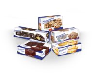
Entenmann's Coffee
The baked goods company reclaims its heritage with a redesign of its coffee product line.

 By Jennifer Welbel
The story: In the late 1800s, after emigrating from southern Germany, William Entenmann opened his first bakery in Brooklyn, New York, delivering fresh baked goods door-to-door in a horse-drawn wagon. Throughout the early part of the 20th century, the family business flourished, and, in 1951, the company traded in-home delivery for retail distribution, supplying grocery stores with its now-famous pastries and cakes. In 2007, with more than 100 products, the company introduced itsfirst line of coffee.
The challenge: Despite being a famous cookie and cake brand, Entenmann’s coffee varieties and packaging were relatively unknown. According to Steve Defontes, founder and creative director of Big Idea Advertising, the agency responsible for the redesign, “We heard from so many people that they just didn’t know this line had existed.” So when Entenmann’s began changing production and licensing for the product line, the company decided to “reinvest in the line” and update the packaging. “There was the feeling that the old design really didn’t evoke that traditional Entenmann’s look enough, and that may have been one of the reasons why the original product line wasn’t as successful with consumers as it could have been,” says Defontes. “So the goal was to tryand reclaim that [history] and almost re-launch it, as if the previous product line hadn’t existed.”
The solution: For countless years, the traditional Entenmann’s brand has been associated with the white cake boxes. “So that was really the starting point for the new design,” says Defontes. Big Idea began by switching from a blue bag to a white bag, creating a clean, modern backdrop, and then added blue elements-including blue bands along the cup and saucer rims and a blue napkin-to evoke the recognized Entenmann’s blue-and-white brandidentity.
From there, the design team focused on the cake photography, giving it prominent positioning to make sure consumers would recognize the tie-in between the brand’s new venture in coffee and its heritage in desserts. “In the original bag, the copy was laid right over the cakes,” says Lance Pilgrim, senior art director at Big Idea.
They also included coffee beans to reinforce the fact that it was a coffee product. “If you notice, youdon’t really see ‘coffee’ in large print anywhere,” says Pilgrim. ‘It’s in a coffee bag and located on coffee shelves, but we wanted to make sure that it was balanced with the dessert [imagery].”
The results: The redesign was recently revealed at the 57th Summer Fancy Food Show in July. “It was really well-received,” says Defontes. “That’s a good indicator of how buyers feel, representing how they think the product will perform with consumers.” Next up, Entenmann’s and Big Idea are in the process of developing hot chocolate.
CREDITS
Package Design
Big Idea Advertising, http://bigideaadv.com

AFTER

BEFORE
The story: In the late 1800s, after emigrating from southern Germany, William Entenmann opened his first bakery in Brooklyn, New York, delivering fresh baked goods door-to-door in a horse-drawn wagon. Throughout the early part of the 20th century, the family business flourished, and, in 1951, the company traded in-home delivery for retail distribution, supplying grocery stores with its now-famous pastries and cakes. In 2007, with more than 100 products, the company introduced itsfirst line of coffee.
The challenge: Despite being a famous cookie and cake brand, Entenmann’s coffee varieties and packaging were relatively unknown. According to Steve Defontes, founder and creative director of Big Idea Advertising, the agency responsible for the redesign, “We heard from so many people that they just didn’t know this line had existed.” So when Entenmann’s began changing production and licensing for the product line, the company decided to “reinvest in the line” and update the packaging. “There was the feeling that the old design really didn’t evoke that traditional Entenmann’s look enough, and that may have been one of the reasons why the original product line wasn’t as successful with consumers as it could have been,” says Defontes. “So the goal was to tryand reclaim that [history] and almost re-launch it, as if the previous product line hadn’t existed.”
The solution: For countless years, the traditional Entenmann’s brand has been associated with the white cake boxes. “So that was really the starting point for the new design,” says Defontes. Big Idea began by switching from a blue bag to a white bag, creating a clean, modern backdrop, and then added blue elements-including blue bands along the cup and saucer rims and a blue napkin-to evoke the recognized Entenmann’s blue-and-white brandidentity.
From there, the design team focused on the cake photography, giving it prominent positioning to make sure consumers would recognize the tie-in between the brand’s new venture in coffee and its heritage in desserts. “In the original bag, the copy was laid right over the cakes,” says Lance Pilgrim, senior art director at Big Idea.
They also included coffee beans to reinforce the fact that it was a coffee product. “If you notice, youdon’t really see ‘coffee’ in large print anywhere,” says Pilgrim. ‘It’s in a coffee bag and located on coffee shelves, but we wanted to make sure that it was balanced with the dessert [imagery].”
The results: The redesign was recently revealed at the 57th Summer Fancy Food Show in July. “It was really well-received,” says Defontes. “That’s a good indicator of how buyers feel, representing how they think the product will perform with consumers.” Next up, Entenmann’s and Big Idea are in the process of developing hot chocolate.
CREDITS
Package Design
Big Idea Advertising, http://bigideaadv.com
Looking for a reprint of this article?
From high-res PDFs to custom plaques, order your copy today!


