Beringer Vineyards
Despite Beringer’s long history of success, the brand felt
that its bottle designs did not effectively convey its heritage. So, it enacted a redesign to reflect the true character of the winery and, at
the same time, to convey a contemporary feel.

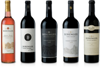
Founded in 1876 by brothers Jacob and Frederick Beringer, Beringer Vineyards is the oldest continuously operating winery in Napa Valley, and in 2001 it was named a Historic District on the National Register for Historic Places. But despite Beringer’s long history of success, the brand felt that its bottle designs did not effectively convey its heritage. So, in January 2011, it enacted a redesign to reflect the true character of the winery and, at the same time, to convey a contemporary feel.
The refreshed look features a modern version of the company’s original “Double B” icon, along with updated label foils, embossings and colors that create distinct tier stratification for Beringer’s lineup, from its entry-level price points (Founders’ Estate) to its flagship Private Reserve.
The Bottom Line: Founders’ Estate was the first Beringer tier to go to market in the new packaging, followed by Beringer’s Knights Valley and Napa Valley. Before Founders’ January redesign, the collection was in decline. However, since its relaunch, each varietal is up between 12 and 20 percent in front line rate of sales, which is double the market growth of five to eight percent. Beringer credits the uptick to the new visual identity, which makes it easier for consumers to clearly differentiate the winery’s tiers and identify the unique points of each variety. Because of this, the company expects to see continued growth as additional tiers hit shelves in the new packaging this spring. (Package design: Yard, www.yardnyc.com)
Looking for a reprint of this article?
From high-res PDFs to custom plaques, order your copy today!


