World's Best Cat Litter increases distribution

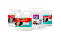
When your brand name is “World’s Best,” your packaging has to convey just that. So when the marketers of World’s Best Cat Litter asked themselves, “does our current packaging represent the best product on the market?” and realized the answer was no, they knew it was time for a redesign.
The goal was to create a premium package that would connect with consumers, command shelf presence and translate the brand’s high-end qualities. The new packaging enlists black and white cat photography to convey a premium feel and connect on an emotional level with consumers. A solid black background and metallic cat face logo add to the packaging’s upscale look. Designers chose bright, bold colors to call out the brand name, variety and product attributes.
The bottom line: After making its first appearance on store shelves with the new packaging in October 2009, World’s Best Cat Litter has seen an increase in shipments by about 10 percent, half of which the brand’s director of sales and marketing attributes to packaging.
“I think six months from now we’ll be able to look back and see that we probably had anywhere from a 10 to 15 percent jump just on the packaging alone,” says Paul Zobel.
Another sign that the packaging has increased ROI comes from the brand’s increasing number of new accounts, including Publix grocery stores. Zobel says World’s Best Cat Litter’s existing retailers have also responded favorably to the new design, calling it innovative, distinct and “category leading” and, in the case of PetSmart, providing more SKU placement for the brand. (Package design: MicroArts, www.microarts.com)
Looking for a reprint of this article?
From high-res PDFs to custom plaques, order your copy today!


