U.S.A. > Wisk
Looking to strengthen its brand voice, Wisk
relaunched its detergent with a new design and formula.

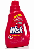
Looking to strengthen its brand voice, Wisk relaunched its detergent with a new design and formula. The redesigned bottles give prominence to the brand’s equity color, red, save for the caps, which are color-coded according to function. The new, white logo also features more modern typography. “[Wisk] is now a standout in the category-screaming premium and performance, while remaining relevant and approachable to the consumer,” said John Nunziato, creative director of Little Big Brands, which enacted the redesign.
Launch
August 2010
Package design
Little Big Brands, www.littlebigbrands.com
Looking for a reprint of this article?
From high-res PDFs to custom plaques, order your copy today!


