Chobani launches new packaging design with painted fruit images

Chobani, the company that helped kick-start the Greek yogurt craze, is shrinking those words on its label as it may expand beyond that food in an increasingly crowded yogurt market.
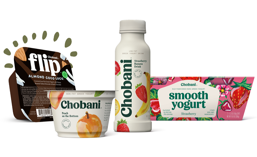
The new look, which will show up in supermarkets this week, removes "Greek Yogurt" from underneath the Chobani name. The yogurt inside will stay the same. Its packaging will be more muted than the current bright white, use a new font and style, and feature watercolor paintings of fruits rather than photographs of strawberries and peaches.
"What this new identity enables us to do is start to seed, if you will, us going into other areas beyond yogurt," says Peter McGuinness, Chobani's chief marketing and commercial officer. But he wouldn't say what new foods or products it might make, or when it would happen.
Chobani has grown quickly since its yogurt was first sold at supermarkets 10 years ago. Older food companies scrambled to catch up and offer their own versions of Greek yogurt, but last year Chobani was named the best-selling yogurt brand in the U.S., according to market research firm Euromonitor.
McGuinness says the new, thicker font makes Chobani easier to spot in the overcrowded yogurt aisle, and the off-white containers differentiate it from its rivals.
Its Smooth Yogurt, which launched earlier this year as a less-tart alternative to Greek yogurt, gets a more colorful container and shrinks the Chobani name. A similar treatment was given to Chobani Flip, which has yogurt in one container and mix-ins such as chocolate or dried cranberries in the other. Flip, which was launched nearly four years ago, is on track to become a $1 billion business in about two years, says McGuinness. It gets people to eat yogurt beyond breakfast and brings people to the brand who may not like yogurt, he adds.
Looking for a reprint of this article?
From high-res PDFs to custom plaques, order your copy today!


