interpack technical article
Beauty packaging out of the tube, glass and jar

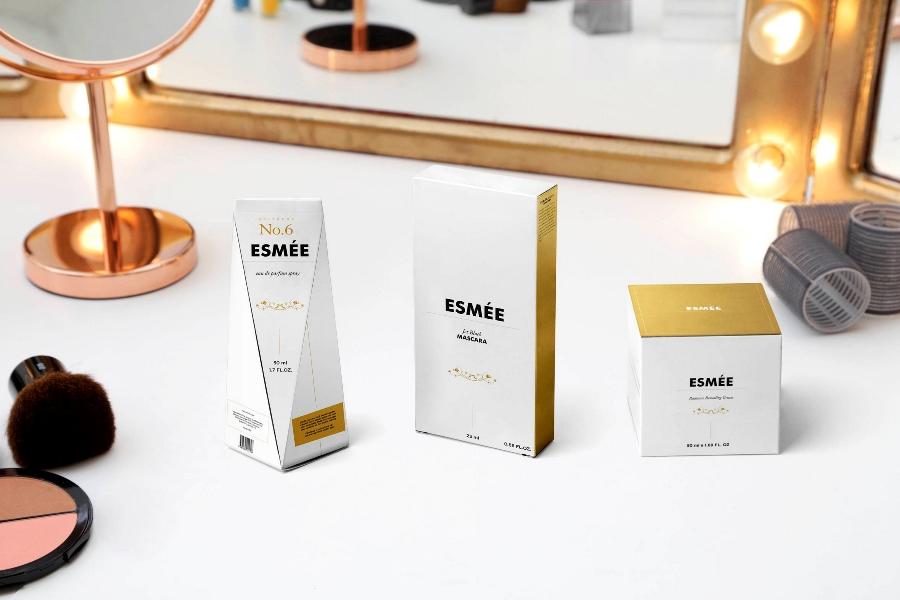
“Beauty is everywhere a very welcome guest,” wrote Johann Wolfgang von Goethe at the start of the 19th century. And already 3,000 years before this, a great deal of time and care was devoted to external appearance. The Ancient Egyptians were famous for their highly developed beauty culture; serving as a reference and the epitome of purity and beauty was legendary Queen Nefertiti. Whether make-up, ointments or tinctures – often made by priests the products found their place in select and finely decorated containers made of clay, slate, metal or wood. And also today, packaging for cosmetics evokes the idea of luxury combining high-quality materials with sophisticated graphic applications and finishes.
That certain something
The body care cult does not seem to decrease. On the contrary, spending on cosmetics is rising year to year. According to a business report by cosmetics giant L’Oréal, global transactions of cosmetic goods in 2016 were worth an estimated Euro 205 billion – a rise of 4% over the previous year more growth than achieved in the previous three years. (1) However, this growth goes hand in hand with increased competition. Therefore, to be successful on the highly competitive cosmetics market one also has to ensure to have precise positioning and communication of brand content. When selecting packaging, brand and packaging firms therefore look for unmistakable brand design. Going hand in hand here are multi-sensory effects and special finishes that turn simple packaging into a real brand experience.
A specialist in the high-quality packaging solution sector is the family company Edelmann. To achieve surprising results, the packaging experts combine different finishing technologies. Oliver Eschbaumer, in charge of marketing at Edelmann, explains the special effect this achieves, “By combining individual elements the original contrasts develop into a new symbiosis and in a smart combination they achieve unexpected impact.” An example of this is the interplay achieved by using both matte and gloss coatings. Surfaces can be emphasized like this or lettering can be highlighted. Tactile aspects are also a very important trend in packaging and beauty products. By embossing graphic elements individual accents can be created. “At Edelmann time and again we are inspired by tactile communication,” explains Eschbaumer. “But we know that featuring tactile-looking elements on packaging often only makes sense if a dialogue is initiated with the product promise.”
Whiter than white
A product promise of this kind is not only conveyed by the laundry detergent brand Persil but also the Finnish-Swedish group Stora Enso. Here we are referring to the white tone of their new improved virgin-fiber carton board Ensocoat. “Luxury packaging typically includes processes like embossing and hot-foil embossing as well as other special effects that make high demands of the material in terms of smoothness, whiteness and folding characteristics,” stresses product manager Eva Lundqvist.
Whiteness and lightness of the carton are, she says, the most important technical properties. Established on the market now since the 60s this carton made of bleached cellulose (solid bleached board or SBS) will be presented at this year’s interpack trade fair alongside many other innovative packaging solutions for the cosmetics industry. From May 4 – 10, 2017, in Düsseldorf, Germany, visitors will find answers to all questions concerning the manufacturing, packaging and logistics of highly sensitive products.
Also providing interesting insights into the latest components for manufacturing technologies will be the accompanying event “components – special trade fair by interpack” that is primarily aimed at upstream suppliers to the packaging industry and firms that offer drive, control and sensor technology products for industrial image processing, handling technology, industrial software and communication as well as complete automation systems for packaging machinery.
Nature in focus
In the beauty sector it is not only ingredients and production that need to be as sustainable as possible because consumers also make the same demands for packaging. Here they want recyclable packaging in the same way as they want resource-saving production. Alongside the use of renewable raw materials, companies also offer special compact packaging that can help to avoid unnecessary waste. Special packaging solutions also help to reduce cosmetic residue by ensuring tubes, bottles and jars can be emptied more easily.
Especially with natural cosmetics, brand owners and manufacturers look to sustainable packaging concepts. Originally known for its comfortable sandals, footwear firm Birkenstock developed a natural cosmetics line focusing on the main active ingredient cork in February 2017. To tie in with this, packaging systems with a refill system were selected. The stable bottles with airless dispensers and cork bases contain replaceable cartridges. When a product is finished the consumer just buys the refill and places it in the original container. This saves resources and shows how clever and uncomplicated sustainability can be. What’s more, the product is protected since the airless dispenser allows no air to reach the contents. This very naturally protects against oxidation, contamination and dehydration.
Safety as a basic principle
With sensitive products like cosmetics, protection is a top priority. Like in the pharmaceutical and food sectors, stringent hygiene rules apply. Use of cleaning products and disinfection methods means the materials in the sterile environment of the packaging machinery are often subjected to high stresses; at the same time they must offer as little room for contamination as possible.
To prevent contamination ingress from cleaning or packaging materials unsealed closures must be avoided as much as possible in the filling process. For filling ointments, creams and other paste-like products the specialist packaging technology firm IWK offers “FP Sterile,” a platform for the tube filling in metal, plastic or laminate tubes that rules out so-called dead spaces where residue or bacteria can collect and multiply. This particularly applies for critical transitions to components. To prevent any particles entering the open tube the grippers only touch the outer sides of the tubes – unlike with conventional machines where the mandrel penetrates the open tube.
Gender differences
With men’s altered care routines, men’s cosmetics have become one of the biggest growth markets in the body care sector. The segment saw its first boom at the beginning of 2000 when the cosmetics industry put the metrosexual man into focus which led to numerous dedicated men’s cosmetics lines. Seventeen years later expectations many have lowered but at the same time niche products have become generators of income. Market researchers value the turnover at more than U.S.$47 billion(2).
The packaging world has also changed in pace with the development of this male target group for beauty care products. This is because what women might like does not necessarily appeal to men. And this is something corporate consultant Diane Jaffé, CEO at bluestone AG, knows only too well. She advises companies on the topic of gender marketing and is familiar with men and women’s different expectations of packaging. Shape, size and material play an equally decisive role as surface textures, colors or ornamentation.
“Women are often attracted to the opposite of what appeals to men,” explains Jaffé. Straight, square and angular means masculine; rounded forms look more feminine. Brand-name companies have long since recognized the potential of targeted packaging design and do not just attune their marketing and packaging according to gender but also their prices.
The right color
However, packaging colors must not just be seen in the context of gender. Colors also increase recognition levels and underline brand identification. More than fonts, colors are easier recognized by consumers and remain in their memories for longer. Strong brands like Coca-Cola or Nivea have managed to be distinctive purely based on their choice of color. Special color systems help to choose the unique corporate or brand color. There are thousands of colors to choose from. But for long-term recognizability it is vital that the same color tone is uniformly used. This also entails technical challenges – especially in printing and finishing processes that can impact the chosen color tone. To choose, compare and check printing inks there are so-called color fans that are produced using offset printing and which therefore ensure particularly high concordance. Proprietary colors can be defined in any gloss level as a color standard: as a printed version, in plastic or digital. The nearer the material of the master is to the original material the easier it is to compare. And the easier it is for the packaging to meet shoppers’ expectations thereby making it the perfect brand ambassador.
1 2016 Business Report, L’Oréal
2 Market research by Euromonitor and Bloomberg Intelligence. https://kurier.at/wirtschaft/businessoesterreich/der-gepflegte-mann/250.457.202
For outstanding printing results and high performance in all finishing processes Ensocoat’s virgin-fiber carton board has now become even whiter. Photo: Stora Enso
Looking for a reprint of this article?
From high-res PDFs to custom plaques, order your copy today!


