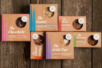
Higgidy pies and quiches relaunch in colorful box packaging


An eclectic and eye-catching new brand identity for Higgidy has been unveiled by B&B studio (bandb-studio.co.uk/). The brand repositioning moves Higgidy away from being a product-led challenger brand, launched 13 years ago, to an established British brand with a unique and differentiating philosophy.
The new identity is based around the strategic positioning of ‘the best food always looks a bit Higgidy’ and celebrates the hand-finished nature of Higgidy’s much loved pies and quiches.
The Beauty of Imperfection
B&B studio worked closely with Higgidy on an extensive brand renovation, with B&B involved at every stage, helping the brand define, articulate and express its positioning.
In-depth category research, consumer and stakeholder workshops confirmed an opportunity to truly disrupt the category. The resulting positioning, based around the idea of ‘The Beauty of Imperfection’ and inspired by the product’s natural qualities, challenges standardised ideals of perfection.
The best things in life are Higgidy
The creative strategy led on the belief that ‘the best things in life are Higgidy’ – evolving the positioning from product to lifestyle philosophy. The resulting packaging for the brand’s 33 pies, quiches and sausage rolls, is inspired by an eclectic collection of ceramic plates. Illustrators collaborated to create abstract illustrations, inspired by the recipes, which appear cropped.
A new round logo, which breaks the name of Higgidy up across two lines, makes a distinctive, memorable and easy to read brand mark. The logo has been artworked to look subtly different each time emphasising the look and feel of Higgidy products.
Emotional nourishment
Shaun Bowen, founder and creative partner, B&B studio, says: “From the start, we were keen to help build Higgidy’s broader philosophy – and the company’s belief in the beauty of its imperfect pies felt like something that could evolve way beyond the food.
“The packaging design was inspired by a lifestyle aesthetic born out of the beauty of imperfection, and the mismatched plates gave us the opportunity to tell a story around each recipe, either in terms of its inspiration, ingredients or associations. We worked closely with founder Camilla Stephens to truly appreciate each recipe, then with each individual illustrator to ensure the story came to life in the most appropriate way.
“The redesign required a brave client to take a game changing approach, but the result is a category challenging brand with depth.”
Mark Campbell, managing director, Higgidy, says: “An enormous amount of thought and rigour has gone into this new approach. Category and consumer insight have driven our thinking at every step and we wanted to take a completely new approach to re-energise the category.
“The new packaging is just one part of our commitment to an on-going programme, which aims to re-energise the category as a whole. We are also taking our marketing approach to the next level with our first ever above the line campaign in April to extend our reach further and reach a new audience.”
Looking for a reprint of this article?
From high-res PDFs to custom plaques, order your copy today!


