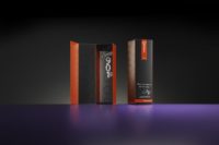
Emerging Trend: Essentialism
5 ways to put Essentialism to use in your packaging


Consumers have more options than ever, making the competition for their attention incredibly intense. Packaging is an opportunity for a brand to draw attention to their product. Essentialism is an emerging trend in the packaging industry that focuses on creating clarity to inform the target audience what the brand is all about.
So how can essentialism be part of effective packaging? When it comes to packaging, essentialism calls for designs that clearly communicate a message and provide meaningfulness to the end user.
1. Simplicity
Simplicity in design focuses on the brand message, allowing clear text-based, uncluttered designs to take center stage. While some may call these designs over-simplified, simplicity in design creates a clarity and purpose. With minimal elements being part of the design, each individual element has to be thoroughly thought through to provide a clear message to consumers regarding the brand’s promise and quality. That includes colors, typography, finishes and even substrates.
Rather than utilizing multiple effects on packaging, selecting a single, standout element, be it a finish, off-press technique or other, creates a powerful message that consumers can understand and connect with.
2. Geometric Structures
When it comes to essentialism, geometric structures are key to expressing a brand’s approachability and honesty. Rather than using elaborate structures that can detract from a brand’s message, geometric or organic structures communicate a familiarity that many of today’s consumers appreciate. Unlike over-the-top packaging, essentialist packaging focuses on using familiar geometric shapes like circles, squares, hexagons or rectangles to focus on the quality of the product.
Although simplistic in shape, essentialist packaging can be truly innovative and embody a more approachable brand.
3. Minimalistic Text
Overly informative designs make text less useful and more repetitive. Text can be an effective tool for informing consumers, but it should not be the only tool. The written content on a package should provide consumers the directions and other absolute necessary information that cannot be communicated in other means. A lot of information can be conveyed with images and in the design itself.
When including text on a package, brands should ask “does the consumer need this information?” to ensure brand clarity.
4. Efficient Design
Large packaging is not necessarily a bad thing, but it must be justified. Excessively large packaging inconveniences consumers and sends a negative message about the company and its product. A sleek, efficient package can be more easily stored and moved. A sleek package shows consumers that the company values efficiency and the limited space of the customer. Size and shape are especially important in industries such as food and beverage.
Working with an experienced packaging partner, brands can simplify packaging thanks to innovative options for closures and even carton styles.
5. Stand-Out Design
Consumers have an abundance of brands competing for their attention. Brands cannot afford to blend in and an innovative package differing from the industry norms is a great way to exhibit a company’s creativity and commitment to explore new ideas. Standing out could mean vibrant colors, a unique shape, or even vintage elements.
Essentialist packaging requires a well-designed story that is expressed through every element of a design. From fonts and colors to substrates, packaging must accurately embody a brand’s personality.
Looking for a reprint of this article?
From high-res PDFs to custom plaques, order your copy today!


