Kashi shows good looks and good food go together

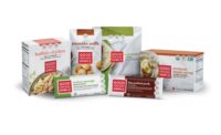
With the inspiration that 'good clean food deserves good clean design,' Kashi® is launching a new and refreshed brand identity that reflects its belief that food should not only taste good, but do good. Created in partnership with Jones Knowles Ritchie, the new look is a commitment to visually telling the brand story of bringing people close to the food they love. Initial changes will be reflected across the company's logo and packaging portfolio.
As a healthy food pioneer for more than 30 years, Kashi has always been committed to creating foods that enable uplifting health. With an entire portfolio of Non-GMO Project Verified products and ever-increasing organic offerings, Kashi sought to develop packaging to better reflect its progressive food values, highlight the stories behind the foods and also revisit some of the inspiration from its original packaging. Kashi was one of the first brands to use white cereal boxes and, with this packaging refresh, is again shaking up the natural and organic category with a bold departure from imagery reliant on farm and field visuals. The new design features food front and center against a clean white canvas and accented with a design that is unmistakably contemporary – with clean lines, vivid colors and straightforward typography.
Kashi is also one of the first brands to incorporate editorial-style stories on all packaging about how the food was made and where it comes from – including employees, farmers and friends of Kashi who had a deep impact on it. For example, Kashi Dark Cocoa Karma Shredded Wheat Biscuits features the story of Wyoming-based farmer Newton Russell, who was one of first farmers to pilot the Certified Transitional protocol (an initiative to help farmers transition fields from conventional to organic) and grew the wheat featured in the first batch of this new cereal. Other packaging features Wild Willow Farm & Education Center, a 5-acre working farm in Kashi's hometown that focuses on educating the community about the progressive food movement and place where Kashi draws inspiration for its own foods.
"At Kashi, we are inspired by some of the world's most vibrant ingredients and love bringing them together to create tasty food that also delivers the best possible nutrition," says Jeff Johnson, surfing nutritionist and senior director of marketing and new ventures at Kashi. "The new packaging reinforces our belief that foods should be clean and purposeful, the two ideas simply go together."
"Kashi is changing the way it showcases its quality, starting with the consumer's first impression of the product on the shelves and the food itself," says Tosh Hall, creative director of Jones Knowles Ritchie, the branding agency behind the new packaging and identity. "Our new design reflects values of the Kashi Company. The visual identity system and packaging tell the story of the product's quality, its origins and the dedicated people behind the Kashi brand."
New packaging is rolling out on shelves at select grocers and natural food retailers nationwide.
Looking for a reprint of this article?
From high-res PDFs to custom plaques, order your copy today!


