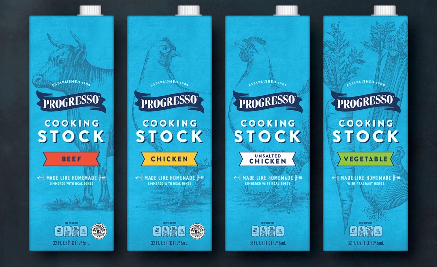
Progresso launches new line of cooking stock

Progresso believes that real, quality food makes life better. But, how does a brand with over 100 years of heritage design packaging that speaks to loyal supporters as well as more adventurous cooks looking to try something new? This was the challenge Progresso faced when they partnered with Hornall Anderson (hornallanderson.com) to design the packaging for a new line of cooking stocks.
In order to communicate the higher quality of product inside the package, the design needed to appeal to cooks’ creative aspirations, as well as demonstrate clear superiority over the competition. By understanding that premium brands create trends rather than follow them, the result was a solution that radically broke category conventions—building on years of heritage to create a fresh, new perspective.
Using lively, classic illustrations, modern typography and a fresh color palette, craftsmanship and love of the ingredients inside was emphasized. The side of the packaging touches on Progresso’s heritage and love for food, and gives suggestions to inspire our cooks to create their next perfect dish.
Throughout all of the deliverables—from packaging and photography, to a style guide demonstrating best practices for advertising, a microsite, and more—Progresso’s passion for real, quality food shines through.
Looking for a reprint of this article?
From high-res PDFs to custom plaques, order your copy today!


