Iced tea brand for fun in the summer Hamptons appeal
New design communicates marketing story of summer fun and refreshment

Long Island Iced Tea is usually associated with the legendary cocktail, but an upstart challenger brand is making waves in the ready-to-drink, $4.8 billion iced tea category by inviting curious consumers to check out the brand. Long Island Iced Tea (LIIT), based in Long Beach, New York, is targeting the bigger established brands with a new brand identity and design. The brand, which is sold in the Tristate area, tapped Tigre Creative Inc., (tigrecreative.com) the New York-based international brand design and development firm, who saw this as an opportunity to increase shelf and brand presence while communicating the brand’s unique story.
Tigre collaborated with LIIT’s marketing team on the holistic brand strategy with an emphasis on package redesign. “We set the creative direction by establishing the new brandmark and packaging,” says Tammy Vaserstein, creative, principal, Tigre. “By capitalizing on the enticing image of summer fun and providing a bold, new image for the brand, it now stands out in a crowded category.” One of the brand’s key differences from competitors is its emphasis on natural ingredients with no high fructose corn syrup.
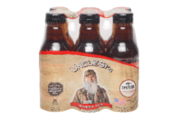
Tigre combined its experience in this market segment with competitive analysis, brand development and strategy. According to Philip Thomas, CEO, LIIT, the only element that was retained from the previous branding and packaging was the green color of the logo. “Tigre interpreted our team’s vision for the brand and helped guide us through design iterations that re-shaped and improved the packaging’s look and feel. The new design reflects a warmth and familiarity tied to summer weekends. The clapboard siding that serves as the background suggests a beach home or boardwalk; the logo reflects a worn sign you might find marking a charming bed and breakfast in Sag Harbor.” The color-coded painted flavor bands are reminiscent of the paint on the side of a cabana.
The new brandmark, a dark green square with white typography enhances shelf presence. The typography’s rough edges are combined with a san serif. “We wanted to create a strong/bold presence with this brandmark both on and off shelf -- a badge that has both traditional Americana strength, but with the edginess appropriate for a beach community. It works because it is authentic and premium while still being accessible,” notes Vaserstein. The fresh fruit imagery refers to the summer sun-kissed premium ingredients of the product.
The packaging redesign included all 8 flavors: unsweetened, lemon, peach, raspberry, diet peach, diet lemon, green tea/honey, half tea/half lemonade. Tigre also created multi-packs for club stores as well as point of sale displays and coolers.
The new packaging is rolling out now at major supermarkets, local grocers, Costco, and convenience stores. The bottles retail for $1 each.
Looking for a reprint of this article?
From high-res PDFs to custom plaques, order your copy today!


