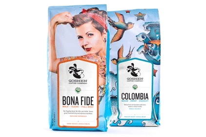
St. Louis-based Goshen Coffee, a company that has served socially conscious whole-bean coffee locally for more than ten years, reveals its new packaging and refreshed website, thanks to Marketing and design agency Atomicdust(www.atomicdust.com).
Goshen brought Atomicdust on board to create designs more reflective of the company’s colorful attitude and commitment to unique, bohemian java.
“Atomicdust is filled with coffee addicts and enthusiasts,” says Mike Spakowski, creative director of Atomicdust. “We were excited to take on the challenge.”
To counteract the typical exclusivity of the average coffee brand’s packaging, Atomicdust took a bold and unique step, finding inspiration in Canadian photographer Michaël Fournier’s “Modern Rosie” image.
“We wanted Goshen’s new image to be unique to its retail category without being gimmicky,” says Spakowski.
The “Modern Rosie” look embodied a rebellious, underdog attitude representative of Goshen’s history and bright future. Two packaging variants were used for each of Goshen’s 25 coffee varieties, which feature custom labels.
The image and new design identify also appear on Goshen’s new website, which was designed by Atomicdust to serve as a welcoming, fully functional online store.


