5 Packaging Design Mistakes and How to Avoid Them

We all enjoy a good meme poking fun at embarrassing mistakes online. But, it’s far less funny when your product or package is the butt of those jokes.
Poor packaging leads to worse things than a bruised ego – it leads to lost sales and revenue. And, it’s no mystery why.
People’s brains are measurably impacted by viewing product packaging. Attractive packaging often stimulates the reward centers of the brain, but poor packaging design activates areas of the brain associated with negative emotions.
Here’s why you should care: People aren’t inclined to buy things that they feel badly about.
Packaging design is a vital bridge between your customers and your product. Customers will see and touch your packaging before they ever interact with your product. And, as awesome as your product might be, it’s the packaging that does the selling. So, don’t let poor packaging undermine your sales.
Here are 5 common package design mistakes and why you should avoid them:
Packaging Mistake #1 – Waste
We’ve all purchased an item and then marveled sadly at the excessive and unnecessary packaging surrounding it. It’s not exactly a rare occurrence. But, why does this happen?
My marketing brain almost understands it. It’s important to communicate your message effectively on product packaging. And, the more space you have to do that, the easier it is to communicate.
But, it’s more important not harm the environment by wasting packaging materials – not to mention bumming out your customers with that waste.
Today’s consumers are more environmentally aware than ever before. And, they’re willing to use their spending power to reward the businesses that are helping rather than hurting.
According to a 2017 study by Cone Communications:
- 88% [of consumers] will be more loyal to a company that supports social or environmental issues.
- 87% would buy a product with a social and environmental benefit if given the opportunity.
- 92% will be more likely to trust a company that supports social or environmental issues.
So, don’t create silly, wasteful packaging that will leave shoppers shaking their heads.
After all, your product packaging is an important part of your company’s brand identity. If consumers hate your packaging, they won’t love your brand.
Avoid This Mistake: Choose appropriately sized, sustainable packaging. You can learn more about sustainable packaging from the Sustainable Packaging Coalition. The SPC is a leading authority on sustainable packaging.
If you can’t find existing packaging that works for your product, invest in custom packaging design. Bonus — packaging with a unique, custom size or shape will also help to differentiate your product on the shelves!
And, once you’ve committed to a sustainable packaging strategy, don’t be afraid to let your consumers know!
Packaging Mistake #2 – Misrepresentation
Some packaging deliberately creates the impression that a product provides more than it really does.
And, while some businesses may think it’s worth it to mislead customers in order to earn a quick sale, it’s an ill-advised practice in the long run.
Tricking (or outright lying to) your customers is a great way to eliminate their trust in your business. And, with that trust broken, they’re unlikely to ever buy from you again.
Not to mention that you can be sued over misleading packaging.
So, whether the packaging physically makes a product look larger than it is, or your copy makes promises the product won’t deliver, dishonesty of any kind is always a bad idea.
As tempting as it may seem, never over-promise.
Avoid This Mistake: Always be honest with your customers. You’ll create a better user experience if you under-promise and over-deliver. So, set realistic expectations with your packaging and then exceed them if you can!
Make it your goal to build trust through honest, authentic packaging design choices. If you find yourself wanting to overcompensate for a product, go back to the drawing board and fix it. When you have products to be proud of, there’s no need to misrepresent anything.
Packaging Mistake #3 – Errors
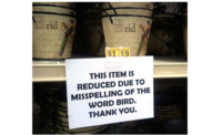
Professionalism breeds trust. But typos, misspellings and questionable design layouts will leave your potential customers wondering about your company’s professionalism.
And, sadly, once an obvious packaging error is out in the world, it’s a tough thing to take back. It’s costly to recall the product. For example, in our smartphone culture, pictures of your packaging mistake will inevitably start circulating the internet. The damage is done.
Consumers will not want to risk paying their hard-earned money for a product or service provided by a company that can’t even get their packaging design act together. They are already grammar critics. And, they’re becoming more design savvy every day. Don’t let them be the ones to discover a faux pas.
Avoid This Mistake: Don’t rush the proof process! In any custom design process, you’ll be given proofs to review. For example, in all custom design projects on crowdspring, we specifically include a proof step during project wrap-up so that you can carefully review the copy, design, and everything else and make sure it’s all perfect before the designer provides the final, print-ready files.
Don’t waste this opportunity. Check and double-check everything.
Take the time to verify spelling. Read your copy aloud to make sure it makes sense. And, look at the design layout in relation to the packaging it will be printed on.
Finally, make sure that more than one person reviews proofs before they’re approved and the final files are sent to be printed. A second proof-reader with a fresh perspective may catch things that were overlooked.
Packaging Mistake #4 – Impossible to Open
In some ways, humans are simple creatures. We like things to be easy. And yet, some packaging designs ignore this cardinal rule of human nature by being outrageously difficult to open. You know the ones – and you hate them.
There’s even a name for the feeling consumers experience when they encounter one of these hard-to-open packages: “wrap rage.” But, as fun as “wrap rage” is to say, it’s not fun to experience. And, even if you’re not a master of marketing psychology, it should be fairly clear that making your customers feel rage is a bad way to encourage repeat business.
Making it easy for customers to remove your packaging and access the product inside is an important part of creating a positive user experience.
Avoid This Mistake: Being mindful of the customer experience from the beginning of the decision-making process. As we point out in our guide on how to start a business, give consumers a reason to remember your brand and seek you out. Test out packaging options before committing to a full run. And choose a packaging option that will protect your product while still allowing consumers to open it without a rage-induced melt-down.
Packaging Mistake #5 – Lack of Differentiation
The goal of any product packaging is to catch a potential buyer’s eyes.
But, if your packaging looks just like the competition’s, it is likely to go overlooked. Or, customers may even choose your competitor by mistake.
In the example above, it’s nearly impossible to tell the difference between the two cookies. The logo design for each is tiny and unremarkable while the color on the packaging looks nearly identical. Neither design stands out.
People often don’t pay close attention – and we’re all guilty of distracted shopping. In fact, if you’re like me, you may not even remember brands. I get “the blue one” or “the one that’s mostly green with a little bit of white.”
Following that shopping logic, it’s easy to see how look-alike packaging like the example above could cause trouble for your product sales.
It’s vital to be visually distinct from your competition – don’t make the mistake of blending in.
Avoid This Mistake: Stand out with custom packaging design. If you want your product to stand out on shelves and be memorable to consumers, you must make design choices based on your unique brand identity. Capturing your brand essence in your packaging will require a custom design.
Leverage a crowdsourcing design platform (like crowdspring) to obtain many possible designs to choose from at a price that’s 10x to 50x less than working with an agency. And don’t design your packaging in a vacuum. Pay attention to what your competition is doing and avoid designs that are too similar.
Packaging design is a vital sales tool. Make sure your packaging is making the right impression on consumers – and not undermining your sales.
Looking for a reprint of this article?
From high-res PDFs to custom plaques, order your copy today!


